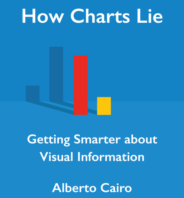
🏆🥁Hah, I think this is the first time I won something in my life by participating in a survey or any similar. I responded to @DataVizSociety's survey, and the prize is @AlbertoCairo's @howchartslie book! And now I have to wait until October.
🧐 Oh my… This chart is something.
@AlbertoCairo, they must've really studied "How Charts Lie" to nail this one!
https://t.co/VbnHaLaElR ht @DillonRGardner#dataviz
Just send out my bi-yearly newsletter with all the new stuff and updates from the past 6-ish months :D (Cats & Dogs! Desktop vs Mobile dataviz! Depth circles! Sankeys! and more ;) )
You can also read it here: https://t.co/h12n7CfzAt
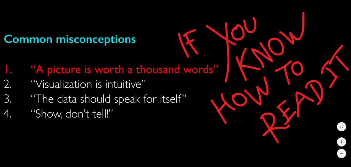
"Contrary to what we commonly hear, there is always an uncertain gap between what we intend to communicate and what our readers end up seeing; bridging that gap should become a priority to any visualization designer."
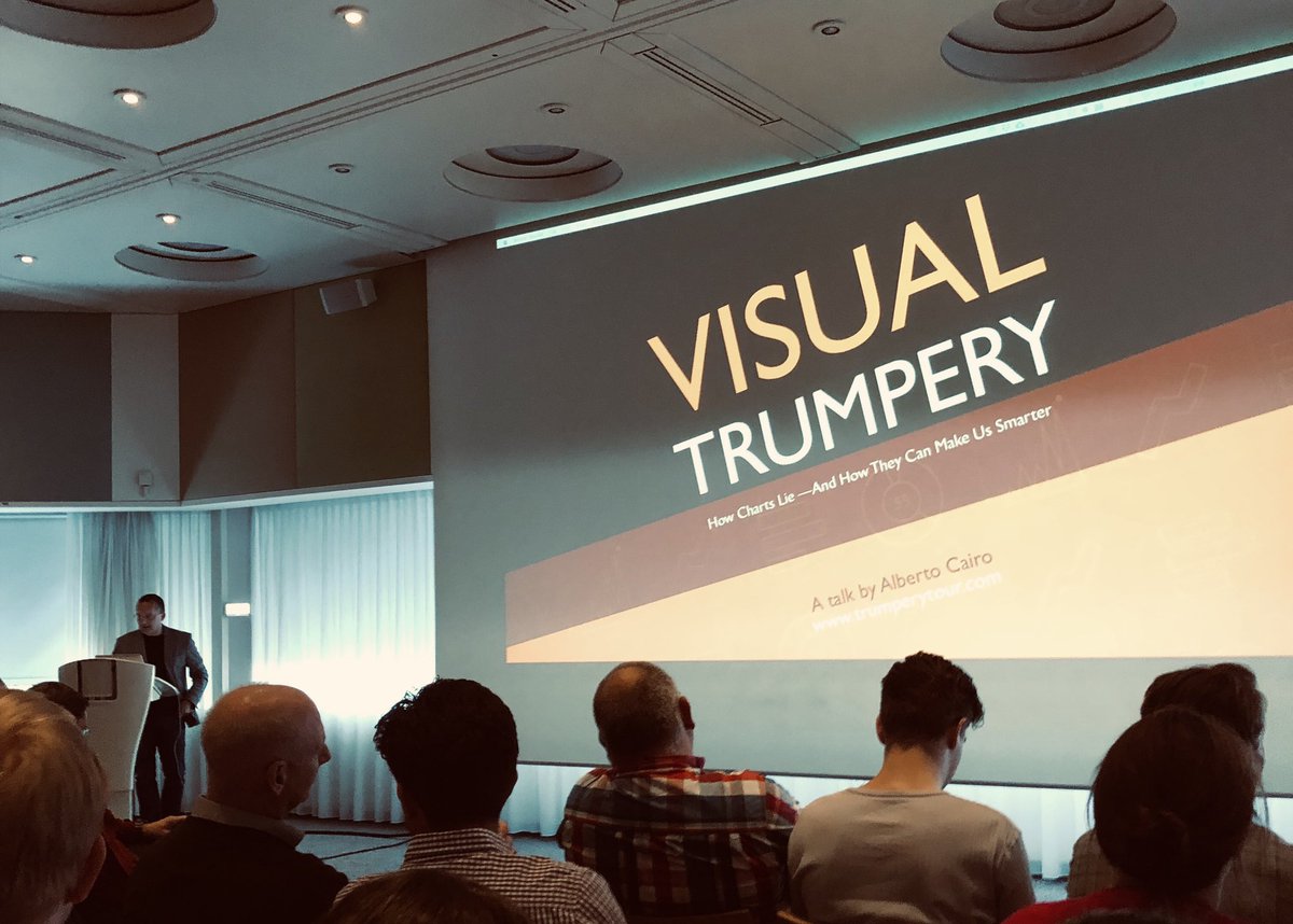
"Visual Trumpery" talk by @AlbertoCairo is inspiring & cautionary at the same time! 😮📊📈 Thank you for sharing your slides Alberto: https://t.co/CCGIfOXerw
I can't wait for Alberto's new book @howchartslie
Thank you @ABNAMRO for making it happen!
#dataviz#data#HowChartsLie
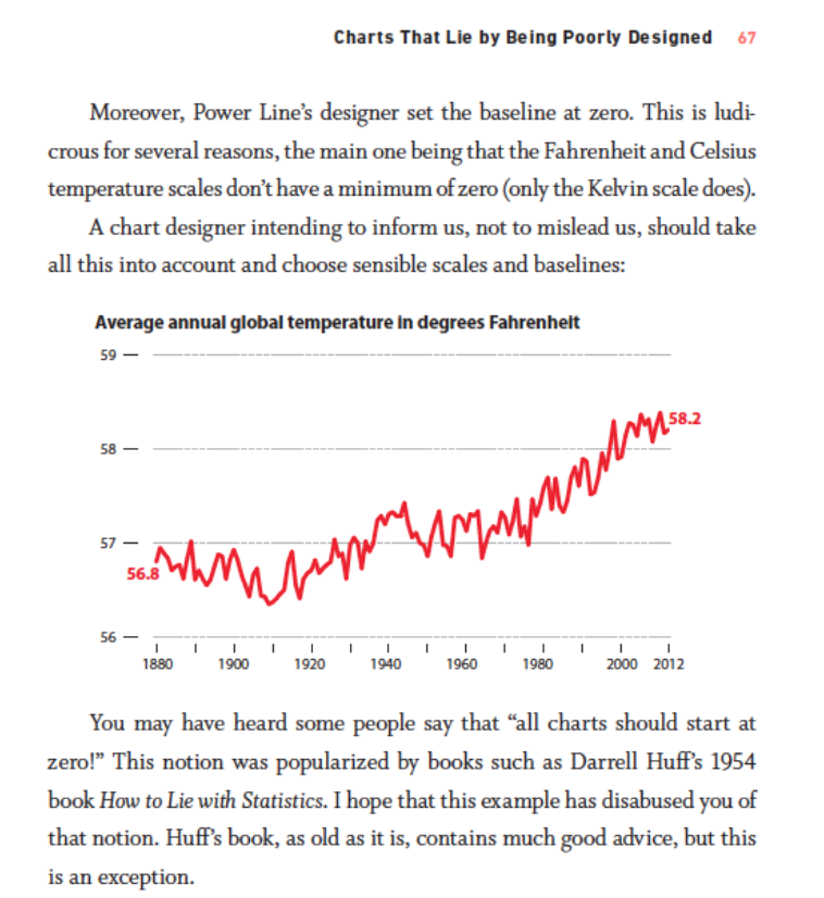
Should all chart baselines start at zero? In a sneak peek of @AlbertoCairo’s upcoming book @howchartslie, he critiques charts that mislead readers by using scales & baselines that aren’t sensible https://t.co/WIskBUAILM
According to responses, this looks like a good case for #HowChartsLie: see the article linked here (I ran it through Google Translate, as it's in Dutch): https://t.co/FIrJjIKm6R … and these other charts https://t.co/5tmnbOPSms … https://t.co/lETmRVIOVY …
@AlbertoCairo Well, the National Hurricane Center predicted it was a tropical storm, but as it turned out, the @howchartslie preview was a Cat5 of knowledge 🤯 🌪📊🌊
Tropical storm @AlbertoCairo made his landing in Amsterdam today. Thanks for an awesome talk!
Really looking forward to reading “How Charts Lie” this October 🙌🏼
Last minute request...can there be an Appendix dedicated solely to #fakenewscharts ? 😂