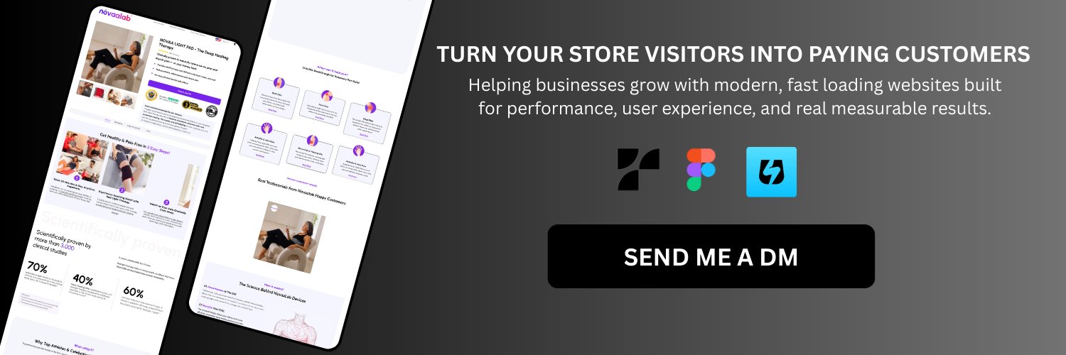
I help ecommerce brands increase sales with high converting Shopify product pages.
Designed in Figma. Built in Replo & Instant.
DM for a free 1-minute page idea
I redesigned this listicle page to solve what kills conversions: weak trust, poor structure, and unclear messaging. Every section guides visitors closer to buying not just browsing. What would you improve first? Drop your thoughts below. Need higher converting pages? DM me.
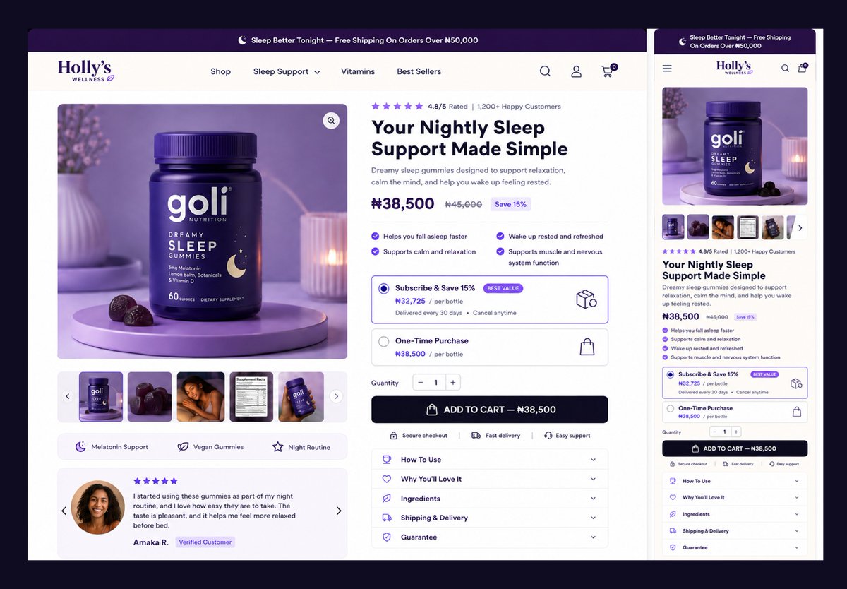
This PDP buy box wasn't redesigned for looks alone. I fixed the buying experience by improving hierarchy, highlighting trust, and making the CTA impossible to miss. I don't just design I solve conversion problems and build pages that sell better. @figma
I didn't just redesign the product page I rebuilt the buying experience. Clear hierarchy, stronger trust signals, better bundle visibility, and a streamlined mobile flow designed to increase conversions and reduce purchase friction.
I didn't just redesign the product page I rebuilt the buying experience. Clear hierarchy, stronger trust signals, better bundle visibility, and a streamlined mobile flow designed to increase conversions and reduce purchase friction.
Designed this listicle hero section to solve a key conversion problem capturing attention, building trust, and guiding visitors toward action. Every element is intentionally crafted to move prospects closer to becoming customers. @figma
A or B?
I'd choose B. It communicates the product better, highlights key benefits, and feels more conversion-focused. But I'd love to hear your thoughts.
Which one would you pick and why? Drop your feedback below.
Designed this landing page using Auto Layout to create a clean, responsive, and conversion focused experience. Every element was carefully structured to improve user flow, strengthen visual hierarchy, and deliver a seamless journey that keeps visitors engaged from start to finish