Day 4/30
Still following Manupaji's advice and building in public.
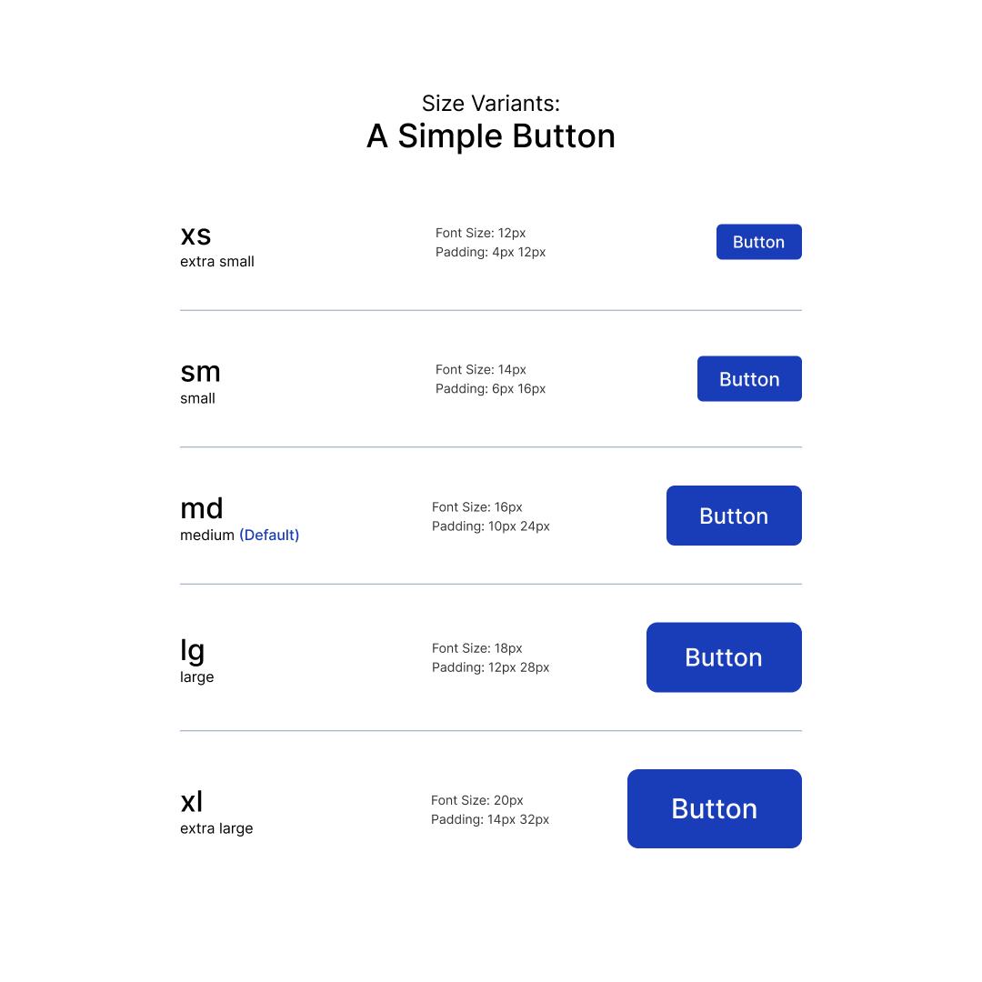
Today's focus was size.
A button isn't just a button. It has to feel right whether it's XS, SM, MD, LG, or XL.
One more piece added to the button system.
Component 4: A Simple Button and Its Sizes
Day 3/30
Following Manupaji's advice and building in public.
Today, the button meets its cousins.
Secondary, tertiary, destructive, links, and icon-only variants.
Turns out there's a whole family tree behind a "simple" button.
Component #3: A Simple Button And Its Cousins
Day 2/30
Still following Manupaji's advice and building in public.
Yesterday: a simple button.
Today: its siblings.
• Leading icon button
• Trailing icon button
Small step, but I'm slowly building toward a complete button system.
Component #2: A Simple Button And Its Siblings
Day 1/30
Hiring isn't hiring me, so I'm listening to Manupaji's advice and building in public.
For the next 30 days, I'm building a UI component library from scratch and sharing everything along the way.
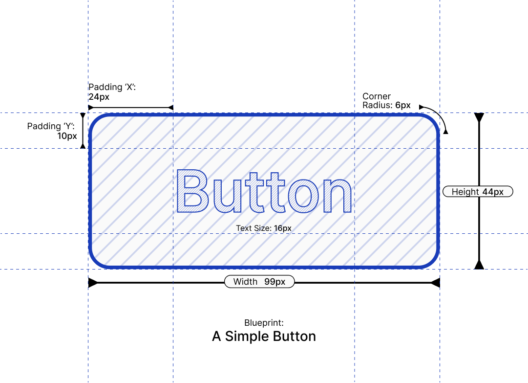
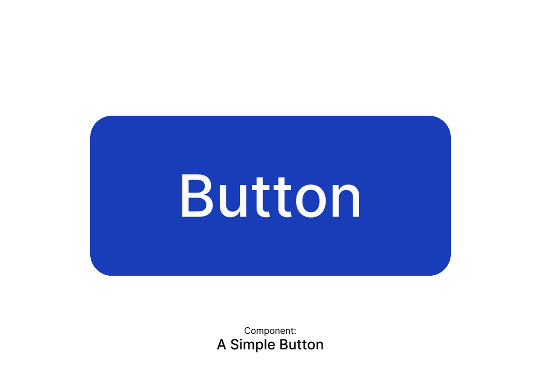
Component #1: A Simple Button.
Let's see where this goes. 👀