Creating #dataviz projects should be effortless! Infogram's #AI tool makes creating data visualizations fast and easy for everyone. Generate charts, craft #infographics, and make your message more impactful - all with the help of AI. ✨ Learn more: https://t.co/3ndnjMd6ri
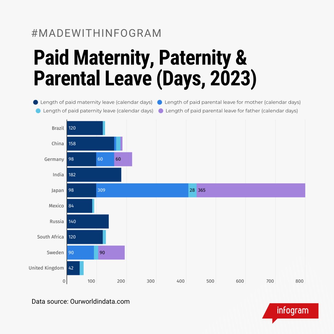
See how paid maternity, paternity, & parental leave compares across countries in 2023. 🌎 This stacked bar chart reveals the number of paid leave days for each.
✨ Explore the data, visualized with Infogram!
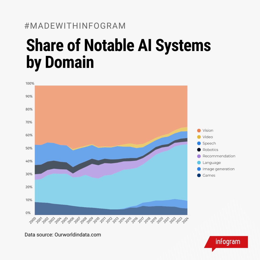
Which domains are leading the way with notable AI systems? 🤔 Explore the trends in this chart!
✨ Start sharing your own AI insights with Infogram today!
#ArtificialIntelligence#AI
Make your line charts stand out with Infogram’s data animations! 🤩
✔️ Capture attention.
✔️ Highlight trends with ease.
✔️ Create engaging, polished visuals.
Transform your storytelling today with Infogram! ✨
#Charts#DataVisualization
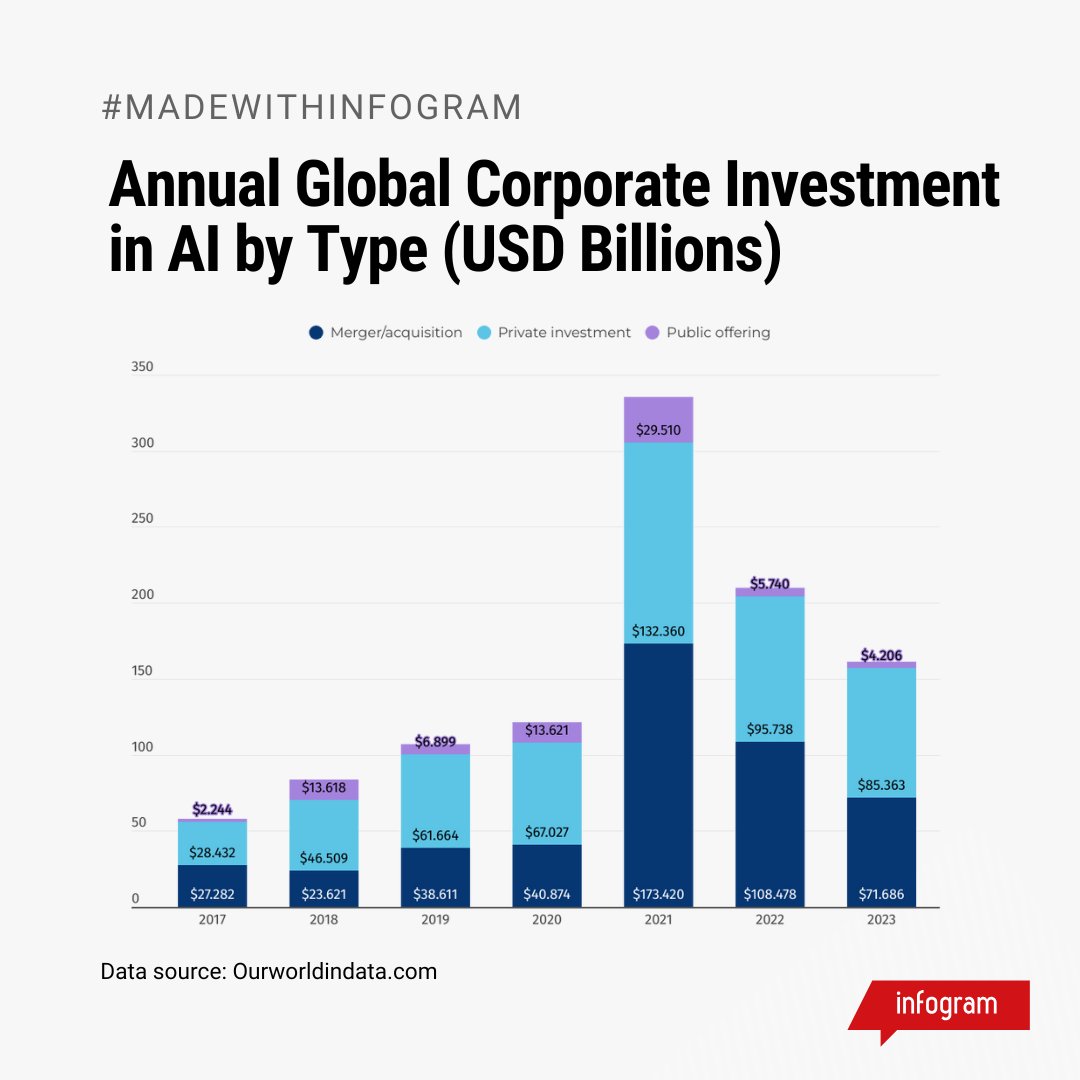
Where is the corporate world investing in AI? 💡
This column chart shows annual global corporate AI investment by type.
✨ Visualize your data with Infogram today!
#ArtificialIntelligence#AIInvestment#AI
Interactive infographics make data engaging, dynamic, and easy to explore—and we've got the guide to help you create one! ✨
Turn your data into an engaging story! 🎯
Read more: https://t.co/IYRxACnvv3
#Infographics
📊 Tracking the number of countries with key economic & social rights for women. See how this line chart visualizes the changes over the years—created with Infogram.
✨ Dive into the data and track progress!
#IWD2025
Make your visuals more inclusive with accessibility patterns! 💡
Infogram’s accessibility patterns let you distinguish data without relying only on color, making your charts more readable and engaging! 🌐
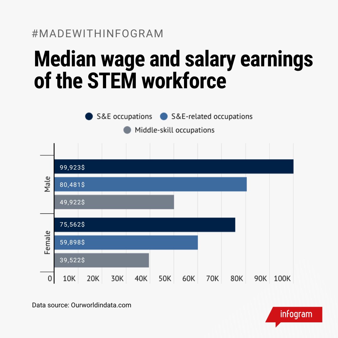
💡 Did you know? Women in STEM (Science, Technology, Engineering, Mathematics) earn less on average than men.
This chart shows the median earnings in STEM fields, highlighting the wage gap. 💡
#STEM#DataVisualization
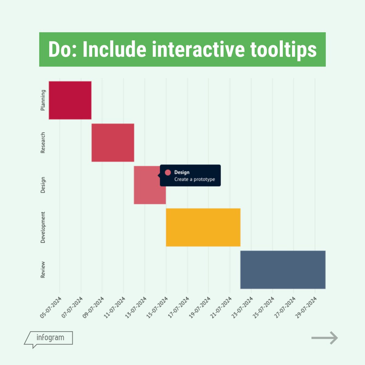
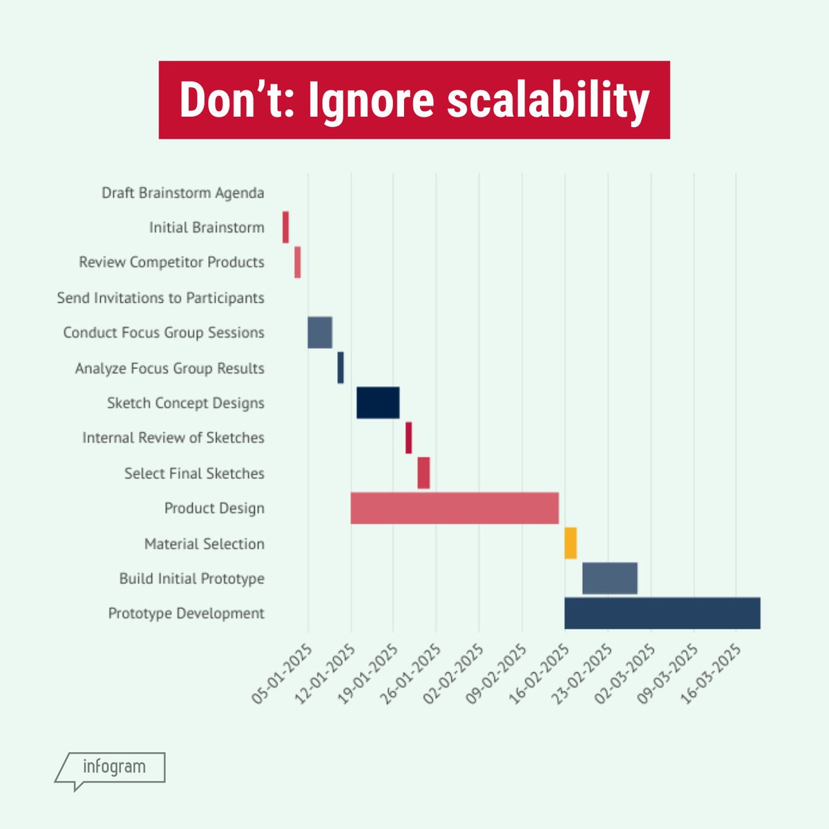
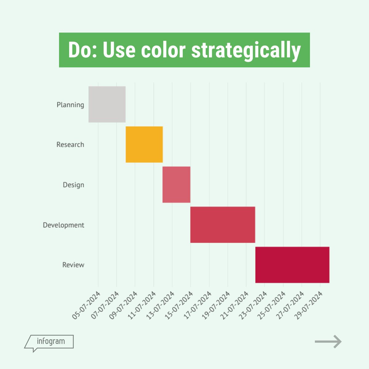
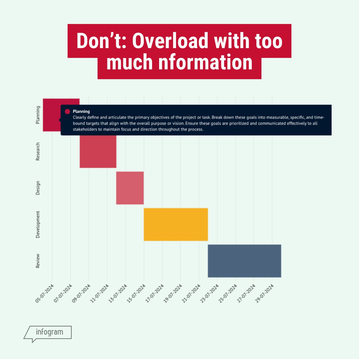
Ready to improve your Gantt charts? Check out our visualized dos and don’ts of gantt charts in the post! 💡
📊 Start visualizing better with Infogram today!
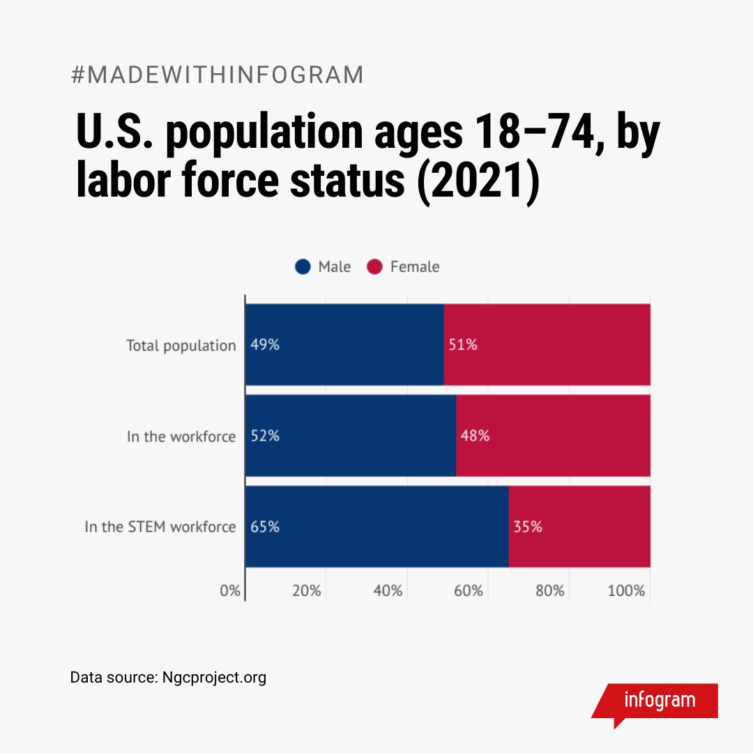
This chart, created with Infogram, highlights the U.S. population (ages 18–74) by labor force status in 2021—shedding light on ongoing gender disparities in STEM (Science, Technology, Engineering, Mathematics) fields.
✨ Want to tell your own stories through data? Try Infogram!
Looking for infographic design ideas? 💡 From timelines to interactive designs, our new blog is packed with inspiration to help your visuals stand out. ⭐
Read it here: https://t.co/LqUSaKGkWH
#InfographicDesign#Infographics#DataVisualization
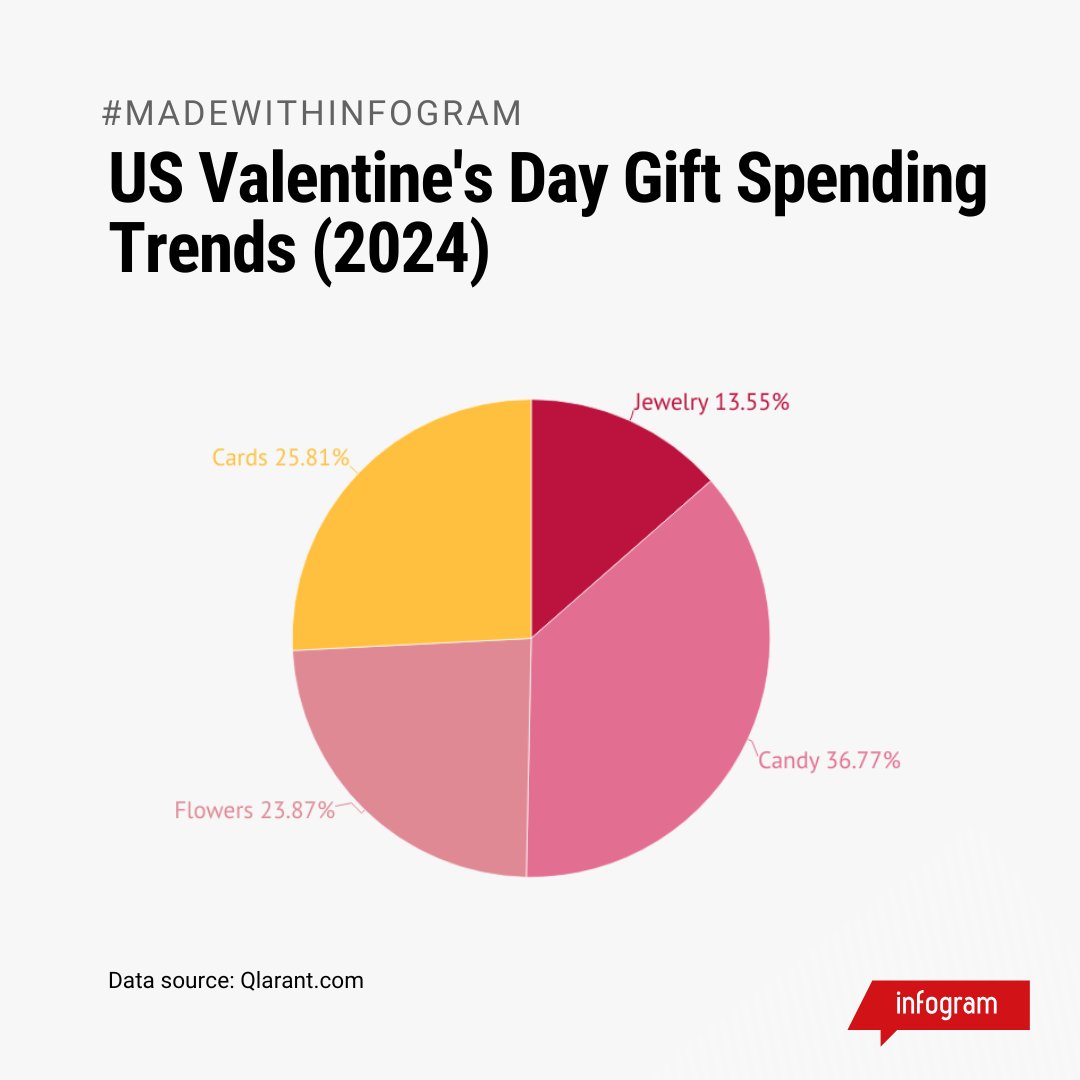
Ever wondered what people spent most on for Valentine’s Day? ❤️ Check out this pie chart to see what gift categories are the most popular! 🍬
#ValentinesDay#GiftTrends#DataVisualization
Today is International Day of Women and Girls in Science! 👩🔬
Our blog explores the importance of women and girls in STEM fields, featuring an eye-opening infographic exploring the gaps.
Read the article: https://t.co/QeqkIkKHVy
#WomenInSTEM#IDWGS2025
💘 Experience gifts are becoming the new Valentine’s Day favorite! Our line chart shows how giving experiences has steadily risen over the years.
✨ Create visuals like this with Infogram!
#ValentinesDay#ValentinesDay2025
🚀 What’s new on Infogram?
✨ Data animations: Add motion to line charts.
🎨 Accessibility patterns: Make visuals inclusive with patterns.
💡 Tooltip customization: Tailor tooltips with light, dark, or transparent modes.
Ready to try? Start creating today!
Need accurate maps for your data? Infogram lets you locate regions, cities, and countries with ease, even when you have a typo. Create stunning, precise maps for any project! 🤩💡
#Interactive#Maps
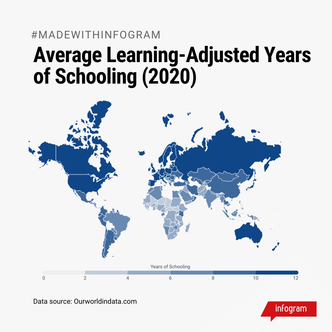
Education is key, but years in school vary globally. See our visualization of Average Learning-Adjusted Years of Schooling (2020) and the disparities that exist. 📚
#InternationalDayOfEducation#DataVisualization
Learn the key tips for visualizing a process—from flowcharts to timelines, we’ve got you covered with design tips to make complex steps clear and engaging. 💡
👉 Read more: https://t.co/nIxP6n3q8P
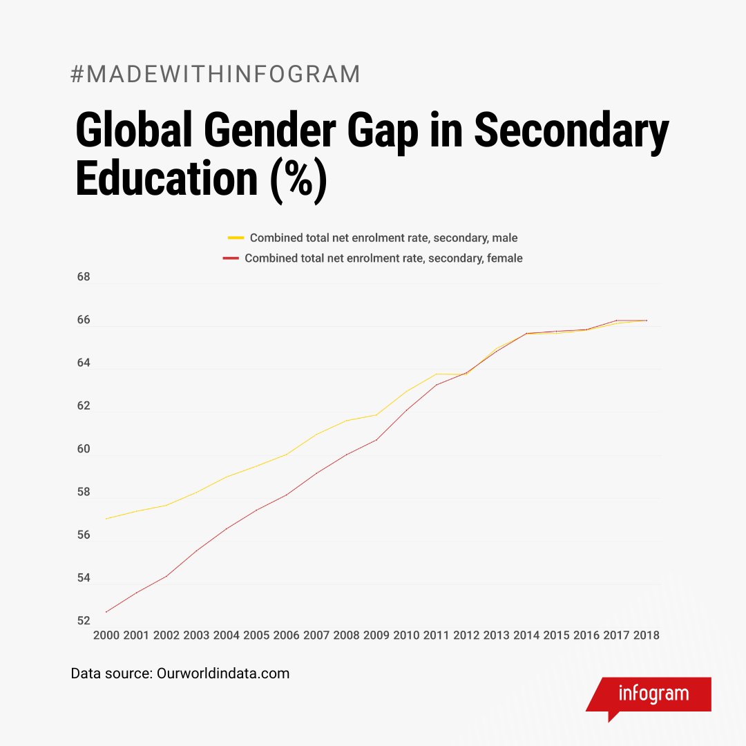
See our visualization of the Global Gender Gap in Secondary Education (%), showing where progress has been made. 📊
Let’s push for equal education opportunities worldwide. Create visuals like this with Infogram! 💡
#DataVisualization#GenderEquality
Learn how to design impactful data visualizations for environmental science. From climate trends to biodiversity maps, see how to turn data into action. 🌍💡
👉 Read here: https://t.co/gQceWmhWGD
#EnvironmentalScience#DataViz#ClimateAction