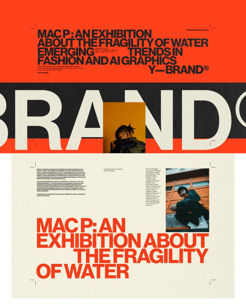
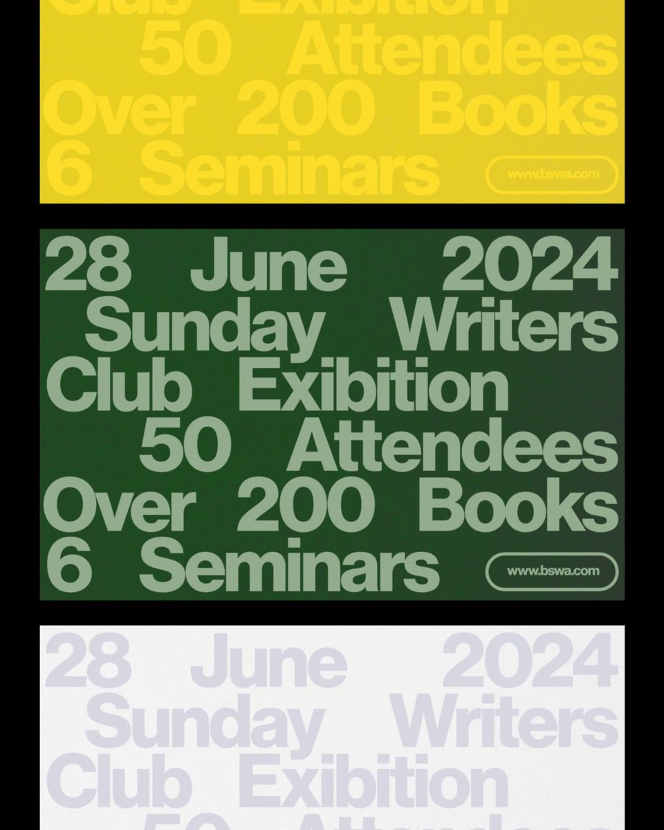
Plug-and-play Motion templates with creative control, music with stems, mockups with smart objects and tidy layers.
Drop in your content, swap and customize in a few clicks.
Visit https://t.co/WT4OR27jLW for more.
TWENTY1 production is a stage production design studio that creates immersive environments through light, form, and motion.
We developed a new visual identity and website that reflects their ambition to raise the standard in their field. The system had to bridge both sides of their work—the digital precision of screens, lights, and technical planning, and the physical craft of sketches, tape, and backstage coordination.
Previously known as 21 Productions, we proposed writing the name as TWENTY1—a compact, distinctive form that feels more ownable and brand-ready. The logotype is set in Aeonik with custom spacing and a refined lining numeral, forming a strong typographic signature.
A high-contrast palette of bold yellow and deep black takes cues from stage markings and gear, while Aeonik’s structure ensures clarity across formats—from browser to backstage.
TWENTY1 production is a stage production design studio that creates immersive environments through light, form, and motion.
We developed a new visual identity and website that reflects their ambition to raise the standard in their field. The system had to bridge both sides of their work—the digital precision of screens, lights, and technical planning, and the physical craft of sketches, tape, and backstage coordination.
Previously known as 21 Productions, we proposed writing the name as TWENTY1—a compact, distinctive form that feels more ownable and brand-ready. The logotype is set in Aeonik with custom spacing and a refined lining numeral, forming a strong typographic signature.
A high-contrast palette of bold yellow and deep black takes cues from stage markings and gear, while Aeonik’s structure ensures clarity across formats—from browser to backstage.
We’ve won Silver at the European Design Awards 2025 — Motion Graphics category!
This recognition means a great deal, especially coming from a jury that reviews and evaluates some of the best work across Europe every year.
Big congratulations to our partners at @hottypeco , and thank you for the ongoing trust and collaboration.
The awarded project is part of an ongoing series we create with Hot Type. Each time they release a new font, we design kinetic videos that push the typeface through a range of styles and motion techniques—both 2D and 3D. The goal is to explore its visual potential and give it a distinctive voice in motion.
Finally, thank you to the @europeandesign jury for recognizing the craft behind the work.
Modul is a self-contained unit with defined boundaries and a clear function. It operates within a larger system, gaining meaning through alignment and relation. Interchangeable, efficient, and precise.
05/25 WIP & Explorations
We’ve been exploring new visual languages and experimenting with motion, sound, and storytelling. This piece isn’t part of a project or client work — just an idea, an exercise, a moment of curiosity. It keeps us sharp, makes us happy, and reminds us why we love what we do.
05/25 WIP & Explorations
We’ve been exploring new visual languages and experimenting with motion, sound, and storytelling. This piece isn’t part of a project or client work — just an idea, an exercise, a moment of curiosity. It keeps us sharp, makes us happy, and reminds us why we love what we do.
Our motion piece for @hottypeco is nominated for the 2025 European Design Awards!
We’re shortlisted in the Motion Graphics category of the ED-Awards, one of Europe’s most respected recognitions in communication design. Since 2007, the awards have been judged by a panel of design journalists and critics from across the continent, offering a unique perspective on creative excellence.
The nominated work is part of our ongoing collaboration with Hot Type. Whenever they release a new typeface, we create a kinetic video that showcases it in action, examining how it behaves in motion across various visual styles and dimensions. From minimal to expressive, 2D to 3D, we explore what the font can do, beyond static specimens.
Thanks to the @europeandesign jury for the recognition. Winners will be announced this Saturday in Ljubljana.
See you there!
05/25 WIP & Exploration
We’ve been exploring new visual languages and experimenting with motion, sound, and storytelling. From early sketches and tests to building systems that move and evolve, this is a glimpse into the process. Some directions lead to finished pieces, while others just open new questions.
Either way, we follow where the work takes us. This is a collection of those in-between moments, works in progress, ideas taking shape, and pieces that may never be finished, but still matter.
A lot has been happening behind the scenes.
We’ve been exploring new visual languages and experimenting with motion, sound, and storytelling. From early sketches and tests to building systems that move and evolve, this is a glimpse into the process. Some directions lead to finished pieces, while others just open new questions.
Either way, we follow where the work takes us. This is a collection of those in-between moments, works in progress, ideas taking shape, and pieces that may never be finished, but still matter.
Words with weight.
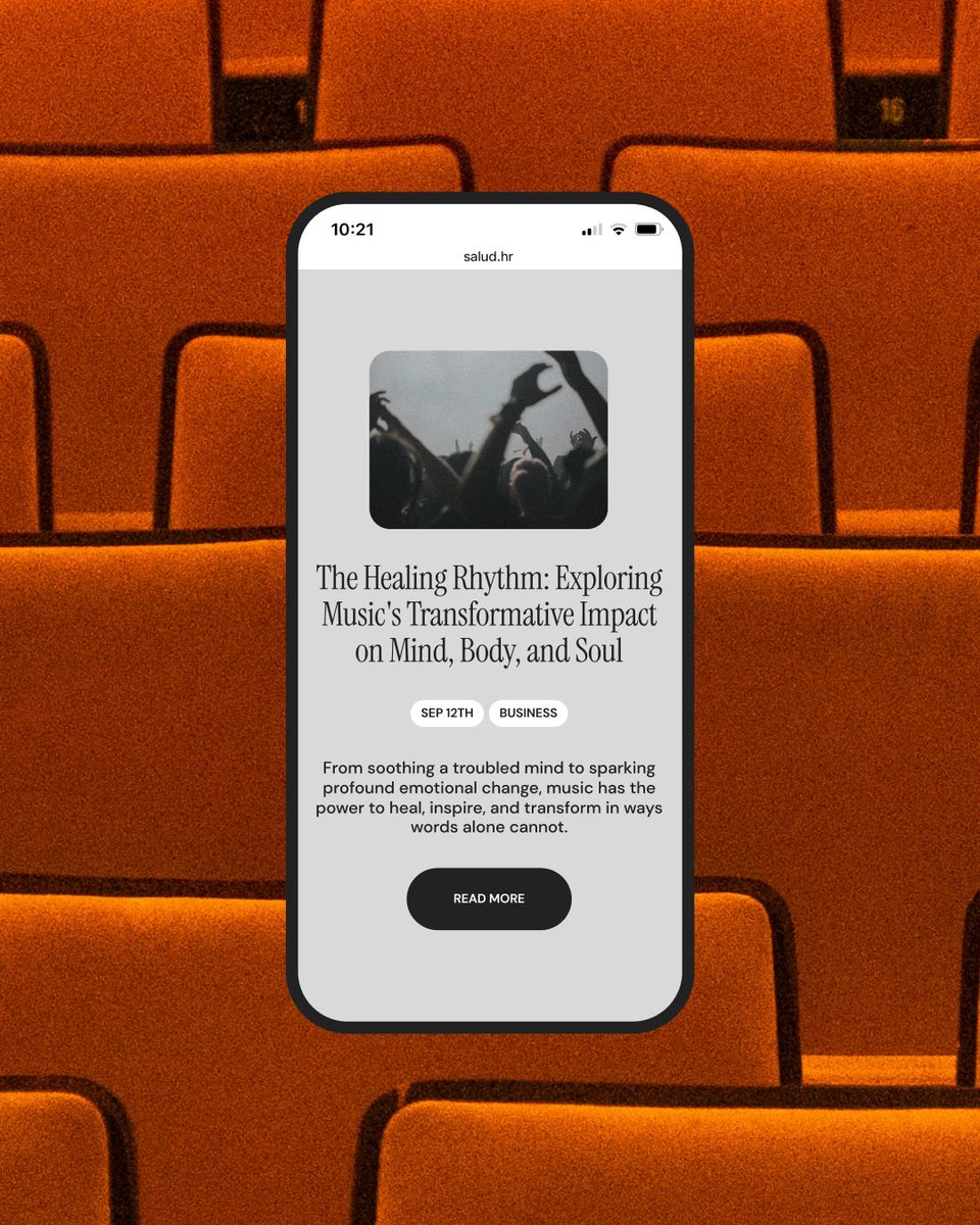
Salud is a digital magazine for modern reflection, a place where stories unfold slowly and with intention. Inspired by the tactile world of printed newspapers, we designed a visual identity & website that translates analog warmth into a contemporary web experience.
The UI bridges analog motifs and digital function. Structured around a familiar 12-column grid, the layout bends just enough to breathe. Oversized components, rounded corners and spacious breaks create a rhythm that feels curated, not coded.
The goal was not to replicate the past, but to borrow its texture: off-whites instead of whites, washed-out blacks instead of true black, and a rich typographic system that makes reading feel like a ritual. It’s a space that breathes, invites, and never rushes. A digital publication that feels human.
We designed a series of posters as part of the promotional work for Exat, exploring the typeface through bold compositions, expressive typography, and mid-century inspired structure.
The project was created to support the launch of Exat, a typeface by @hottypeco, inspired by the legacy of EXAT 51 and the New Tendencies movement.
Alongside the posters, we developed motion pieces, layouts, and a dedicated microsite to present the typeface in various contexts, from expressive to functional.
Circles, grids, repetition—more than just shapes, these were the foundation of a movement. For the pioneers of EXAT 51 and New Tendencies, geometry wasn’t just a visual tool. It was a system, a rhythm, a way of shaping ideas.
That thinking shaped our approach to promoting Exat, a typeface by Hot Type. More than just showcasing letterforms, we pushed the type beyond the static page, testing how it moves, reacts, and adapts across motion, print, and digital applications.
Mid-century design has always suggested movement. Even in its most structured forms, there’s a rhythm, a flow, an energy. We used today’s tools to bring that to life, setting Exat in motion through kinetic typography and bold compositions.
Forma. Oblik.
These words mean “form” and “shape,” fundamental concepts in modernist design. For the Croatian pioneers of EXAT 51 and the New Tendencies movement, they were the foundation of a new way of thinking where function and aesthetics worked as one.
Exat, a typeface by @hottypeco , carries this legacy forward. Inspired by the bold geometry and structured clarity of mid-century modernism. Our task was to bring it to life beyond the static page, exploring its full potential through motion, print, and digital applications.
Modernist design has always suggested movement. Even in stillness, compositions create rhythm, direction, and energy. Using today’s tools, kinetic typography, and motion graphics, we tested Exat’s adaptability, pushing its design across mediums while staying true to its roots.
The art direction reflects the same structured yet expressive spirit that shaped EXAT 51 and New Tendencies. Their vision was about breaking conventions and redefining the future of visual culture. This project was more than just a type specimen. It was a way to continue that dialogue and keep radical ideas in motion.
Exat, designed by @hottypeco , is more than just a typeface. It carries the spirit of EXAT 51, a pioneering movement that redefined modernist design and challenged artistic conventions.
Our task was to bring it to life through motion, print, and digital applications, showcasing its full potential and versatility.
Modernist design has always suggested movement through rhythm, direction, geometry, and visual tension. With today’s tools, we had the opportunity to bring that movement to life.
Using kinetic typography, motion graphics, and bold visual compositions, we stretched Exat across different mediums, testing its adaptability and seeing how far it could go while staying true to its modernist roots.
The art direction was deeply inspired by the mid-century aesthetic that shaped EXAT 51 and New Tendencies, balancing precision with expression and function with beauty.
This was more than just presenting a typeface. It was about continuing a dialogue and keeping radical ideas alive. Exat is a nod to the past and a bridge to the future.
Our latest web design for Arch, an influencer agency.
The design is centered around a bento-box-inspired grid, giving each project, campaign, and agency detail its own space while keeping the experience clear and dynamic.
This modular structure reflects Arch’s ability to create custom solutions for clients while maintaining a strong, cohesive identity. It introduces a sense of order without rigidity, allowing the site to feel adaptable yet structured.
At the same time, the visual style—bold typography, dynamic layouts, and refined motion—establishes a brand presence that feels young, modern, and agile, deeply connected to the fast-paced world of influencers and digital media.
#branding #design #web #webdesign #motion #motiongraphics
Studio hours. Week 8/53
Studio hours. From concept to creation, frame by frame.
This week, we’ve been deep in design, motion graphics, sound design, and 3D modeling.
What a beautiful life.
Hot WIP is a curated selection of work-in-progress fonts from our friends @hottypeco. We put them in motion 🖤
Remoker font channels the rugged beauty of nautical design, drawing inspiration from the bold, geometric forms seen in maritime signage, cargo labels, and passenger transport. Its raw yet structured aesthetic captures the essence of movement and exploration.
Stencil letters happen to be a common sight on maritime vessels, and this rings particularly true in regards to “Jadrolinija”, our home country’s most famous seafaring liner. Inspired by the intricate wayfinding and warning signs painted on surfaces in and on their ships—often done off the top of one’s head, without any predefined matrix.
The amalgamation of its almost raw, geometric shapes forms an unmistakable aesthetic specific to cargo and passenger transport. Still, the typeface works just as well in a broad spectrum of environments that call for an industrial look and feel.
Hope you like them.
#kinetictypography #artdirection #branding #motion #typography #motiondesign #graphicdesign #studiosize