@Younez_EW Younez, are you tracking a running triangle or running flat off the Jan 2025 high?
3 waves off the ath may be complete for triangle, or 3 of 3 complete now in a 5 wave of c for the flat.
Thoughts?
I wanted to give everyone something meaningful, a gift…
This comes from Global Macro Investor (GMI) and a deep, long-running body of research developed by @RaoulGMI and myself.
Many of you already know The Everything Code, which is our framework for understanding the macro landscape and why major central banks are debasing their currencies to manage aging demographics and overwhelming debt loads.
I call this a gift because these four charts, while only scratching the surface of The Everything Code, give you the big-picture context you actually need in moments like this.
They stop you from getting lost in every Bitcoin pullback and explain why Raoul and I never panic, even when, to borrow one of his expressions, everyone’s acting like monkeys throwing poo at each other.
Once you understand The Everything Code, you stop trading short-term noise and expand your time horizon. You cannot unsee it.
The starting point is what we call The Magic Formula:
GDP growth = population growth + productivity growth + debt growth.
Population growth and productivity growth have been falling for decades. Debt growth is the only thing filling the gap.
The private sector has been deleveraging since 2008, mainly households, but debt levels are still around 120% of GDP. The public sector sits at roughly the same level.
Here’s the problem…
If the government is running debt at 100% of GDP and the private sector is sitting on another 100%, and for simple math we call rates 2% even though they are really closer to 4%, then the entire 2% trend growth of the economy is being consumed by servicing private-sector debts. That is a completely unproductive use of GDP. And then there’s the issue of public-sector debts. There’s just not enough organic growth to service the existing debt load.
To understand why this dynamic persists, you need demographics.
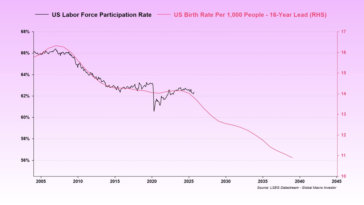
Birth rates peaked in the late 1950s and have been declining ever since. This shows up about sixteen years later in the labor force participation rate as each generation enters the workforce (chart 1).
That means the labor force participation rate is not going to rise any time soon. It is set to keep drifting lower. This is a structural problem.
Aging populations, falling birth rates, and rapidly expanding automation make the backdrop even more deflationary. AI and robotics are replacing humans at scale, and we are only at the beginning. This reinforces the need for ongoing stimulus to keep the system functioning.
With weak population growth and sluggish productivity, the only way to keep GDP expanding is through debt.
Now here’s where it gets interesting…
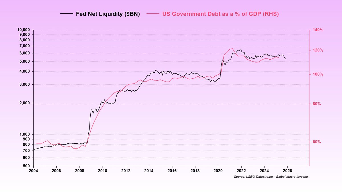
Government debt growth is completely offsetting the demographic decline and policymakers know exactly what they are doing (chart 2).
And what happens next?
All debt growth in excess of GDP gets monetized (chart 3).
Basically, since 2008, magic money has effectively been paying the interest. Governments issue new debt to cover old interest, and once rates fall enough, central banks absorb it onto their balance sheets.
So to wrap this up, demographics drive the decline in the labor force. Governments offset that decline with more debt. That debt eventually gets monetized through quantitative easing (QE) style operations, not always directly by the Fed, but through the coordinated ecosystem of the Fed, the Treasury, and the banking system. And the bottom line is that there’s still a massive wall of interest that needs to be monetized, far more than GDP can ever cover. Liquidity is literally the only game in town.
And what thrives in a world of perpetual debasement? Bitcoin (chart 4).
I know this correction has been painful, but it’s all part of the journey. These periods feel brutal in the moment, then they fade and the trend resumes. This too shall pass…
To quote Walter White from Breaking Bad, later echoed by @LynAldenContact, nothing stops this train.
MOAR COWBELL (liquidity) = number go up over time. Zoom out and be more bullish…
Steps to enter:
1. Join the waitlist below https://t.co/Q2Z4SGSYfp
2. Drop the email confirmation of your waitlist entry
3. Like and retweet the main post above
Start here! 👇
@harmonictrader Scott, is there a bearish shark emerging on BTC since 6th Oct?
Fake out the lows, defy all the bearish continuation traders, gain bullish sentiment, take the highs, lower.
Makes sense, this whole cycle has been fuckery.
@punk6529 Level me;
I own a property in the city, I own land in the country. I live in a small trailer (3 years) as I try to build a home (planning and building myself) with no prior experience.
I work 50 hours a week.
I have 5 fig savings in crypto.
I have debt.
Either way it looks like SUI/BTC is going higher, and these moves line up with the idea that SUI's REAL trend beginning was Aug '24, and will continue through to Q1 '26.