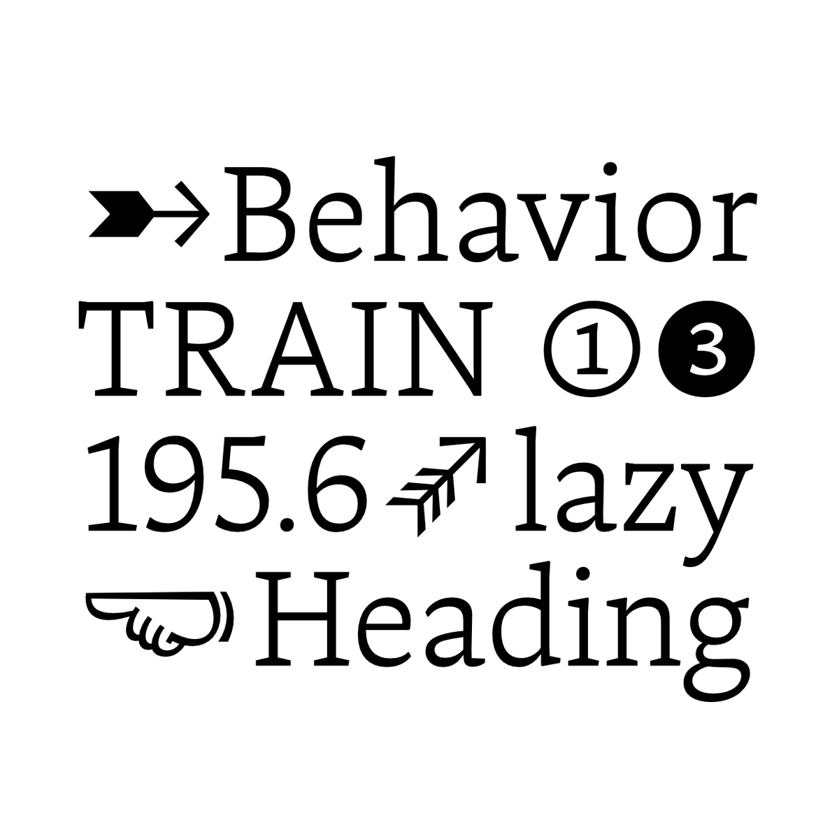
It took a bit longer, but Capito v0.4 is finally out. Besides smaller and bigger tweaks, the new version adds 185 characters, including lots of numerals, arrows and symbols. The price has gone up slightly, but it’s still a steal.
https://t.co/8Y64z3neoh
It took a bit longer, but Capito v0.4 is finally out. Besides smaller and bigger tweaks, the new version adds 185 characters, including lots of numerals, arrows and symbols. The price has gone up slightly, but it’s still a steal.
https://t.co/8Y64z3neoh
Nice’s optical sizes allow a high degree of application-specific optimizations. As the name suggests, Nice Poster works best in very large applications (>48pt) but some may want to use it below that and guess what, why not? ❡ #NiceTypeface
I am pleased to introduce my new typeface NICE! 56 styles, 4 optical sizes, variable fonts. Exclusively available from my friends over at @fontwerk.
→ https://t.co/gPOQIJjgae
Capito by @janfromm is comfortable on the pages of books and magazines, and can be used for any project where a charismatic seriousness is wanted. v0.3 is available now. https://t.co/Xbqhf2PoXY
Some good news for once: Capito version 0.3 is out and provides the long awaited Italics! The family has now grown to 12 styles. Try it, buy it → https://t.co/8Y64z3neoh
NEW VERSION: Capito 0.2 comes with a big bunch of new glyphs and features!
✓ New weight: Light
✓ 5 new figure sets
✓ Broad language support
✓ WEBFONTS!
✓ Trial fonts (If you’re still not convinced)
Get the whole family at https://t.co/8Y64z3neoh
In case you missed it: My new typeface Capito is available at @futurefonts. Buy an affordable license now, and get all future upgrades for free!
https://t.co/8Y64z3neoh
#Gewinnspiel Vom @VerlagHSchmidt haben wir zwei Exemplare des neuen Buches »Making Fonts« von Chris Campe und @LiebeFonts erhalten. [Weiter im Text geht es im Screenshot.] ⓝ


![typefacts's tweet photo. #Gewinnspiel Vom @VerlagHSchmidt haben wir zwei Exemplare des neuen Buches »Making Fonts« von Chris Campe und @LiebeFonts erhalten. [Weiter im Text geht es im Screenshot.] ⓝ https://t.co/UT1SCsoAw4](https://pbs.twimg.com/media/D4vyG-BWkAAfrZO.jpg)


![typefacts's tweet photo. #Gewinnspiel Vom @VerlagHSchmidt haben wir zwei Exemplare des neuen Buches »Making Fonts« von Chris Campe und @LiebeFonts erhalten. [Weiter im Text geht es im Screenshot.] ⓝ https://t.co/UT1SCsoAw4](https://pbs.twimg.com/media/D4vyHAkWsAARxwl.jpg)


