Built an animated Liquid Metal border component library with built-in reflections on neighboring components, multiple styles and color modes, dark & light mode
https://t.co/fxDfTP7Gkl
npm install metal-fx
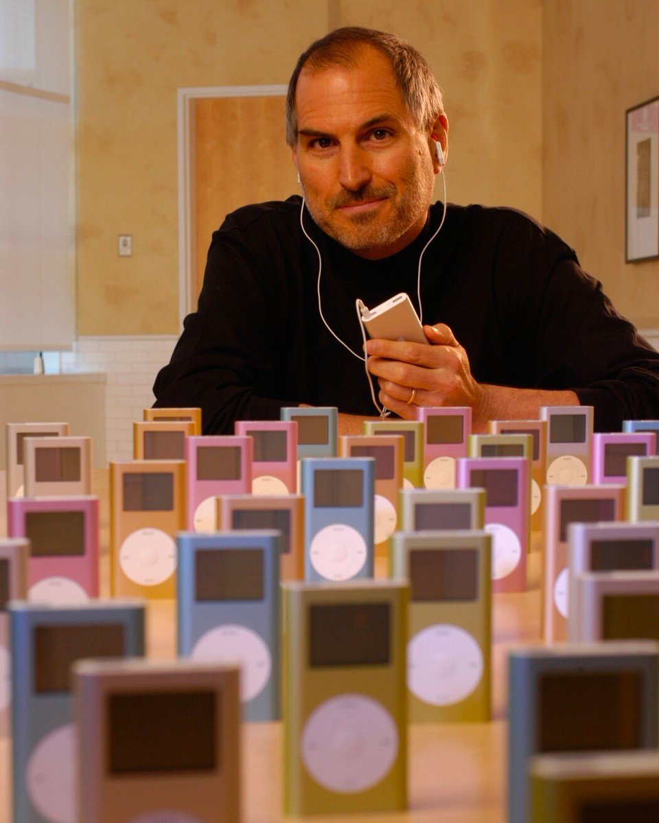
The original iPod launched at $399, worked only with Macs, and got savaged by critics.
"Way overpriced." "Too limited." One famous headline called it the "Wheel of Fortune"... And not as a compliment.
Tony Fadell shipped it anyway.
Then he shipped 17 more versions.
Windows compatibility. The Mini. The Nano. The price cuts.
Each one closing the gap between what they'd announced and what they'd actually imagined.
By the time the iPod peaked, it had sold 400 million units and quietly become the foundation for the iPhone.
Most people remember the iPod as a huge win for Apple but in reality the first version was expensive, Mac-only, and widely mocked.
The product that changed music forever needed several generations to become itself.
That's the thing nobody tells you about great products.
"The launch isn't the achievement. The launch is the permission to keep going."
My dear front-end developers (and anyone who’s interested in the future of interfaces):
I have crawled through depths of hell to bring you, for the foreseeable years, one of the more important foundational pieces of UI engineering (if not in implementation then certainly at least in concept):
Fast, accurate and comprehensive userland text measurement algorithm in pure TypeScript, usable for laying out entire web pages without CSS, bypassing DOM measurements and reflow
I’m looking through my Macintosh user guide (the booklet that accompanied my 1984 Macintosh) for the first time in a while, and I’m a little obsessed with this graphic explaining scrolling.
every designer and product leader needs to watch Shopify's CDO explain why craft is the only moat left
when anyone can vibe code software in a weekend, the only thing separating premium products from throwaway tools is the experience
My notes + video here:
A study of over 7,000 objects in the UK’s Science Museum found that the colors of consumer goods have been steadily neutralized since 1800.
We now inhabit a world that is flatter, duller, drained of color and vibrancy.
a startup that knows how to storytell today can beat one 10x its size.
because AI is killing the product gap in software. everyone has the same models, the same features, the same playbooks.
the only thing left is the story. and the story is the product, because in feeds, people don’t experience the product, they experience the narrative around it.
the story is the product, the distribution, the moat.
it decides whether your launch feels like someone should invest their time/money… or just keep scrolling.
This is bonkers.
Iphone screen now vs the OG.
I could fit ONE icon from the modern screen to the old.
Flat design was a necessity, because we were designing for the size of a business card.
We are going to make beautiful rich icons because we were suppressed for YEARS.
To achieve intentional blocks of color, "A Walk in the Park" uses a very low-res noise texture. It's cropped, stretched, and mirrored, and each stroke's color is based on the block it originates from. Some are simple, some more chaotic ...
A new @salesforce login experience is here. 🙌
Now, you can use your email address to log in, see all your accounts, or reset your password. If you have accounts in different Salesforce organizations, you can find your org using the org ID.
🎯 Select the "Log In with Email" button to get started: https://t.co/uBRLDpV4ph