Two updates to Markdown Review, both about reviewing the document rather than the raw file.
First: tables. When a row changes, the rendered table now marks the exact words that changed inside each cell, not just the row. A bumped limit or a renamed plan stands out on its own.
Second: Viewed marks now stay with the PR for much longer. Tick off sections, close the tab, come back whenever the PR is up for another look, and the checklist is where you left it.
Two small updates to Markdown Review, both about picking a review up where you left it.
First, on the phone: a button in the corner jumps to the next section you haven't reviewed yet. No scrolling past what you already ticked off. When nothing is left, it turns into a check.
Second: the version picker now shows when each push happened, not just the sha. Agent PRs get pushed ten or twenty times, and "the version from yesterday" is how you actually remember one. Each row shows the version, date and time, sha, and the commit subject.
A couple of small updates to Markdown Review, both about reviewing the document rather than the raw file.
First: code blocks now show a diff too. Added and removed lines are marked inside the rendered document, so you don't need the raw view to see what changed in a snippet.
Second: links inside the document now behave like they do on GitHub. Click an entry in a README's own table of contents and the review jumps to that section, expanding it if it was collapsed. Handy on long docs that ship their own outline.
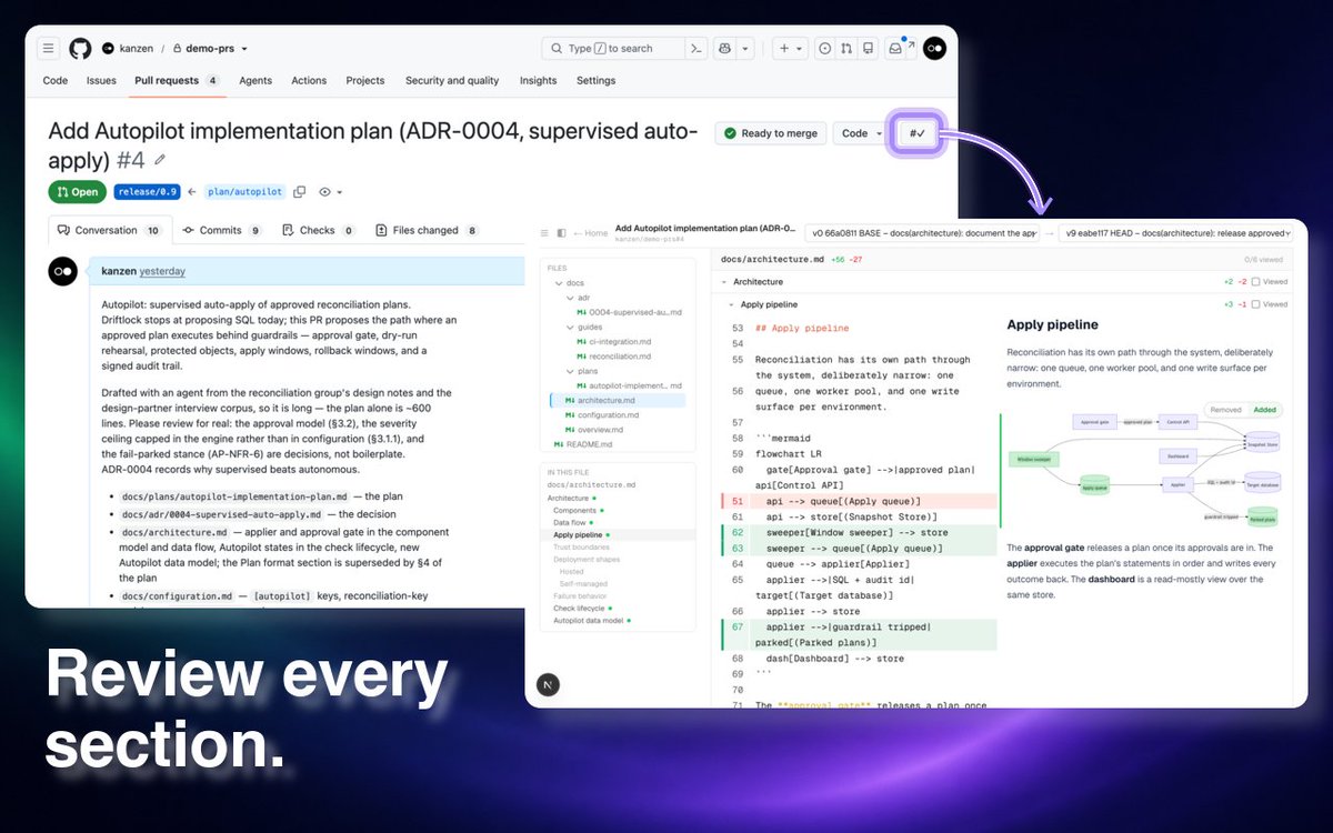
Open a Markdown PR for focused review with one click.
Markdown Review for GitHub adds #✓ buttons to pull requests and Markdown files on GitHub. Click one to open the same PR directly in Markdown Review.
Add it to Chrome: https://t.co/OAGkf4Sqj4
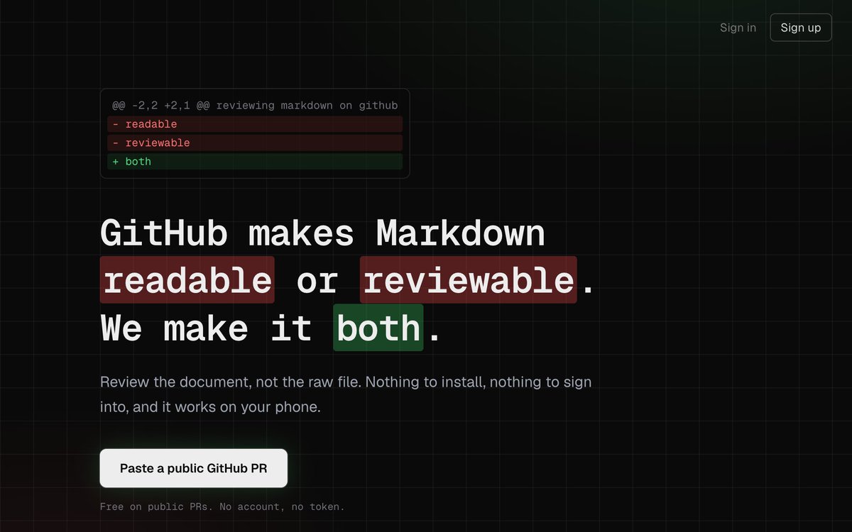
Say hello to our new landing page!
Same Markdown Review: source and rendered side by side, review section by section, pick up where you left off. Just easier to see what it does before your first PR.
Try it on your next Markdown PR.
https://t.co/jXS3h2u6iw
A round of bug squashing on Markdown Review.
Mark a tall section viewed and the next change lands at the top, not mid-screen. Reopening a PR is faster: cached reads, not a full refetch. Sign in works again on the review page.
Try it on your next PR: https://t.co/nzf0dvRgsH
Mobile got some attention too. On a phone the layout collapses to one column, with the file tree, the section outline, and the rendered/diff switch each a tap away. Same change markers and inline comments as on desktop.
A batch of Markdown Review updates just shipped, aimed at one thing: reviewing large Markdown PRs without losing your place.
Diagram diffs, per-row table diffs, word-level highlights, pinned section paths, review progress that survives commit switching, mobile.
What's new 🧵
Viewed marks now survive switching commit ranges.
Mark a section as Viewed and it collapses out of your way; switch base or head and the marks hold, because they track the content, not the commit. A 75-section plan becomes a checklist.