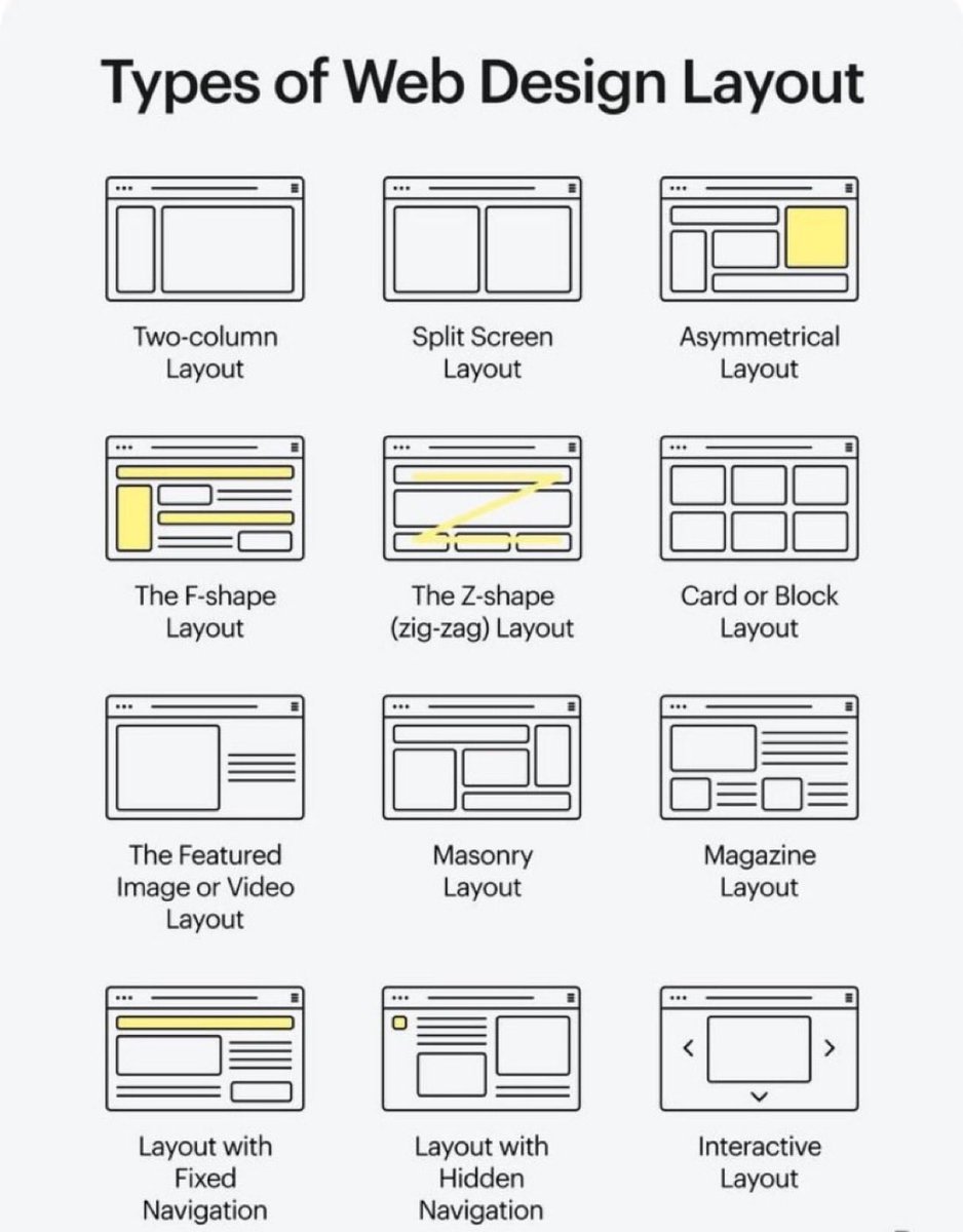
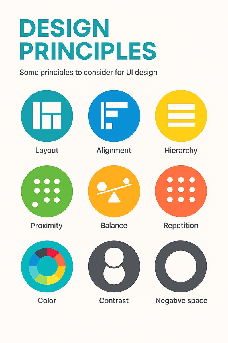
9 timeless design principles every UI designer should know 🙌
Overview:
1. LAYOUT
Layout is the arrangement of visual elements in a design to create balance, clarity, and visual appeal.
2. ALIGNMENT
Aligning elements in a design along a common axis to create order and visual consistency.
3. HIERARCHY
Organizing elements to establish a clear order of importance, guiding the viewer's attention.
4. PROXIMITY
Placing related elements close together to indicate their connection or importance.
5. BALANCE
Weighting or arranging the elements within the image to create visual, even distribution of shape and space.
6. REPETITION
Consistently using the same design elements (e.g., fonts, colors, shapes) to create unity and reinforce visual identity.
7. COLOUR
Utilising colours intentionally to convey mood, meaning, and visual impact in a design.
8. CONTRAST
Contrast can highlight differences or add a focal point by using opposing colour, shade or textures.
9. NEGATIVE SPACE
Also known as white space, it's the empty or unmarked area around or between design elements, used to enhance readability and create visual balance.
Original cheatsheet by Jaxon White
#UX #UI #UIDesign #UXDesign
Excellent Design Inspiration to boost your next mobile design project 🙌
Save to Bookmarks 🔖
60fps is a curated collection of UI/UX animation and interaction design details from the world’s best iOS, android and web apps
Check out the site: https://t.co/ko9fXBn09c 🙌
#UX#UI #UXDesign #UIDesign #ProductDesign #Animation
15 Principles of Good Design to Boost Your Next Design Project 🙌
Great design isn’t just beautiful, it’s usable, accessible, and intentional.
These 15 principles help guide meaningful UX 👇
1. Discoverability
Users should easily find what actions are possible and where to begin.
2. Feedback
Every action should have a clear, timely response to show it’s working.
3. Constraints
Limit choices to prevent errors and guide users toward the correct path.
4. Mapping
Controls should match users’ mental models (e.g., up means increase).
5. Consistency
Keep patterns, terms, and visuals uniform across your product.
6. Affordances
Design elements should suggest how they’re meant to be used (e.g., buttons look clickable).
7. Structure
Group related content and actions logically to reduce cognitive load.
8. Simplicity
Remove unnecessary elements—clarity beats clutter every time.
9. Tolerance
Design should forgive errors—make undo easy and prevent destructive mistakes.
10. Equity
Ensure your design works for users of all abilities and backgrounds.
11. Flexibility
Support different user needs and preferences without forcing one path.
12. Perceptibility
Make important information visible and legible to all users.
13. Ease
Reduce friction—fewer steps, simpler wording, smarter defaults.
14. Comfort
Design for emotional and physical ease—no stress, no strain.
15. Documentation
When needed, provide clear guidance to help users succeed.
Design with these in mind and you’ll build experiences people actually want to use 🙌
#UX #UIDesign #DesignPrinciples #ProductDesign #Startup #Business
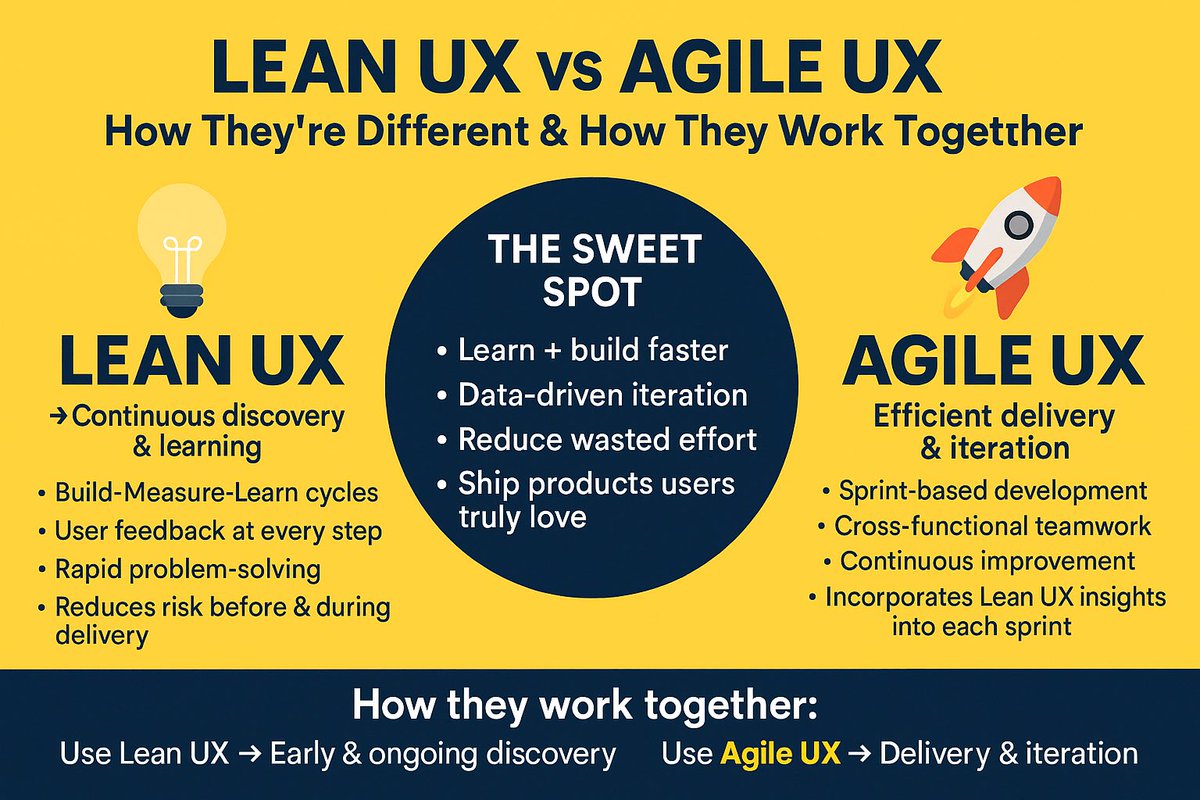
Lean UX vs Agile UX — How They’re Different & How They Work Together 🙌
FREE cheatsheet attached 🔖
💡 Lean UX → Continuous discovery & learning
•Build-Measure-Learn cycles
•User feedback at every step
•Rapid problem-solving
•Reduces risk before & during delivery
🚀 Agile UX → Efficient delivery & iteration
•Sprint-based development
•Cross-functional teamwork
•Continuous improvement
•Incorporates Lean UX insights into each sprint
✨ The Sweet Spot:
•Learn + build faster
•Data-driven iteration
•Reduce wasted effort
•Ship products users truly love
How they work together:
•Use Lean UX to validate ideas early and continuously throughout the Agile process.
•Use Agile UX to deliver those validated ideas in quick, incremental releases.
#UX #LeanUX #AgileUX #UserExperience #ProductDesign
🚀 Want to improve your UX and boost conversions?
Check out The Ultimate Guide to User Testing — packed with tips, tools, and real-world advice to help you test your next design project.
👉 https://t.co/5KGnpAFjsn
By @keepitusable#UX#UserTesting#Usability
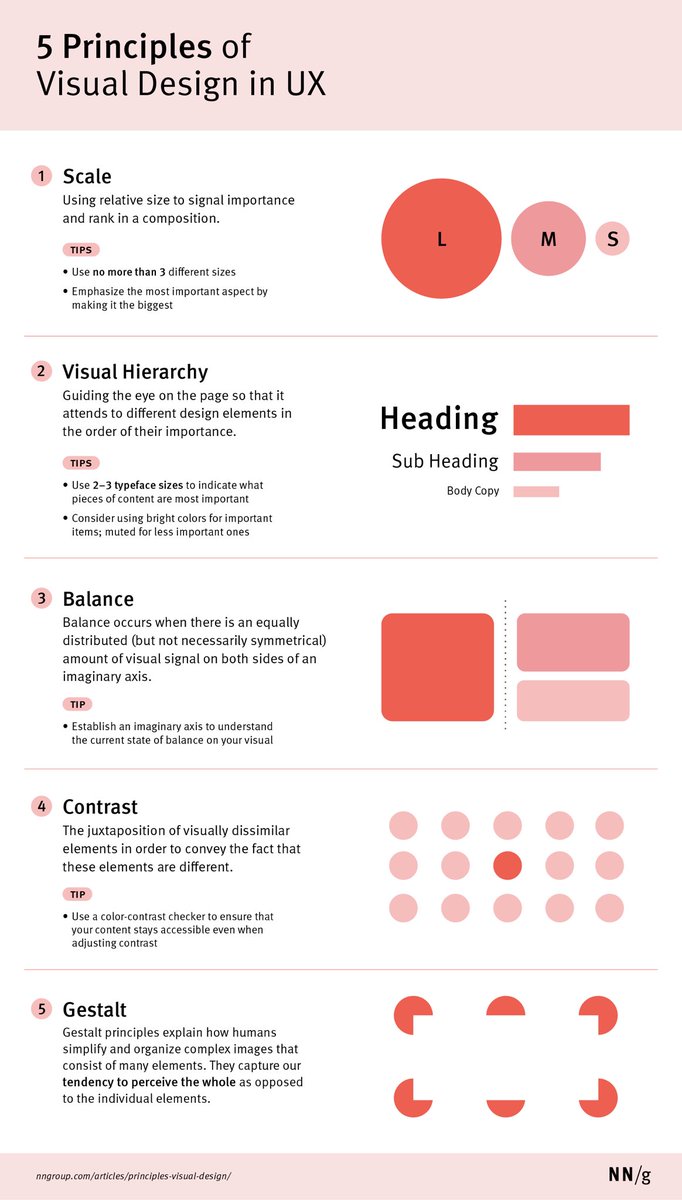
Learn how to apply the 5 Key Principles of Visual Design to Boost your next design project 🙌
The principles of scale, visual hierarchy, balance, contrast, and Gestalt not only create beautiful designs, but also increase usability when applied correctly.
5 Principles of Visual Design in UX:
1 Scale
Using relative size to signal importance and rank in a composition.
TIPS
- Use no more than 3 different sizes
- Emphasise the most important aspect by making it the biggest
2 Visual Hierarchy
Guiding the eye on the page so that it attends to different design elements in the order of their importance.
TIPS
- Use 2-3 typeface sizes to indicate what pieces of content are most important
- Consider using bright colours for important items; muted for less important ones
3 Balance
Balance occurs when there is an equally distributed (but not necessarily symmetrical) amount of visual signal on both sides of an imaginary axis.
TIP
- Establish an imaginary axis to understand the current state of balance on your visual
4 Contrast
The juxtaposition of visually dissimilar elements in order to convey the fact that these elements are different.
TIP
- Use a colour-contrast checker to ensure that your content stays accessible even when adjusting contrast
5 Gestalt
Gestalt principles explain how humans simplify and organise complex images that consist of many elements. They capture our tendency to perceive the whole as opposed to the individual elements.
By @NNgroup
#ux #uxdesign #ui #uidesign #visualdesign #productdesign #userexperience #design #digital #business #startup
How to Communicate Design with Developers - Checklist 🙌
An extensive list of all aspects that must be communicated between designers and engineers throughout design/development process.
Map out cross-platform experience
- What platforms are in scope (mobile, desktop, wearable, iOS, Android, etc)?
- What breakpoints to use?
- What technology to use for mobile experience?
- What Front-End frameworks can be used?
Define technical feasibility
- What are technical limitations for components / interactions?
- What back-end data can be leveraged / exposed to the user?
- What JS/React/.. libraries are available?
- How fast can we output data / content in the UI?
- Are the back-end/front-end processes scalable?
Clarify semantic structure
- HTML5 structure
- Headings hierarchy
- SEO optimisation
- No dark SEO patterns
Consider all states
- Empty state
- Error state
- Loading state
- Other content and interaction related states
Design for variable content
- Variations of copy
- Progressive disclosure
- Text truncation
- Scalable layouts
Agree on naming conventions
- CSS variables
- File names
- Folder names
- Components names
Create placeholders
- Avatars (user pics)
- Image placeholders
- Default backgrounds
Define CSS units and resizing
- Font sizes and font baseline
- Absolute and relative CSS units
- How resizing works (browser zooming)
- Browser support
Flesh out file formats
- Images format
- Icons format
- Streaming mechanisms
- Optimisation
Verify A11Y compliance
- Optimise for levels A, AA, AAA
- Conduct A11Y audit
- Test for auditory, visual, cognitive and other impairments
- Localise content and design
Explain micro interactions
- Define CSS transitions
- Identify differences between desktop and mobile touch screen experience
- Prototype complex interactions
- Define technical feasibility of interactions
- Define frameworks to use for implementing interactions
By @uxhints_com
#ux #uxdesign #ui #uidesign #productdesign #uxprocess #uxstrategy #design #designthinking #prototyping #agile #mvp #digital #business #figma #webdevelopment #webdesign #startup
Excellent Dashboard Design Patterns Repository to boost your UX / UI Designs! 🙌
A huge collection to support the design and creative exploration of dashboard design 👇
Great work by @benjbach#ux#ui#uxdesign#uidesign#dashboard#productdesign#website#websitedesign #programming #html #css #js #react #ecommerce #health #data #mobile #iPhone #android #userexperience #business
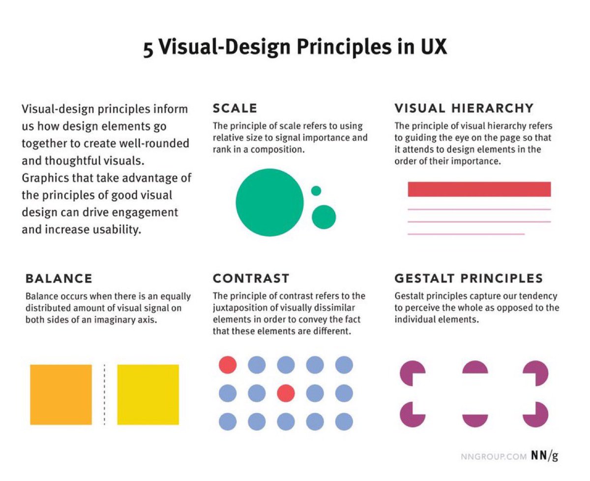
5 Principles of Visual Design in UX to Boost your Next Design Project! 🙌
Overview:
Visual-design principles inform us how design elements such as line, shape, color, grid, or space go together to create well-rounded and thoughtful visuals.
5 Principles of Visual Design in UX
1. Scale
This principle is commonly used: almost every good visual design takes advantage of it.
The principle of scale: Using relative size to signal importance and rank in a composition.
2. Visual Hierarchy
A layout with a good visual hierarchy will be easily understood by your users.
The principle of visual hierarchy: Guiding the eye on the page so that it attends to different design elements in the order of their importance.
3. Balance
Balance is like a seesaw: instead of weight, you are balancing design elements.
The principle of balance: A satisfying arrangement or proportion of design elements. Balance occurs when there is an equally distributed (but not necessarily symmetrical) amount of visual signal on both sides of an imaginary axis going through the middle of the screen. This axis is often vertical but can also be horizontal.
4. Contrast
This is another commonly used principle that makes certain parts of your design stand out to your users.
The principle of contrast: The juxtaposition of visually dissimilar elements in order to convey the fact that these elements are different (e.g., belong in different categories, have different functions, behave differently).
5. Gestalt Principles
These are a set of principles that were established in the early twentieth century by the Gestalt psychologists. They capture how humans make sense of images.
Gestalt principles: Principles that explain how humans simplify and organize complex images that consist of many elements, by subconsciously arranging the parts into an organized system that creates a whole, rather than interpreting them as a series of disparate elements. In other words, Gestalt principles capture our tendency to perceive the whole as opposed to the individual elements.
Why Visual-Design Principles are Important
- Increase usability
- Provoke emotion and delight
- Strengthen brand perception
By @nngroup
#ux #uxdesign #ui #uidesign #userexperience #productdesign #visualdesign #graphicdesign #designprinciples #design #prototyping #startup #digital #business


