Asked my new client why she picked me over the cheaper options.
Her answer: "Your questions made me think beyond the logo. You made me look at my actual business — what could work, what would waste my time."
She came for a logo. One intro call later, she wanted the full process.
Said she needed a proper foundation so her brand doesn't end up looking like it's been stitched together from random Canva templates.
Here's the pattern I keep seeing:
Founders think they need a logo to look legitimate. What they actually need is to understand who they're for and why anyone should care.
Without that, you're just collecting parts. A logo from one mood board. Colours from that brand you saw on Instagram. Typography from whatever looked professional.
That's how you build a Frankenstein brand.
The founders who get this stop shopping for the cheapest logo. They start looking for someone who asks better questions.
That's what my process is built for:
→ Diagnosis — find the Frankenstein symptoms
→ Foundation — build the brand skeleton
→ Design — create the visual system
→ Handoff — deliver everything ready to use
She's not excited because she's getting pretty visuals. She's excited because her business finally has a foundation that makes sense.
—
I take on 2-3 of these projects at a time. Starts at $5K. If your brand feels stitched together and you're ready to fix it properly, DM me and we'll see if it's a fit.
AI didn't make design cheaper. It made cheap design more expensive. The old model worked like this. A designer offering a logo for $50. Unlimited revisions. Their only real cost was their time, and some people were willing to sacrifice that. You got burned by one. Probably more than once.
Then the meter showed up.
Every AI tool has limits. Tokens, credits, subscriptions with caps. Each revision isn't patience anymore. It's money. The designer watching their spend isn't going to run 40 variations to get your brand right. They're going to run three. Take the best one. Send it.
Anthropic just proved the point. Their new top model, Claude Fable 5, just launched. It burns through your plan's usage twice as fast as their previous best. And from June 23 it drops out of monthly subscriptions entirely. Want the best model after that? Usage credits, on top of what you already pay. The frontier doesn't come with a flat fee anymore. It comes with a meter.
You still get a Frankenstein. It just arrives faster, in a cleaner PDF, and costs more than it used to.
The floor for cheap just got higher. The outcome didn't.
I use Claude Cowork mostly. Make a new project for each new client and feed it all the info I get plus meeting transcripts notes etc.
It mostly helps me to be on track and not let go in another direction or use something the client does not want in the project. I talk with it about the ideas or direction or concepts. But mostly just to validate that I am on the right track.
The best thing I can have when starting a brand design project. Direction, aesthetic, look, feel, vibe, whatever you want to call it.
Cosmetic brand, third version of the stylescape. Named after nature, but no leafy clichés. Lab-like. Talking to the nature of the customer, not literal nature.
Logo next. Direction's already decided.
A founder reached out with a naming problem. His brand name literally translates to "knife" in his language. He wanted to expand into plates, cutting boards, aprons. The whole kitchen. 22,000 people on Instagram asking when he's coming back. His question: "Do I need a new name?”
My question back: "How do your customers talk about you?"
Turns out, people don't say "I bought a knife from the knife company." They say "I bought from [brand]." The name stopped being a description a long time ago. It became an identity.
There's a company in his city called the equivalent of "Video." They started making videos. Now they do photography, marketing, full campaigns. Nobody thinks of the format anymore. The name is just the name.
Most founders overthink naming when they should be overthinking positioning. The name doesn't need to describe what you sell. It needs to carry meaning beyond the literal word.
We kept the name. Changed the positioning line. Now it's not a knife company that also sells plates. It's a premium kitchenware brand that started with knives.
Same name. Completely different frame.
Everyone's panicking that AI turns design into a race to the bottom. It's doing the opposite. It's pricing the bottom out.
The cheapest option always existed. You're just swapping the cheapest Upwork designer for the cheapest AI prompter. Same client, same brief, different tool.
But now something actually changed.
The cheap designer used to run on zero overhead. Cracked Photoshop. Cracked Illustrator. Their only real cost was their own time. That's how you get $50 logos and clients with unlimited revisions. It never cost the designer money. It cost them an evening.
Now every AI tool has a meter. Hit the limit and you're paying. Per prompt. Per revision. Per iteration.
So the designer who'll do a logo for $50 and eat thirty rounds of "can you just try it bigger"? That used to cost them a few hours. Now it costs real money, every single round.
The floor for cheap just got higher.
And that's good news if you do serious work. A race to the bottom still needs a bottom. AI just raised it.
The cheapest option didn't disappear. It just stopped being free to run.
Fully fleshed out campaign visuals and the products were not even physically available. What I had: a 3D render of each bottle. Labels were designed by me. A clear sense of the brand's taste with a detailed stylescape.
NUS should have looked like a fully fleshed out skincare brand. Three SKUs, formulas finished and tested, but no bottles to put on a table. No labels to hand to a model. No samples in the post.
To make this work with AI I had to have a lot of patience. The labels needed to be preserved. So did the bottle colors and cap colors.
22 nodes. 33 prompts. Three usable photos.
Not thirty. Three.
AI is powerful, and it is amazing. The three photos are so good they are almost indistinguishable from a real shoot. But it is not the all-powerful one-button solution people are selling it as. You still need taste, knowledge, and most importantly a brand stylescape that will point it in the right direction.
For years in agency life, I'd open a client's files and find 90% of their output breaking their own brand guide. Subtle sometimes. Sometimes so bad it felt illegal. Every designer kept designing. Nobody stopped to ask: if nobody follows this thing, what's the point of it?
Then on one project we went way off brief and deep into strategy. I finally asked the client: "Why are you not following your own guidelines?"
They just sighed and said: "We're tired of explaining what our brand actually stands for to every new designer. Even with the guide, nobody gets our voice."
That's when it clicked.
They didn't have a design problem. They had a Frankenstein problem. The brand guide existed. The brand didn't live in anyone's head.
So we stopped pushing pixels and started talking. We mapped how they really see their company. Paired that with the old guidelines. Built a visual reference only from their own photos and assets. Then we created what they actually needed: simple templates for social and presentations.
Since then, I always make time for a small "brand voice" call before I design anything. I don't want to contribute to the noise. I'd rather fix the monster than stitch new parts onto its face.
If you're a founder with a "brand guide" nobody follows, you probably don't have a design problem either. You've got a Frankenstein brand, stitched together by agencies, freelancers and "make this prettier" requests.
The guide isn't the problem. Nobody built the brand into anyone's head first.
I used to think founders with messy brands just needed better design. Every time, I was wrong. Logo from Fiverr. Tagline from a copywriter. Colours from a freelancer found on Instagram.
Website, pitch deck, and packaging that feel like different companies. Every new designer brief starts with ten minutes of explaining who they are.
That's not a design problem. That's a clarity problem.
Once I started fixing the story and positioning before touching anything visual, projects stopped dragging. Founders knew what to say no to.
The design became easy because it had a job to do.
If you're staring at a Frankenstein brand and you know it's costing you deals, make sense first. Look good second.
Your brand is leaking money and you don't even know it.
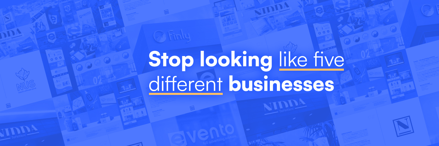
You bought the logo from a freelancer. Your co-founder built the website. Your marketing hire runs the social. Nothing matches. You have a Frankenstein brand.
Customers see the mess. They assume your product is sloppy too. So they bounce and buy from the competitor who looks put together.
Founders burn cash on ads that target everyone and convert no one because the visual pitch doesn't match the product quality. When you fix the Frankenstein problem, the math changes.
A beauty brand I worked with started commanding 40% higher prices for the exact same formula. They stopped looking like a DIY project and started looking like a premium brand.
A 20-year-old workwear company cleared stock 60% faster after we built a cohesive system.
Brand design isn't about making things pretty. It's about removing the friction between your product and your customer's wallet.
Stop losing sales to companies with worse products and better design.
Giving away this content inspiration pack for designers.
It includes your fav designers content strategy and their top-performing posts so you will never run out of ideas (and something extra spicy if you retweet).
If you want it for FREE:
1. Comment
2. Follow me (so I can send you a message)
3. If you retweet, I'll include a secret Claude prompt (your own ghostwriter)
Do all that, and I'll send you the link to your DMs. :)
A founder sent me their new brand last week. Built entirely with AI tools. No designer. I opened the file expecting a mess. It wasn't. The files were clean. The formats were right. The PDF was polished. And it was completely hollow.
The cheap designer was always going to stitch your brand together from mismatched parts. A logo from one place. Colours from somewhere else. Typography from whatever font felt "premium" that week. You got what you paid for.
But here's what changed.
Before, the cheap designer's only cost was their time. They could revise endlessly. Iterate all night. It only hurt them.
Now every revision costs tokens. Every back-and-forth costs credits. So the designer watching their token spend isn't going to run 40 prompt variations to get your logo right. They're going to run three. Take the best one. Send it.
You think you're getting AI-powered design. You're getting the cheapest output the designer could justify billing.
Same Frankenstein. Manufactured faster.
And here's the part nobody talks about: the client can't tell. The file looks clean. The formats are right. The PDF is polished.
But the thinking isn't there. The strategy isn't there. The coherence isn't there.
It just took less time to get it wrong.
A founder asked me why he needed a rebrand. Revenue was stable. Customers weren't complaining. Nothing was broken.
That's exactly why.
Broken is obvious. Drift isn't.
His website said 2024. His packaging said 2020. His social looked like a third brand entirely. Nobody made a mistake. It just drifted.
That's Frankenstein Creep. A new hire makes a flyer. Someone rebuilds the deck. A designer eyedropped the wrong shade of blue and nobody caught it. Each decision looked fine in isolation. Together, they're building a different brand.
Not every rebrand is a growth story. Some are just survival. And survival rebrands never make the case studies.
Founders ask me what the ROI on a rebrand is. They want a number. A sales bump they can point to.
Sometimes that's there. A workwear company I rebranded cleared stock 60% faster. A beauty brand sold the same formula at 40% higher prices. Those stories are real.
But that's not what stopped the bleeding.
Think of your brand like a plane. The engines don't make it go faster every year. They keep it in the air. Turn them off and nothing happens immediately. You coast for a while. Then you don't.
Your competitors sharpened up. Your brand didn't. Customers aren't leaving because something went wrong. They're leaving because someone else started looking more like the company they want to buy from.
Most founders wait for the crash before they fix the brand. Do you?
Investors judge your credibility by your pitch deck before you even open your mouth.
It's 2026. Looking intentional is your currency. Had to spell this out to a founder recently. Your brand isn't a vanity project. It's how you stop people from scrolling past you. It's the difference between being a serious contender and looking like a side project.
Successful startups evolve their look with every funding round. Not because they love spending the cash. They do it because when your website, your app, and your social all tell the same story, you build trust.
When those things don't match, you have a Frankenstein brand. People notice the mess. They just won't tell you to your face. They'll go with the competitor who looks like they have their act together.
A proper rebrand takes eight weeks. Not a year. Not some phase two that stays on a Trello board forever.
Design isn't decoration. It's the proof that you're a real company.