CSS Trick 🍏
You can create that Apple-style blowout text effect with CSS scroll animations and fixed positioning ⚡️
.word {
animation: blowout;
animation-timeline: --section;
}
@keyframes blowout {
0%, 95% { background: transparent; }
to { transform: translateZ(99vh); background: #000; }
}
The trick here is to fix the position of some things in your layout and then animate them based on their non-fixed containers ⭐️
The .word is position: fixed within a <section> that has a height of 200vh
section {
view-timeline: --section;
}
section:first-of-type {
height: 200vh;
}
Every section has a view-timeline: --section that creates a scoped ViewTimeline for each section's children 🤙
As that first section scrolls out of view, you increase its opacity and move it on the z-axis towards you. That gives it the impression of scaling up 🆙
.word {
animation: blowout, fade-in;
animation-timing-function: ease-in;
animation-fill-mode: both;
animation-timeline: --section;
animation-range: exit-crossing 10% exit 0%;
}
You can use the exit-crossing range combined with the exit range to get a timing you like ✨ Definitely experiment with these ranges to see how they play. The timing function creates interesting effects too!
At the same time as the text scales up, you need to fade in the video and the text that goes with it. Again, you can use the parent container's ViewTimeline --section
p, video {
animation: fade-in, fade-out;
animation-timing-function: ease-in;
animation-fill-mode: both;
animation-timeline: --section;
}
p {
animation-range: entry 10% entry 35%,
exit 0% exit 25%;
}
video {
animation-range: entry 0% entry 25%,
exit 10% exit 35%;
}
The timings are slightly different here. Again, you can play with them to get something that feels right for you!
@keyframes fade-in { to { opacity: 1; }}
@keyframes fade-out { to { opacity: 0; }}
Theoretically, you should be able to do something with animation-direction: reverse/alternate like yesterday's demo
video {
animation: fade 2 both linear alternate-reverse;
}
The trick with this effect is all about timing and creating containers that are bigger than the content and using them to drive the animations 🏎️
The scroll-driven signature is a bonus! ✍️ Perhaps a follow-up on that one 🤙
As always, any questions, requests, etc. Hit me up!
With this demo, the GreenSock ScrollTrigger code is included where the CSS scroll-driven animations API is not supported 🙌 That means you could use this demo today!
@CodePen link below! 👇
If you ever want your SVGs to be responsive but also keep your strokes a constant width, then you probably need:
vector-effect: non-scaling-stroke
With this, stroke will be measured in pixels, not user units, so it'll stay the same size regardless of how big the SVG is!
Transition animations: a practical guide
Fantastic guide that covers the principles of animated transitions. From basics like fade in and out with opacity to more complex principles like establishing spatiality.
https://t.co/Z7xffqNrCf
Calendar Page 📅
Here's a comprehensive view of the Calendar for HR Management, showcasing all the details including cards, filters, and more ✨
w / @alignui
Introducing our latest build → https://t.co/DQRwUkRNbL
It's an open-source, AI scheduling assistant.
Want to schedule a meeting? Cancel your bookings? List your meetings for the week? Just email @calcom's AI assistant. ✨
Built with @langchain + @OpenAI + @Vercel by our team @RubricLabs in partnership with @calcom.
Imagine an interface that behaves like paper when you interact with it. (Inspired by Google and @bnj 's Sonar prototype). When you pull or scroll the UI, it expands and contracts in response.
See Figma prototype below. 👇
⚡ @revertdotdev APIs gets as flexible as your CRM ⚡
I'm excited to announce the release of the Field Mapping API in @revertdotdev that allows you the engineer to go beyond the unified schema that we offered so far.
THIS IS HUGE! 😮
Checkout our blog to know why! https://t.co/MBNiAX54Pg
Future CSS Tip! 🚀
You can create auto-resizing text inputs with one line of CSS 🤯
textarea {
form-sizing: content; 👈 That's it!
}
The size of your input will grow to fit your content. If you want to constrain the size, do something like this:
textarea {
form-sizing: content;
min-height: 2lh;
max-height: 10lh;
}
This one's awesome. Think about how much effort it will save you 🙌 No more JavaScript to sync a textarea height to fit the content 🔥
Perfect for chat interfaces, messaging, comments, etc. 📢
@CodePen link below! 👇
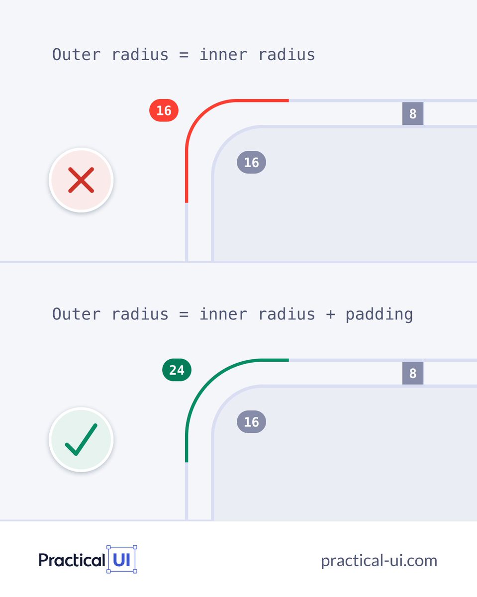
⚡️ UI design tip
Neat little trick you need to save on your long term memory, it will help ensure nested border radius look just right👌
#design#ux#uxui#uxdesign#Webdesign
Been using this for a lot for my designs and templates lately instead of starting from scratch. You can instantly create your own color palettes or select a premade one.
→ https://t.co/zqGF3pFMrn
This morning new updates went to our iOS and Android apps, among other things, your Most Used tags are now accessible right in the tagging pane for even quicker tagging of transactions.
Read our change log here: https://t.co/HlHN22RGBf
(V2UCQE, FVSZSU)
Future CSS Tip! 🔮 (This one's close 🤏)
You can use "subgrid" to give child elements access to a parent's grid tracks 👀
This is great when you want to make sure content lines up 🙌 Check those cards 👇
article {
grid-row: span 4;
display: grid;
grid-template-rows: subgrid; 👈
}
In this example, article uses grid but makes use of the tracks defined by the parent layout container. That makes it easier to line up content within the cards 🙏
Cool thing is, we don't even need to define the rows in the parent. We use the implicit ones from the parent.
main {
display: grid;
grid-template-columns: repeat(auto-fit, minmax(300px, 1fr))
}
This might be easier to understand with the video below that shows the grid tracks using DevTools and toggles subgrid on and off 🤙
@CodePen link below! 👇


![saidul_dev's tweet photo. Why use HTML Semantic Elements?
Detailed explanation with visual presentation.
[ Save for later 🔖]
<<Thread 🧵👇👇>>](https://pbs.twimg.com/media/F5Zd_BibgAAKj4l.png)


