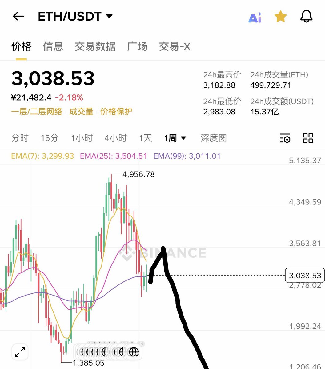
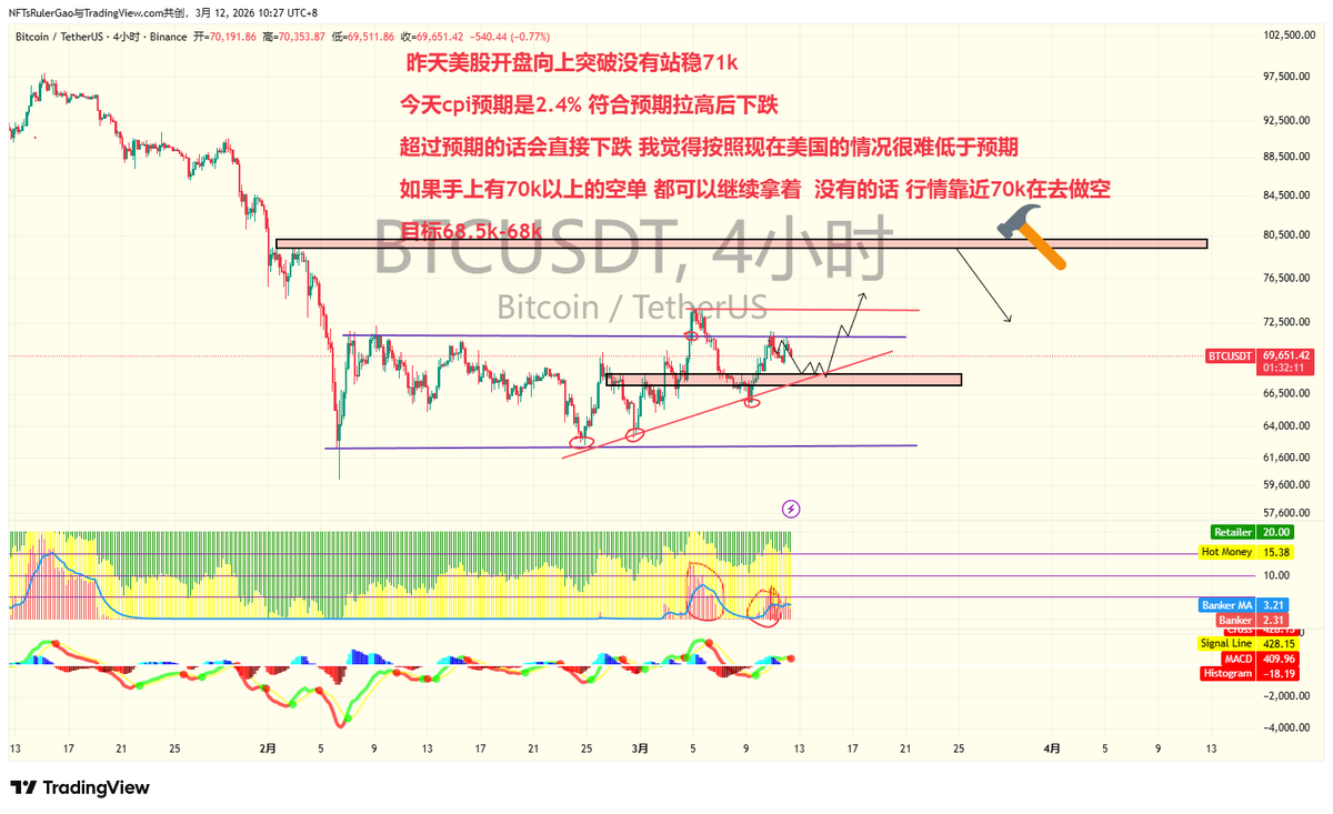
ChatGPT 讨论好久,个人认为,泡沫只会提前不会滞后
✅ Detailed Explanation of the Chart (English Version)
Title: Periods When to Make Money
This vintage-style chart attempts to show economic & market cycles over long periods, using three repeating categories:
•A = Panic Years
•B = Boom / High-Price Years
•C = Low-Price / Depression Years
It is not a scientific model, but a historical cycle observation—similar to the old Benner Cycle (economic cycles repeating every ~8–10 or ~20–27 years).
⸻
🔵 1. Three Categories: A, B, C
A — Panic Years (Top Row)
Labeled as:
“Years in which panics have occurred and will occur again.”
These are years associated with major market crashes, banking panics, or extreme volatility.
Examples shown in the chart (top row):
1927, 1945, 1965, 1981, 1999, 2019, 2035, 2053
The chart claims these years tend to align with:
•bubbles popping
•systemic financial fear
•rapid market collapses
⸻
B — Good Times & High Prices (Middle Rows)
Described as:
“Years of good times, high prices and the time to sell stocks and values of all kinds.”
These represent strong economies and high valuations.
According to the chart, B years are good for selling because markets are expensive.
⸻
C — Hard Times & Low Prices (Bottom Row)
Described as:
“Years of hard times, low prices, and a good time to buy stocks… and hold till the boom reaches the years of good times; then unload.”
These represent market bottoms, recessions, depressions, and are the best years to accumulate assets cheaply.
Examples shown:
1924, 1931, 1942, 1951, 1958, 1969, 1978, 1985, 1996, 2005, 2012, 2023, 2030, 2039, 2048, 2059
⸻
🔵 2. What the Triangles Mean
The entire chart is filled with triangle-shaped “cycles.”
Each triangle represents a mini-cycle of ~10 years, labelled with numbers:
•1 → 3 = bottoming period
•4 → 7 = rising trend
•8 → 10 = high valuation / near bubble territory
The top of each triangle points toward B (or sometimes A), showing where prices peak.
This visually represents:
Low (C) → Rise → High (B) → Panic (A) → Low (C)
a repeating rhythm.
⸻
🔵 3. Interpretation of the Timeline
Horizontal axis covers years from 1924 to 2059.
The creator believed market cycles repeat consistently, so they extended the projections far into the future.
The chart suggests:
✔ After a C low year → you enter a multi-year boom leading to B/A
✔ After B/A peak → a decline follows → eventually reaching next C low
⸻
🔵 4. Why 2026 is Circled (Key Point)
In your image, 2026 is circled.
Based on the model:
⭐ 2023 = C-year (Low / Buy Year)
The chart treats 2023 as a bottom of a major cycle.
⭐ 2024–2030 = B-years (Boom, rising valuations)
So 2026 sits in the middle of a boom phase, not crash.
⭐ 2035 = Next A-year (Panic)
Meaning the real “danger zone” is expected around 2034–2036.
So the chart says:
2026 = good times, high prices → a selling opportunity, not a crash year.
⸻
🔵 5. What the Chart Wants You to Do
This card was meant to be a “simple investment guide” from decades ago:
✔ Buy during C years (depression, low prices)
✔ Sell during B years (good times, high prices)
✔ Avoid being overexposed during A years (panic/crash periods)
It promotes long-term, cycle-based investing, not daily trading.
⸻
🔵 6. Is This Accurate Today?
Not exactly.
This model is not scientific and doesn’t account for:
•Federal Reserve interest rates
•Tech cycles
•Geopolitics
•Globalization
•Crypto markets
•Rapid monetary expansion
But psychologically and behaviorally, it remains surprisingly close to real-world investor behavior.
#仅供参考 #DYOR
Think you’re a true Stander? Prove it.
StandX ID claims are now live.
• Only 1 per person
• Random rarities
• First come, first served
Your job is to search the corners of https://t.co/aA4rzlFDJf 🔎