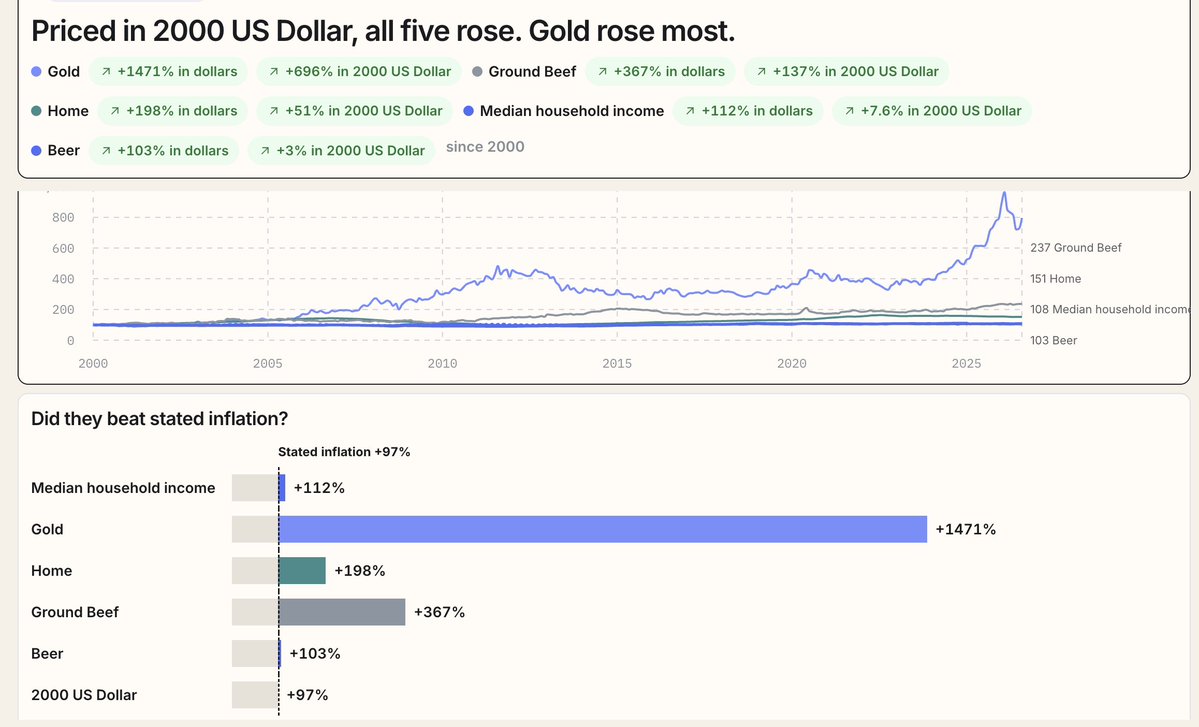
@JamesonCamp Yup. We share charts of common prices all the time. The most common & expensive items always seem to mysteriously outpace the CPI inflation, asses soar, and wages & salaries hold the line consistently.
https://t.co/pkdXbeWuLE
@TakeRightTurn@TKL_Adam This is an interesting chart. Whenever people talk about wealth divide, they're focused on the top row. It seems like the sum of the bottom two rows is probably the more important place to focus.
@TKL_Adam Absolutely. It's all about asset ownership, and tokenization and more recent trends are going to amplify the benefits of asset ownership even more.
@Stinkerbelle359@KobeissiLetter We're curious about this, too. @Grok can you compare the earnings and free cash flows the way that @stinkerbelle1977 asked here?
@RyDawg42 Robinhood also has great margin rates.
We're building out calculators that model out lifestyles where people invest up to 100% of earnings and live out of margin. NOT FOR EVERYONE. But there are some really interesting outcomes in there.
@alexstanczyk We don't do the animations but we have the data you crave.
Gold vs Bitcoin vs S&P, priced in Costo hot dog combos.
https://t.co/aNx1dfdKPZ
@theficouple We used Honda Civics as our base car in the data sets, but income outpaces their worth. Keep your car, stack income.
Civics vs Household income, priced in our favorite denominator.
https://t.co/hj1L31m2Ux
@RonSwanonson Honestly with tokenization, using margin / collateralized debt for emergencies is probably a better bet than holding cash.
The majority of commenters (with assets) are a few clicks away from access to capital at 4-7% interest and they don't even know it.
@BeTheChain@TFTC21@grok We're doing our best, but we're just commenting on every inflation post we can. And there's a LOT of posts.
https://t.co/ZRqKKGQVo9
@TFTC21 This is all these goods since the year 2000, but priced in year 2000 dollars to show what we're told the inflation was versus how they're actually performing today.
https://t.co/ZRqKKGRtdH