Sharing the worlds finest logos, symbols and trademarks, Logobook is a source of inspiration for designers, entrepreneurs and anyone who simply loves logos.
How to draw a timeless logo?
Our number 2 choice from the 1960s was the outstanding British Rail logo, designed by UK design team Design Research Unit, by Gerald Barney, Rupert Armstrong, Milner Gray and Collis Clements:
https://t.co/XGG11qc4Jx
https://t.co/u5DDPI8Ukf
How to draw a timeless logo?
Creative Bloq, asked us to choose the best logo designs of the 1960s, alongside others #pentagramdesign. We agreed on the 1964 Woolmark logo, amongst others:
https://t.co/XGG11qc4Jx
https://t.co/ZnGmRJVsHg
Great feature by @AntoniaEmilyW on the best logo designs from the 60s - https://t.co/XGG11qc4Jx - Thank you @CreativeBloq for reaching out to Logobook. One more addition would be Stephan Kanchev’s Central Puppet Theatre https://t.co/xKkg63n685
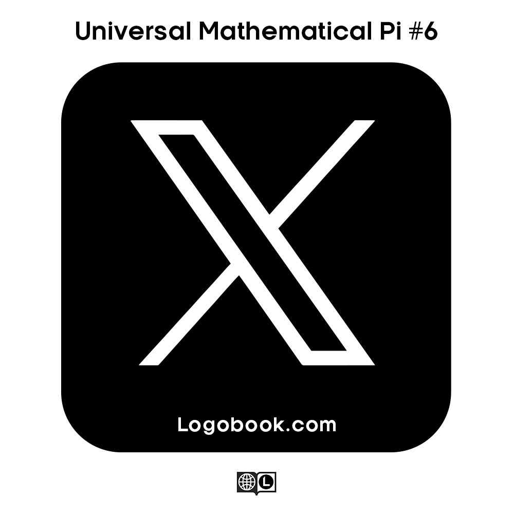
@itsnicethat Interesting article but we have a slightly different origin story for the X logo.
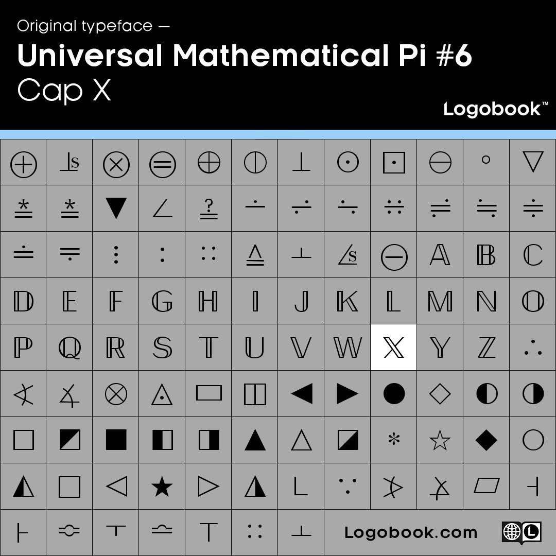
The X logo is actually a decades old letter from the Universal Mathematics Pi #6 typeface. A mathematics dingbats font, with hidden letter glyphs.
Who designed this typeface?
@_rajkhare@elonmusk The future 'X' app logo is a letter from the Universal Mathematics Pi #6 typeface.
A mathematics dingbats font, with hidden letters. This is the cap X.
Still looking for the designer of this typeface. Tell us if you know more.
'X' Marks the spot
The future 'X' app logo is a letter from the Universal Mathematics Pi #6 typeface. A mathematics dingbats font, with hidden letters.
Great reveal of a beautiful hidden glyph.
We will surly be featuring it on https://t.co/Iuvb9QMBHK as soon as it goes live.
@elonmusk Great logo!
The letter form comes from the Universal Mathematic Pi #6 typeface. A mathematics dingbats font, with hidden letters.
Great reveal of a beautiful hidden glyph, congratulations!
Once the identity is live, we will surly be featuring it on https://t.co/Iuvb9QMBHK
A slightly controversial classic logo that we have not featured yet, has recently been redesigned. Which version should be featured on Logobook? Suggestions welcome.
The maple leaf proves inspirational again for Ted Larson in this great logo for Canada’s Environmental Choice - see other great plant and leaf inspired logos here: https://t.co/mmZUPWrP4n but the birds are key to bringing this logo to life: https://t.co/G5i3sNynkm
A brilliant and timeless design commissioned by @heinemannDF in 1972. Designed by the late Alan Fletcher. We would buy the t-shirt. https://t.co/vNLHF9u2c2