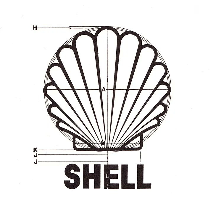
“Eight years have passed since then, and Shell Oil has not contacted me.”
In 1971, Japanese designer Yusaku Kamekura recounted his six-week project for Shell.
https://t.co/nUCMBggycg
“As I ponder the logo selections we reviewed this year, I try to read the tea leaves, if you will, to see where we’re headed.”
Bill Gardner of @LogoLounge is back with the 2024 Logo Trend Report.
https://t.co/BaR7YT9ejP
Catch the full round-up here:
https://t.co/PtmwRKsGZj
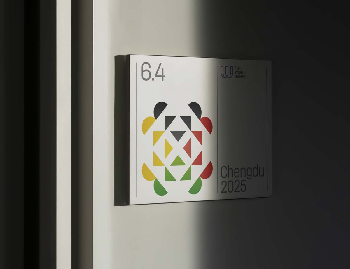
On his logo for @TheWorldGames 2025 John Fairley of @FairleyGraphic said, “Integrating the panda’s face into the logo establishes a strong connection to Chengdu whilst evoking a sense of familiarity and affection among audiences globally.”
https://t.co/dPPa7LCd4b
“Album covers get all the praise, but the humble band logo has never quite got its full dues. Until now.”
https://t.co/rYkRwt1ee0
Logo Rhythm, by @jimkdavies and @jamie_ellul.
“…the studio wanted me to explore a Wonka logo with an elaborate W in a scripted style that eluded to Wonka’s mum’s handwriting…”
Alexandria Vernon on her logo for musical fantasy film Wonka.
https://t.co/BnB0Fk9sV0
Game+Logo — a nostalgic collection of logos from decades past in the video game industry. https://t.co/iZdQkDCxr7
Collated by @DanClarke of @Arkotypeco, full collection → @gamepluslogo
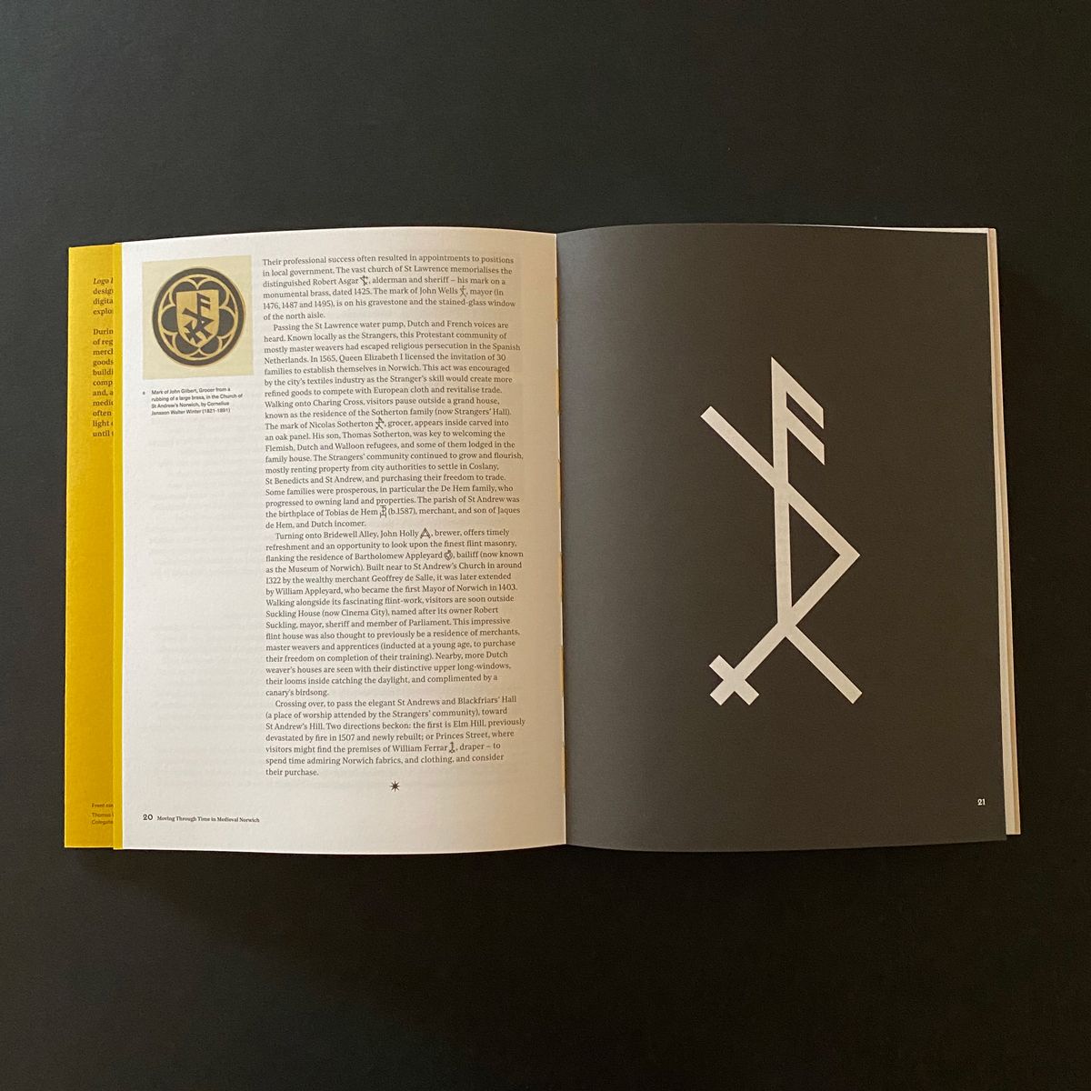
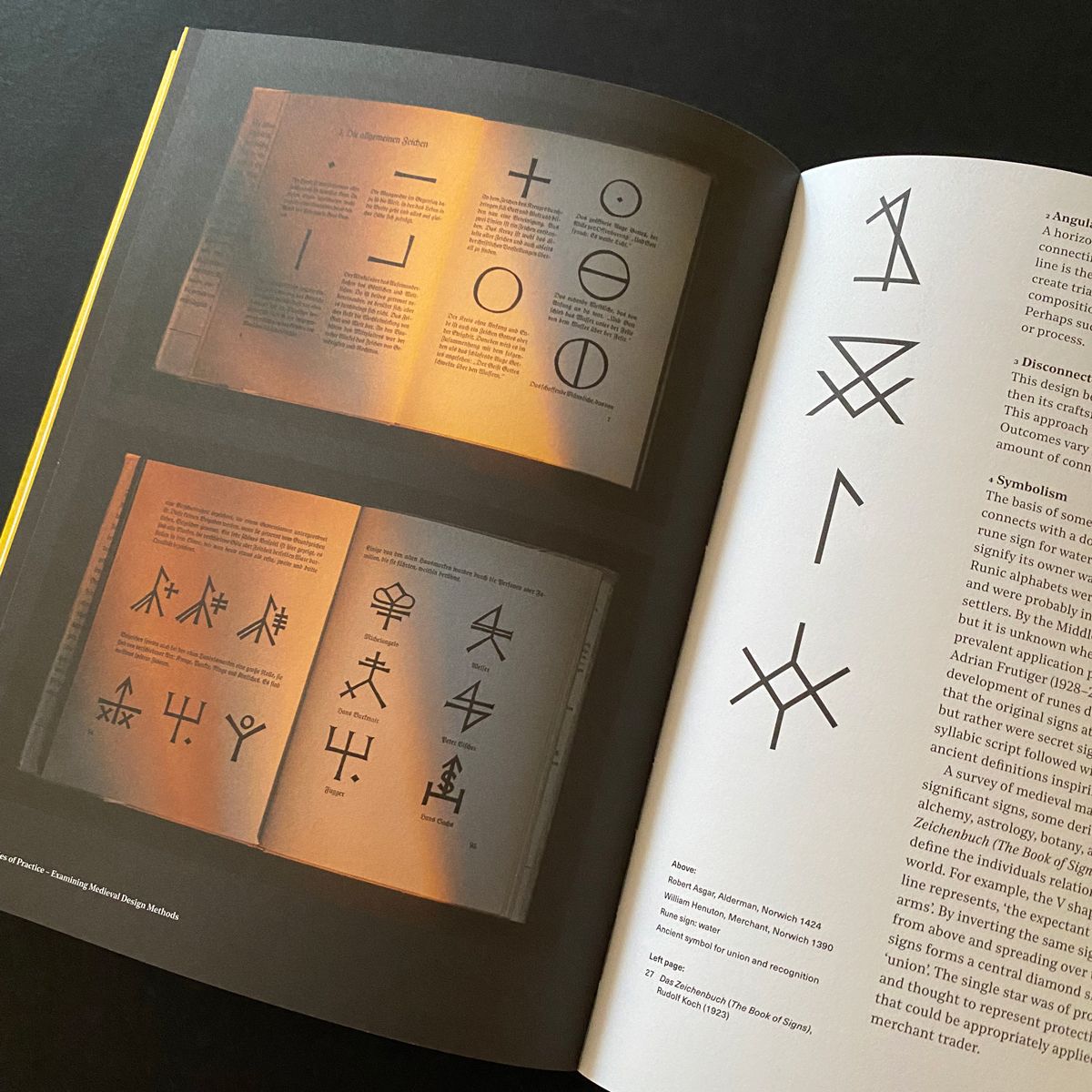
Logo Rewind takes an in-depth look at the merchants’ marks of Medieval Norwich.
https://t.co/EjAdmP0EHa
By @studiotelegram, foreword by @a5jensmueller.
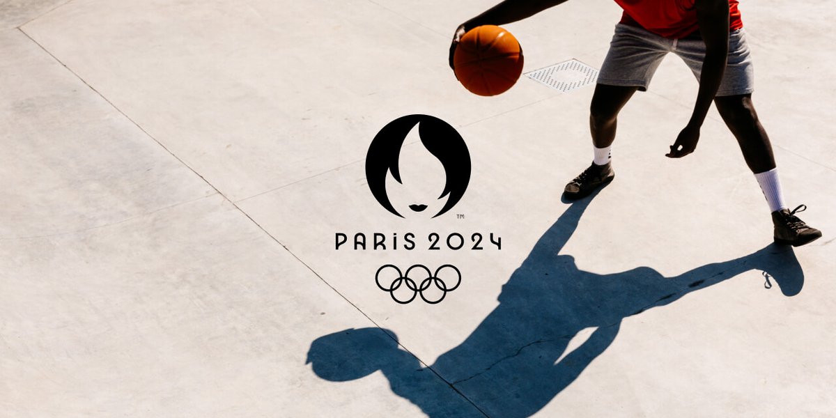
The @Paris2024 logo combines three separate symbols — the gold medal, the flame, and Marianne (the personification of the French Republic).
https://t.co/HhdhXeV2vk
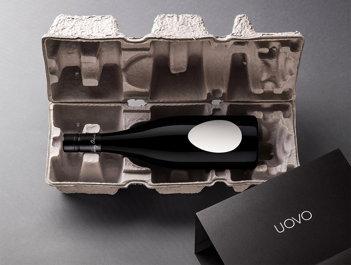
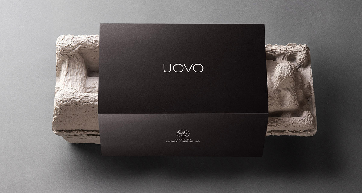
“When winemaker Larry Cherubino had three giant concrete ‘egg’ tanks delivered to his winery, he knew the packaging had to reflect this revolutionary way of maturing wine.”
https://t.co/DAd8Dt6G8e
Designed by Denomination.
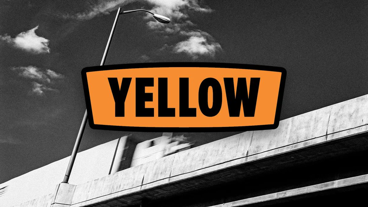
“Even the delightful name of the particular hue that was chosen, Swamp Holly Orange, represents a stroke of branding genius that puts to shame today’s marketing wizards who call white ‘Starlight’ and black ‘Midnight.’”
James I Bowie on the Yellow logo.
https://t.co/beE6BoVQwx
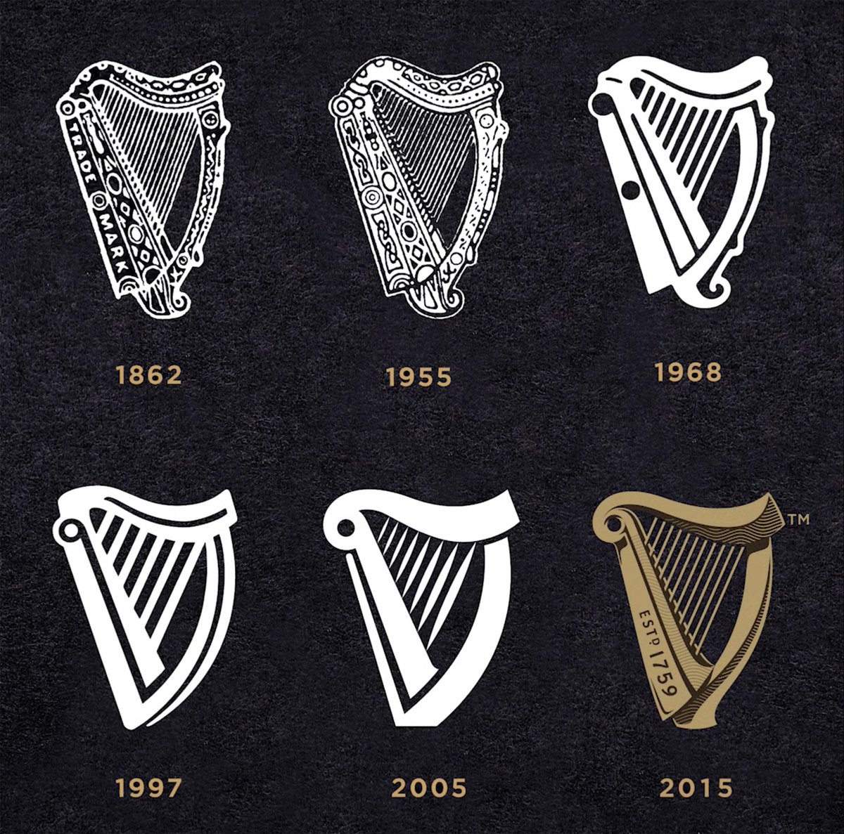
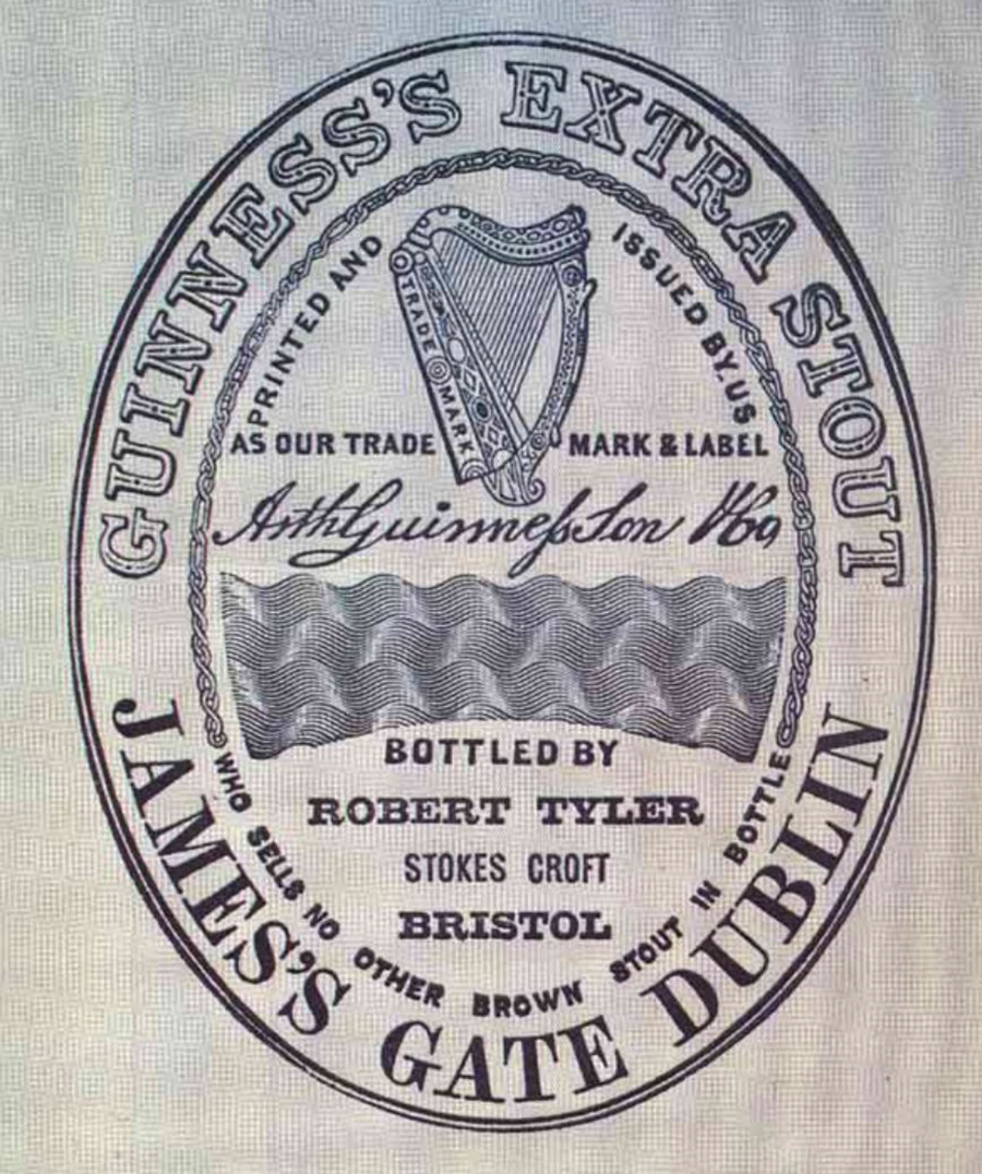
The Guinness logo is based on a famous 14th century Irish harp known as the O’Neill, or Brian Boru harp, preserved in the library of @TCDDublin.
https://t.co/tvDtdOgx6p
Latest update by @Design_Bridge, with Gerry Barney.
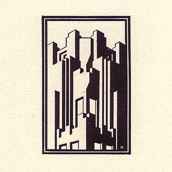
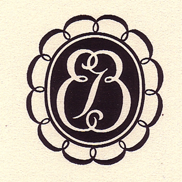
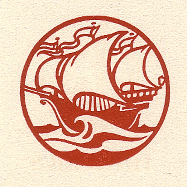
Clarence P Hornung (1899–1997) was an American printer, publisher, typographer, and designer of logos and trademarks. In 1930, Caxton Press published a book featuring his work.
https://t.co/CC0irXXzvz
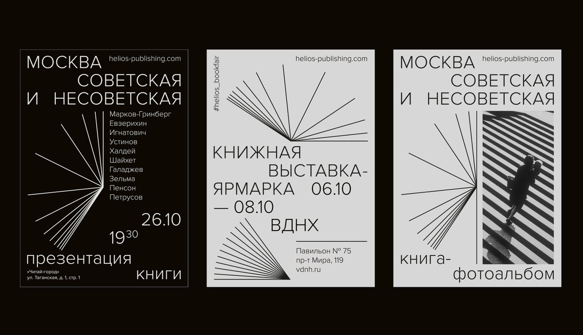
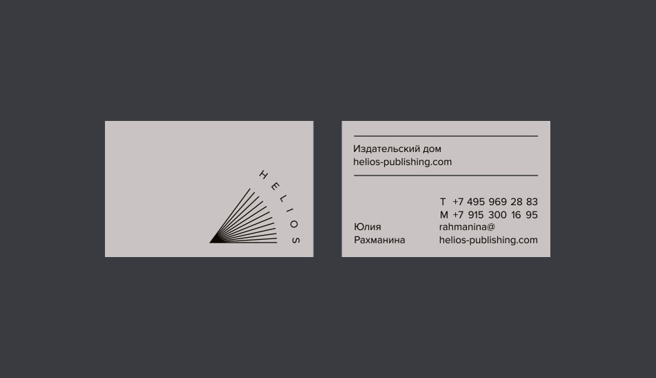
In Ancient Greek mythology, Helios is the god and personification of the sun. “Like a ray of light, books elucidate the light of knowledge. The symbol combines both images: the sun and an open book.”
https://t.co/VdAC5FNiRh (designed by omsky, via @europeandesign)
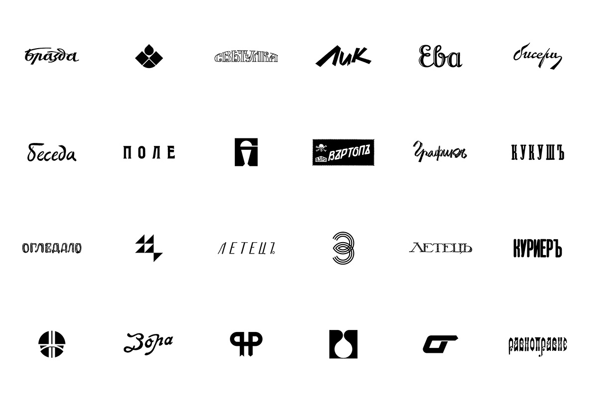
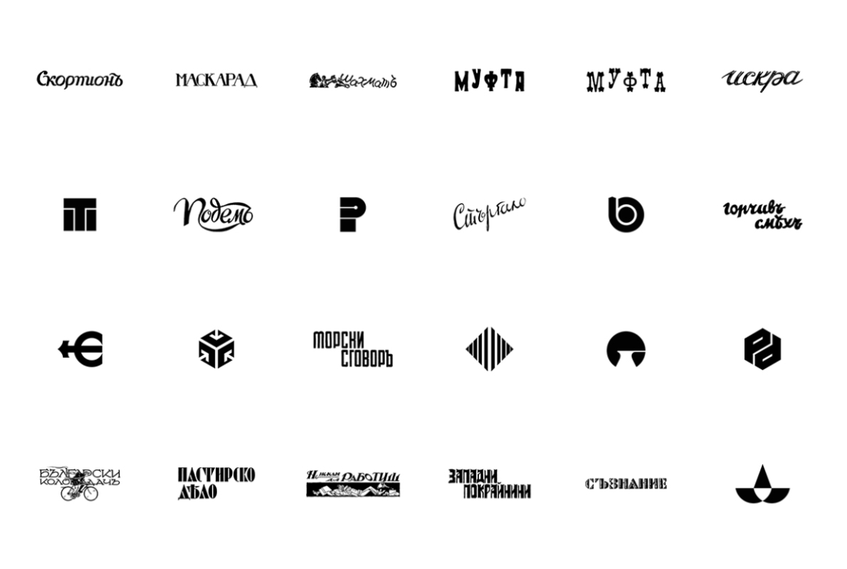
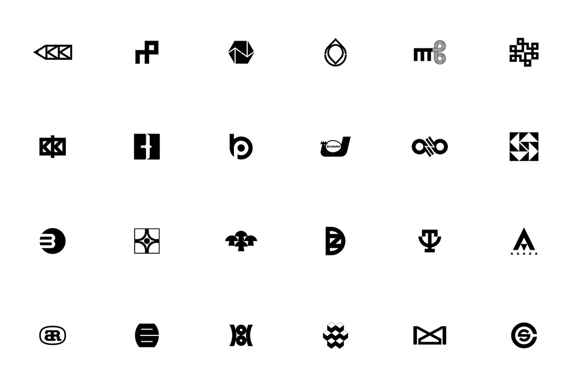
A digital archive of the Bulgarian visual arts, featuring classic logos from the 1920s–70s (compiled by @arcbva, via @LogoArchive).
https://t.co/BB1mISqabX