How Herb Lubalin Redefined Sportswear Design in 1977.
In 1977, the legendary American typographer Herb Lubalin, alongside partner Alan Peckolick, was commissioned to create a unified identity for the newly merged ASICS brand. Tasked by the Japanese agency PAOS, Lubalin developed a logo that captured the essence of "A Sound Mind in a Sound Body." He presented seventeen distinct concepts, eventually settling on a custom, lowercase-heavy wordmark that balanced mathematical precision with fluid movement. The design featured a distinctive, circular "a" and bold, sans-serif letterforms that mimicked the curves of an athletic track. This vibrant blue logotype replaced the fragmented identities of its predecessor companies, providing a modern, global face for the brand. While the primary corporate mark evolved in 2007, Lubalin’s original typography remains the foundation for the iconic ASICS Tiger sub-brand today.
#logodecks
The Wife of Adobe’s Co-Founder Created Their Iconic Logo for Free From Her Kitchen.
Marva Warnock, a talented graphic artist and the wife of Adobe co-founder John Warnock, designed the company’s original logo in 1982. At the time, the startup lacked the funds to hire an external agency, so Marva stepped in to create a professional identity from their kitchen table. Her design featured a bold, stylized "A" with a distinct open triangular crossbar, paired with a futuristic wordmark where the "E" consisted of three simple horizontal stripes. Set against a dark grey background, this geometric emblem became an instant classic. Her clean, modern aesthetic proved so enduring that the iconic "A" remains the core of Adobe’s global brand identity more than forty years later.
#logodecks
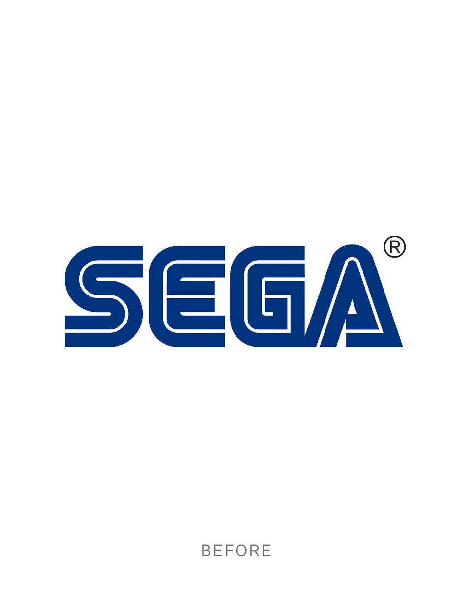
We’re excited to announce that we’re making our SEGA logo 3% more blue.
We hope you enjoy this upgrade.
Please take a moment to familiarise yourself with the new look.