I wanted to share the following 10 Tailwind techniques. These will come in handy next week.
For those who don’t use Tailwind, here be dragons!
1/10 - Let’s start simple. Set a CSS variable (width) based on state and use an arbitrary className.
the little details™
Use trigonometric functions in CSS to create a smooth staggered transition delay 🎬
.character {
transition-delay:
calc(sin((var(--index) / 12) * 45deg) * 0.475s);
}
CSS Tip! 🍬
You can create a CSS-only sticky CTA using position: sticky or scroll-driven animations 🤙
.cta {
position: sticky;
margin-top: 110vh;
bottom: 2rem; /* 👈 Stick! */
}
This is one way 👀
This first way relies on you setting a layout on the body and putting the CTA in a zero-space part of the layout
body {
display: grid;
grid-template-columns: auto 0;
}
The children of the body are an element with your content and then the CTA. You could also use display:flex too.
.content { flex: 1 0 100%; }
.cta { place-self: end; }
As you scroll the body, the CTA comes into view and sticks in position 🙌
That's one way. If you want to take it further and do something like flip between showing or not, maybe scale it up, or add some special easing, etc. an animation is another way 📜
First, change the styles for your CTA. Note the translate property that's powered by a custom property
.cta {
position: fixed;
bottom: 2rem;
right: 2rem;
translate: 0 calc(20vh - (var(--show) * 20vh));
transition: translate 0.875s var(--elastic);
}
Next you need a custom property that you're going to animate
@property --show {
inherits: true;
initial-value: 0;
syntax: '<number>';
}
Lastly, you animate this value on the body. As the property value changes, the value will trickle down to the CTA
@supports (animation-timeline: scroll()) {
body {
animation: show-cta both steps(1);
animation-timeline: scroll(root);
animation-range: 0 10vh;
}
@keyframes show-cta {
to { --show: 1; }
}
}
Using @supports you can use this as a progressive enhancement. If scroll-driven animations are supported, use them. Otherwise fallback to using position: sticky 🤙
That's it! As always, any questions or requests, hit me up! 🙏
@CodePen link below! 👇
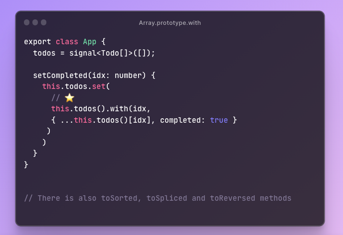
🎉 All major browsers now support the new Array.prototype.with method 🥳
https://t.co/jugUOhlZd7
Ideal for immutable updates. Here is an example with Angular signals:
Your icons should be SVG sprites instead of JSX
- make a component like <Icon name="trash" />
- get autocomplete for icon names
- auto build the spritesheet when new svgs are added
https://t.co/G9DnKL2w5n
🎨 CSS tip(3):
`height: 100vh`
is a common way to make your app fit the whole window. It won't do a good job on mobile though 😬
`height: 100dvh`
works way better!
📱 See the difference on your phone:
https://t.co/t7KR7WGsQ6
💻 Play with the demo:
https://t.co/nSq1PuCu0p
I was unaware of `text-wrap: pretty;`
I knew about the (new/cool) `text-wrap: balance;` — but sometimes that's a bit... too much. I feel like it's nice on headers but not smaller type.
Here's what I mean.


