A few @madebyfriendly stats we're proud of as a team:
🚀 $4.4M+ earned by our skilled designers and developers.
💁♀️ $370k+ shared with our kind referral network.
🤲 $140k+ sent to charities that matter to us
💰 Over $20M raised by our clients (with a little design help)
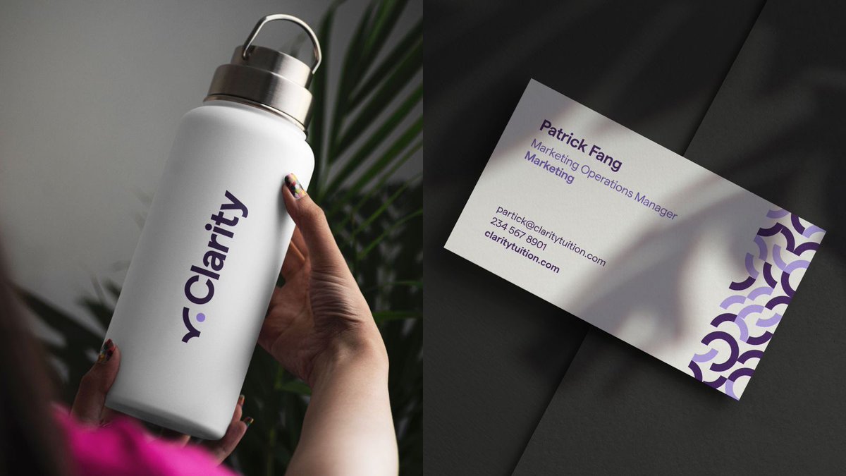
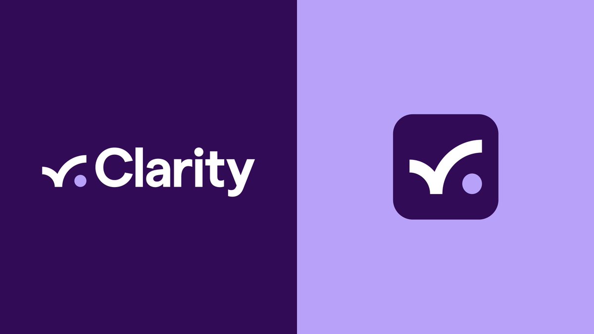
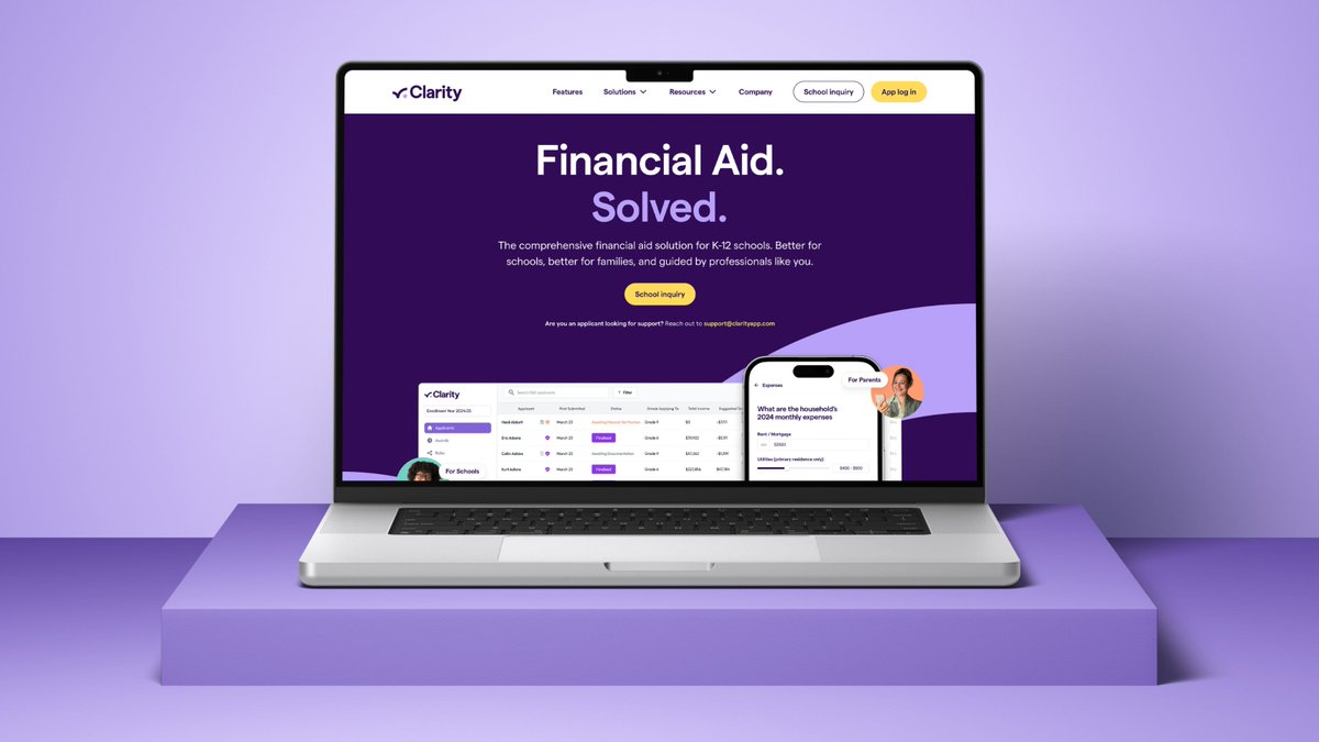
Focused on combating stagnation, outdated technology and poor service, Clarity aims to revolutionise the financial aid sector - enabling more families to access private education. We rebranded Clarity to align with its ethos of innovation, efficiency, and accessibility.
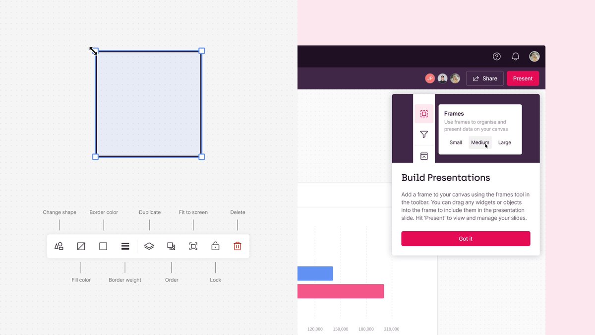
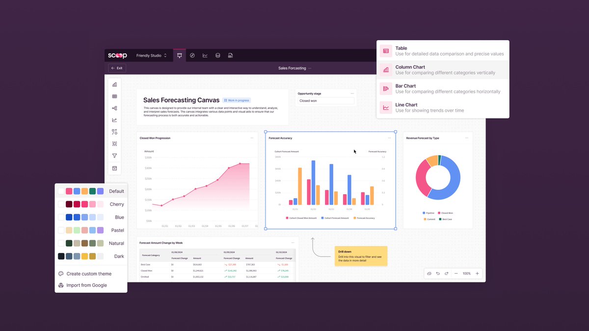
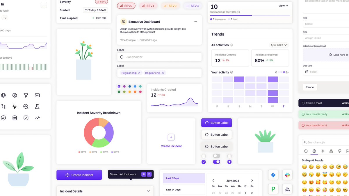
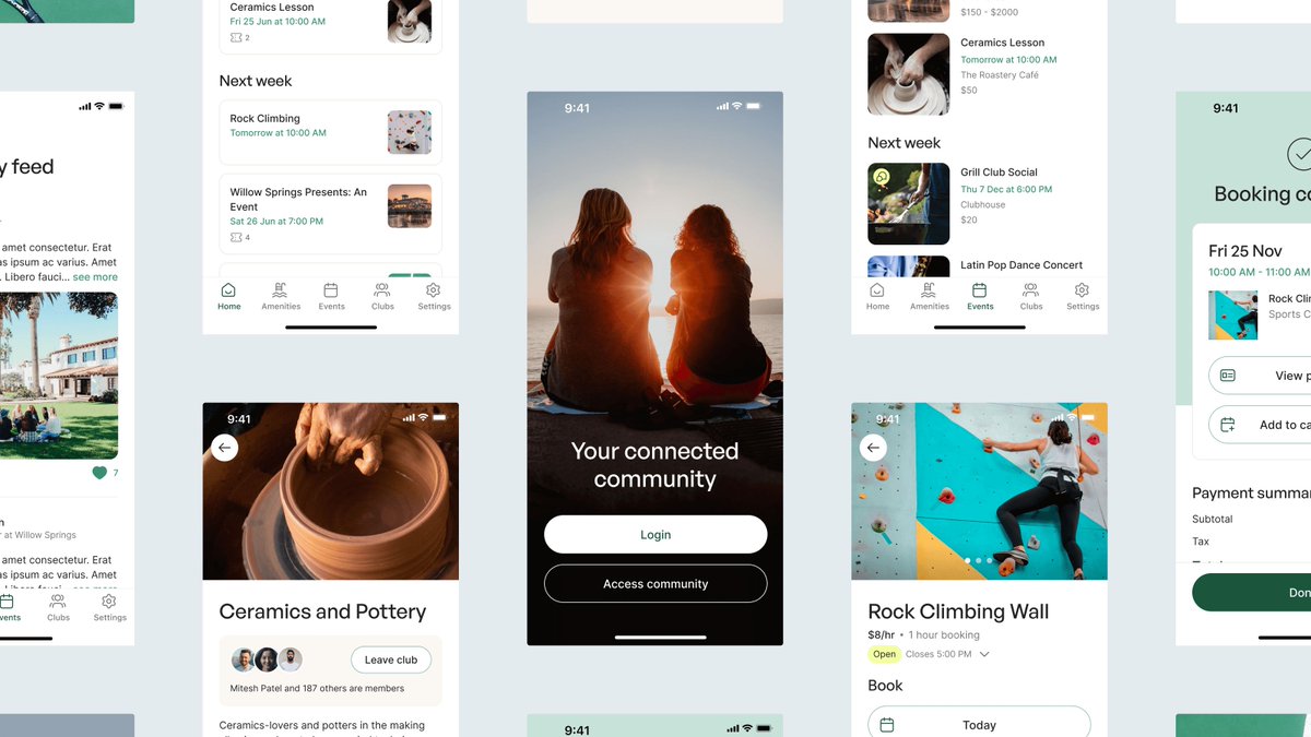
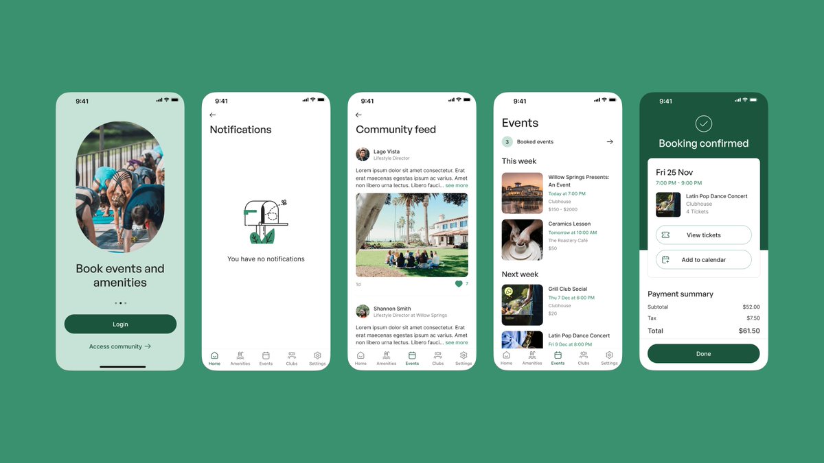
After delving into Scoop’s incredible data capabilities, we designed an intuitive experience to help users unlock valuable insights. We created an infinite canvas with tools for designing data stories, along with an interactive presentation feature.
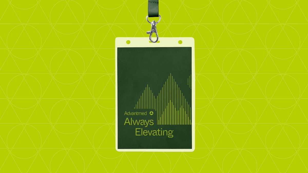
After working with @advantmed on their groundbreaking product, we helped their marketing team make a big impact at trade shows across the US. We designed multiple exhibition booths, presentation decks and custom brand moments that would catch the eyes of event attendees.
We redefined Clarity's identity, incorporating symbols of trust, progress, and support. Through close collaboration with the client, we developed a brand that reflects Clarity's mission to streamline financial aid processes. Explore more → https://t.co/1yu1dBYVZ3
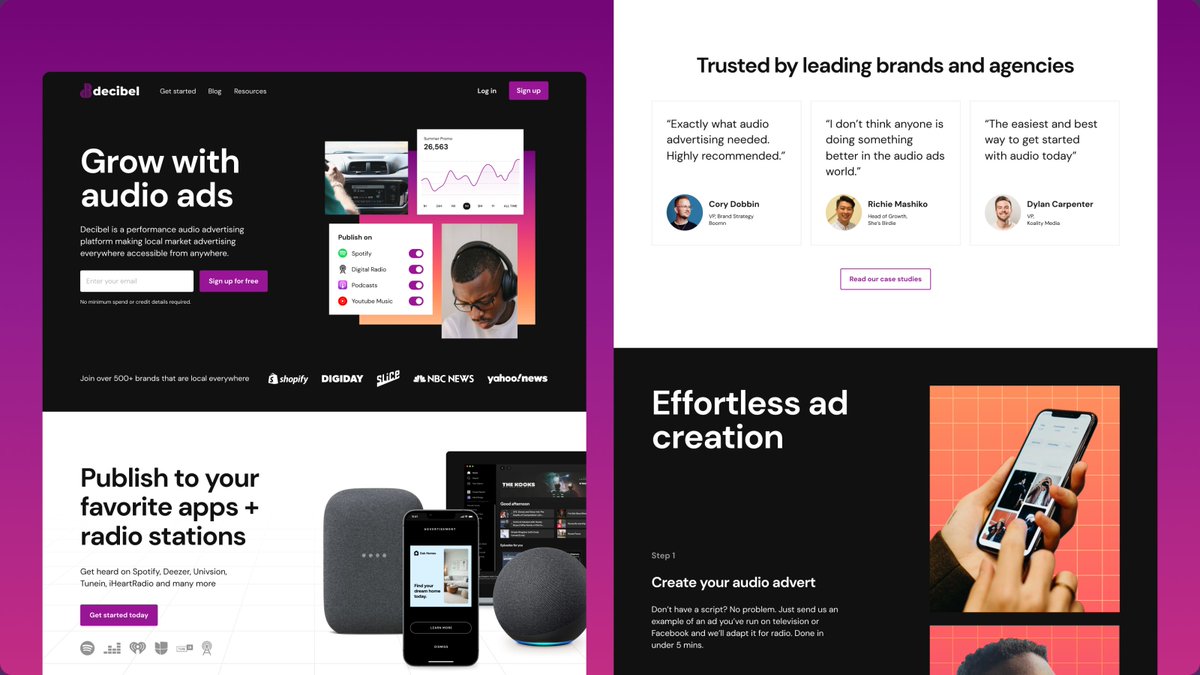
A design system thrives on harmony. We collaborated with @Decibelads to craft a comprehensive system that unifies branding elements across their entire product ecosystem. Take a look at what we did → https://t.co/EAKjTiMFsU
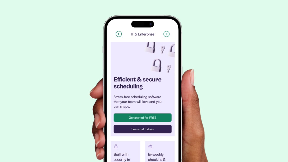
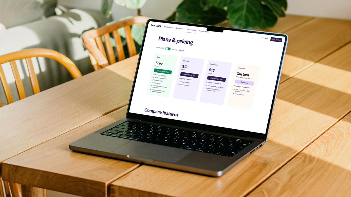
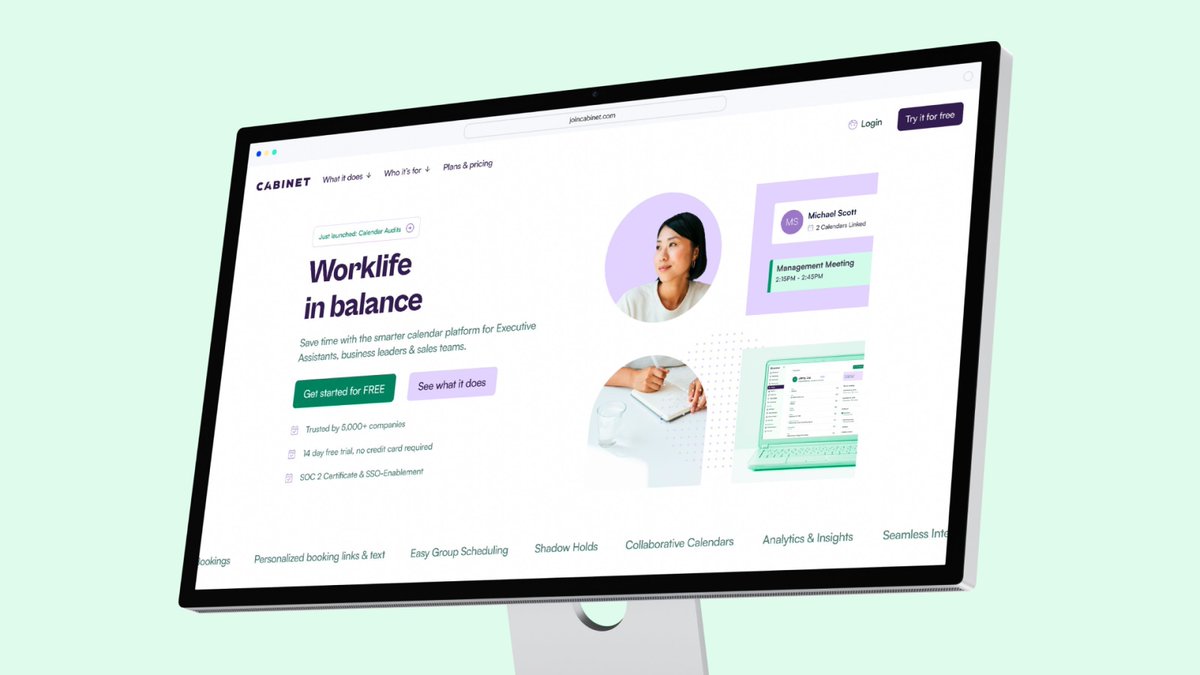
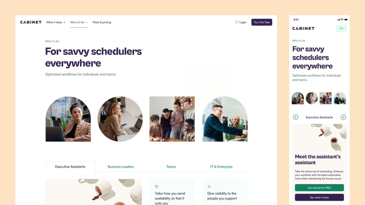
Visual Design can be a powerful storytelling tool. We refreshed @JoinCabinet's brand and designed a new website to effectively target their ideal customers. Here's what we did → https://t.co/FksWsJMwqd
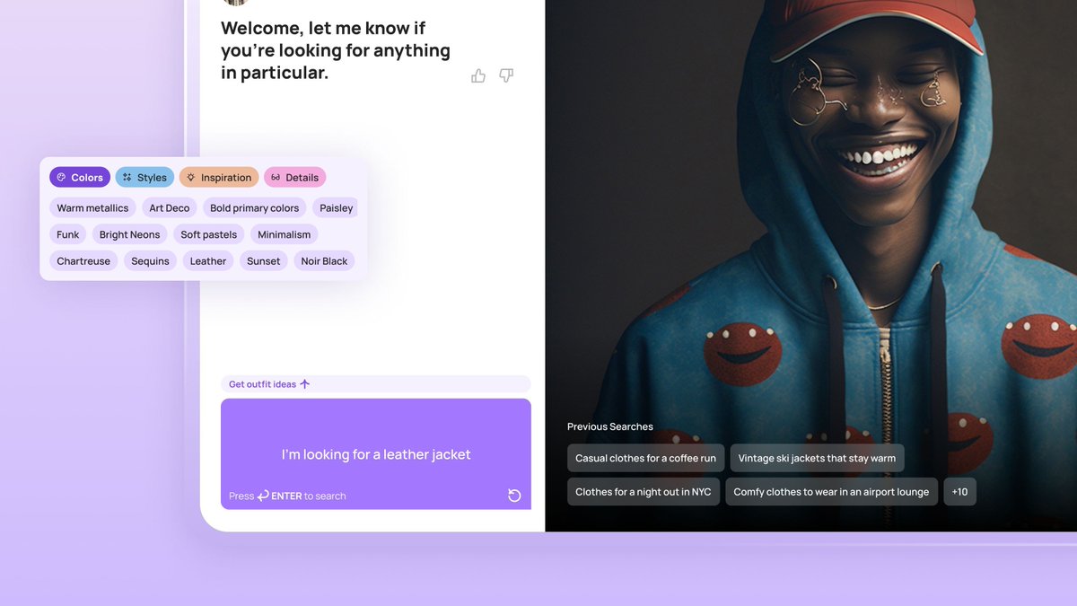
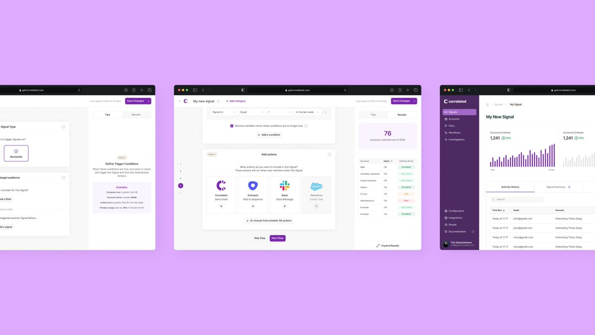
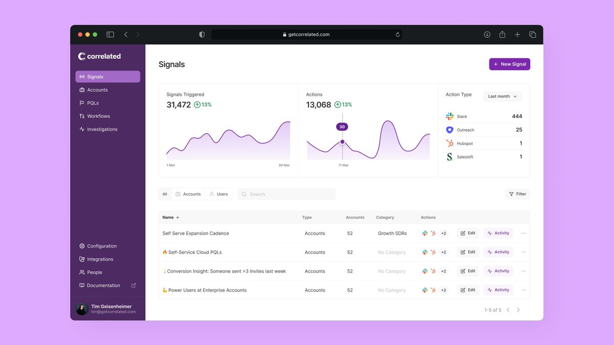
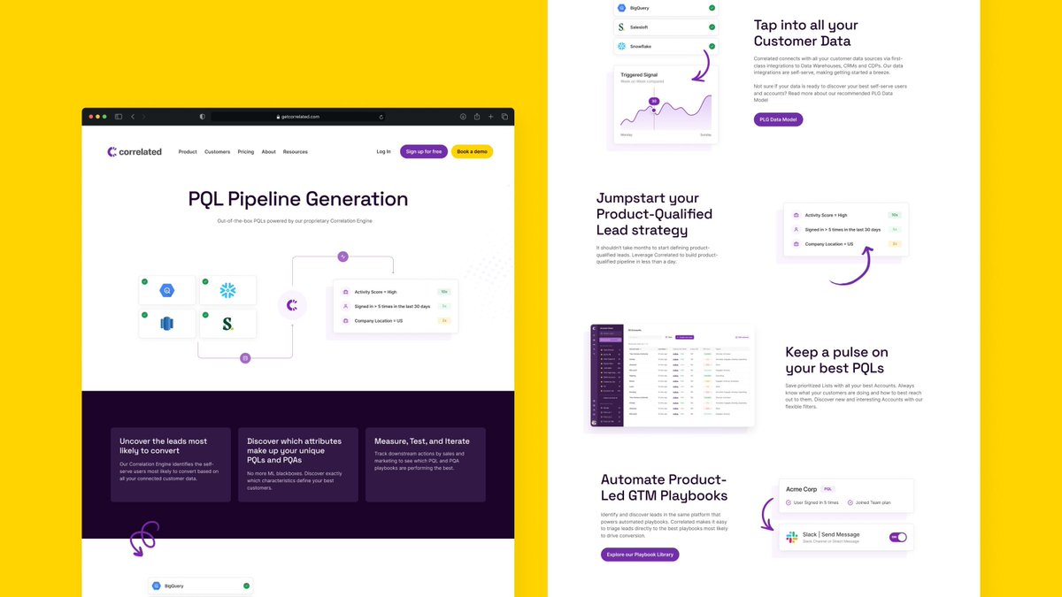
Let’s redefine the way users interact with data. We did this recently with our friends at @CorrelatedLabs. We redesigned the product interface, crafted an engaging onboarding experience, and produced stunning data visualisation tools. Here's what we did → https://t.co/BPSqz8XUTB
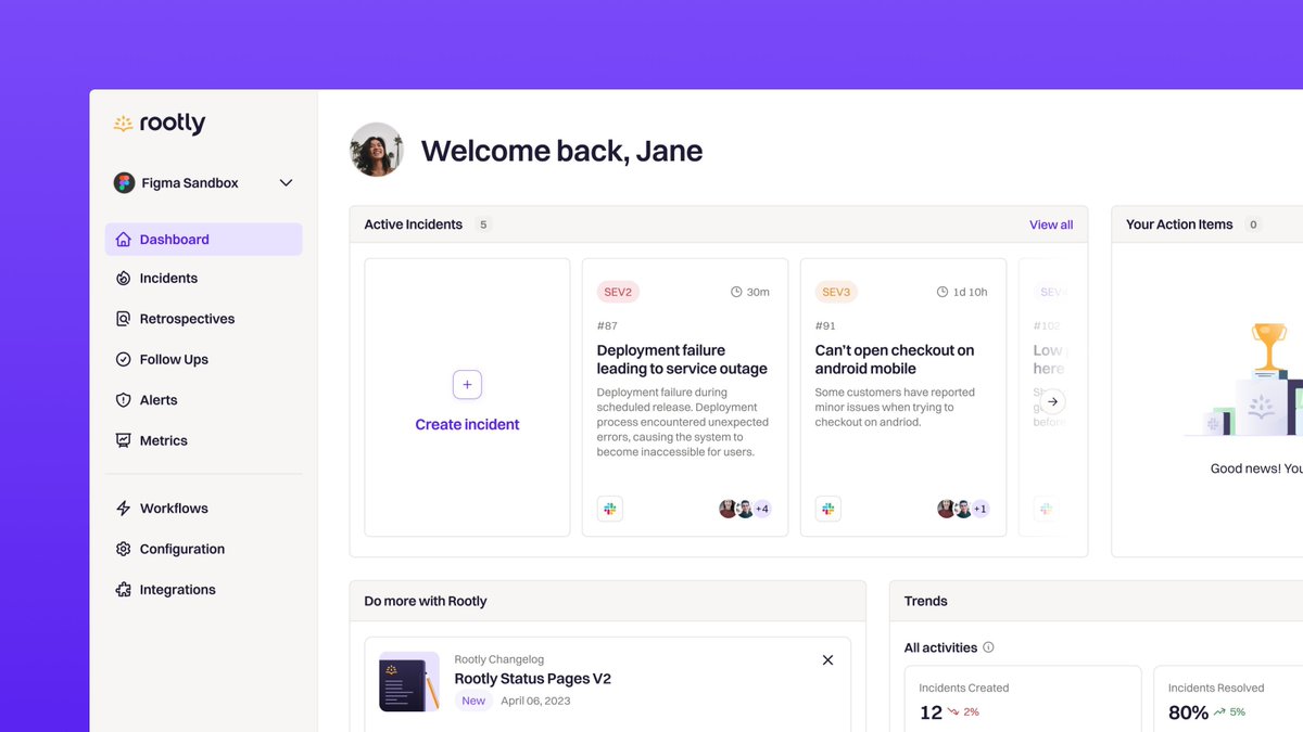
Working with @rootlyhq to enhance their product UX/UI was an exciting challenge. Industry giants like Canva, Cisco, and more trust their mission-critical tool. Our goal was to simplify complex workflows while maintaining their automation features. https://t.co/BHkMII7NDN
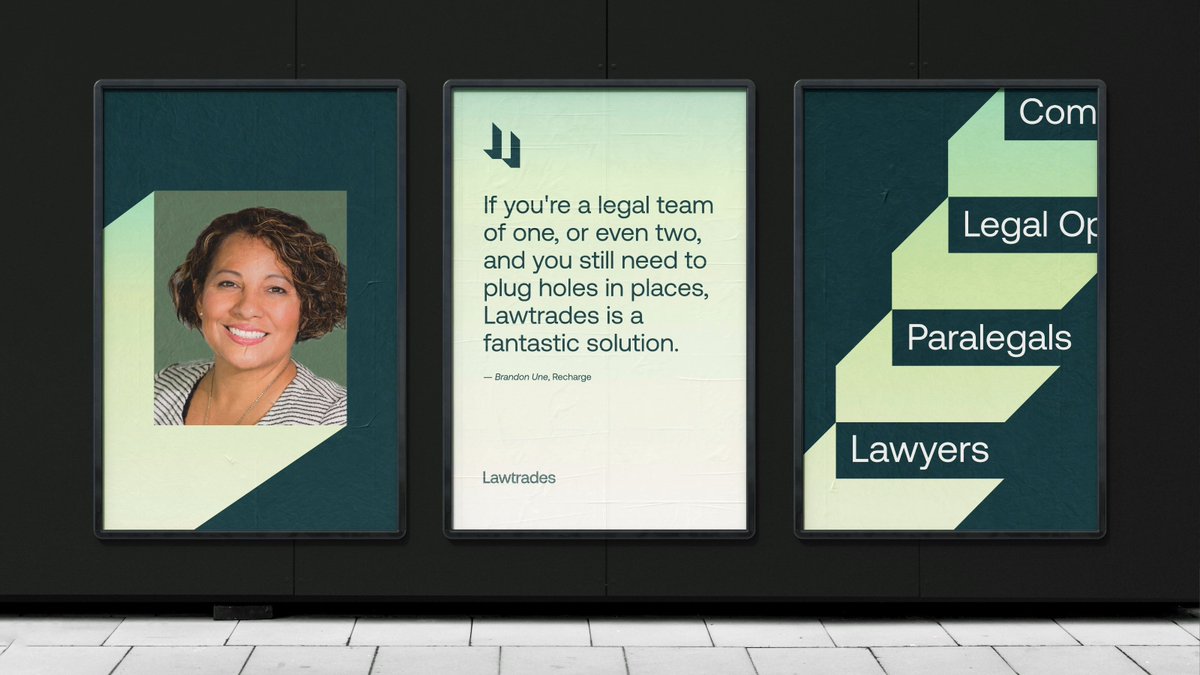
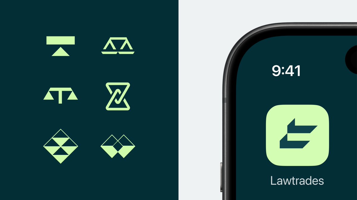
From brainstorming sessions to the final reveal – our collaboration with @LawTrades resulted in a brand that tells a story. Here's what we did → https://t.co/9tFLvXtiRm
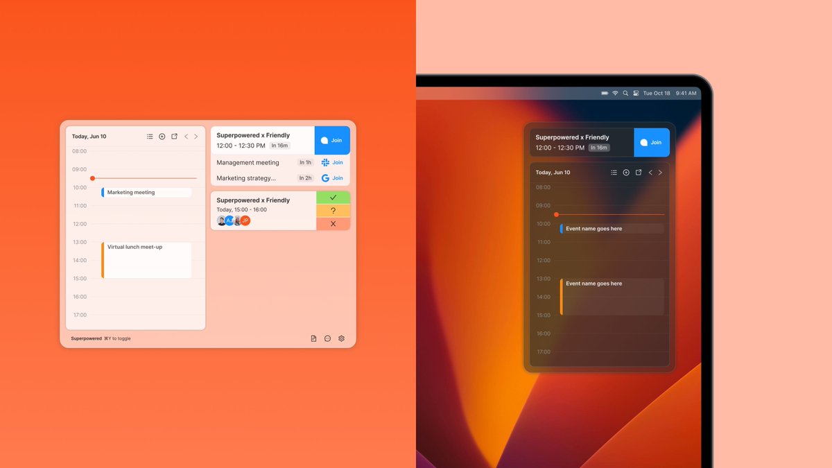
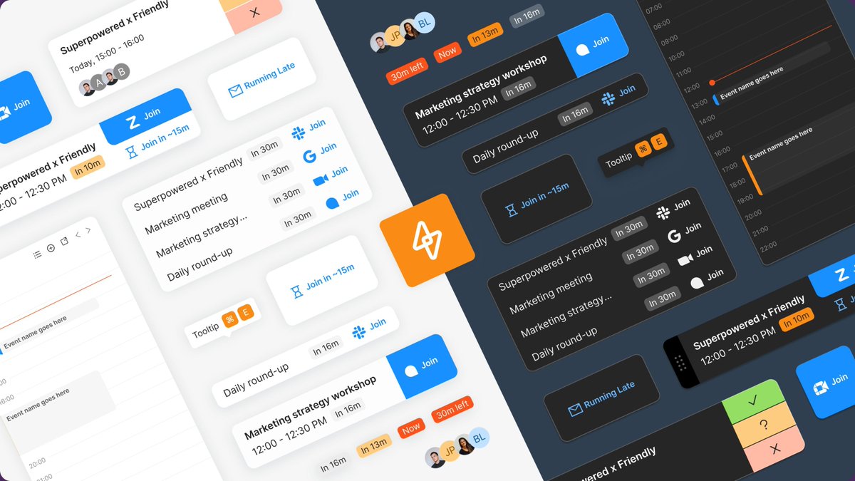
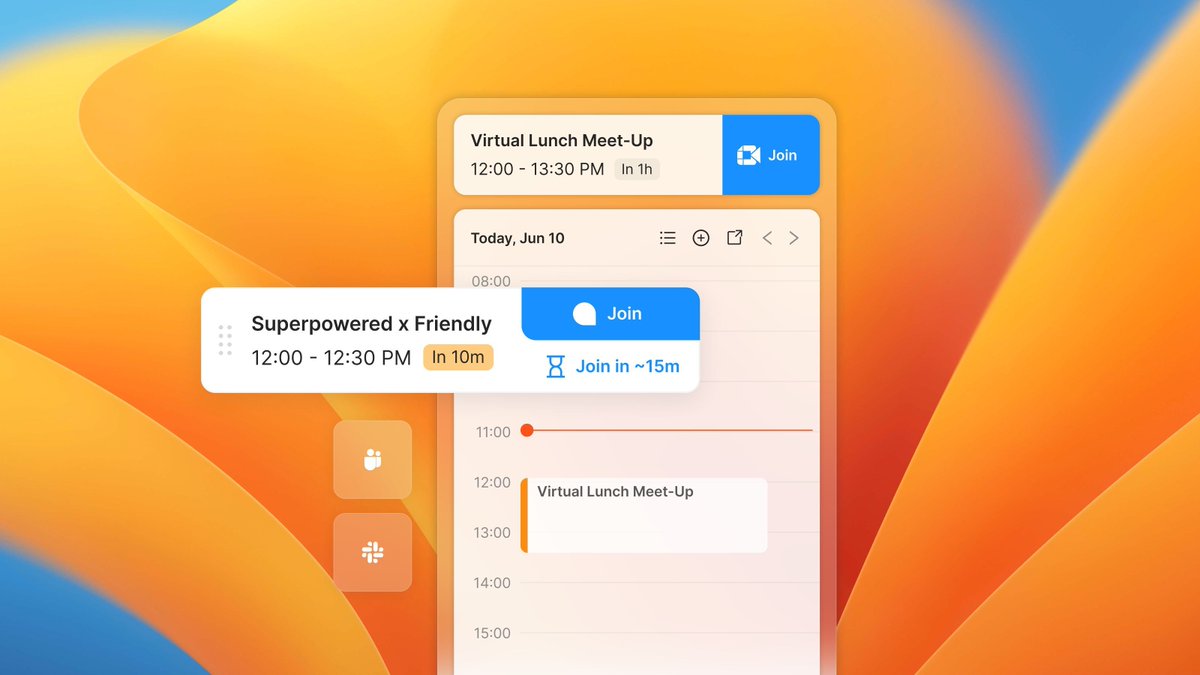
Amid rapid growth, we become your ideal design team ally. @SuperpoweredApp was growing quickly and realised they needed to update their features fast. So, we helped by creating a scalable & robust design system. Take a look at what we did → https://t.co/9oTDu7D6ut
At Friendly, we thrive on collaborative partnerships. Here’s how we worked with @MadeWithCapsule to reshape their user experience → https://t.co/N3ORAJqVtt
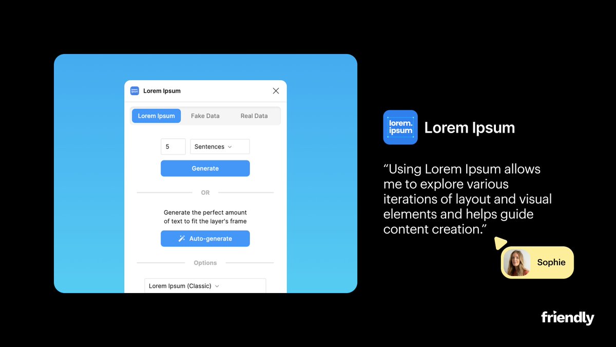
At Friendly, Figma is an essential tool in our workflow. Here are some of our team's favourite Figma plugins that we are loving right now → @LottieFiles, @unsplash, Lorem Ipsum by @divriots, Contrast by @willowtreeapps and @Compressifyio
(see more in thread)
Design systems set the stage for future growth. Our collaboration with @CorrelatedLabs laid the foundation for their expansion.
Here's what we did → https://t.co/BPSqz8Xn43
Norby's all-in-one solution is a game-changer for businesses of all sizes. See how we partnered with @bynorby_ to enhance their product and user flows → https://t.co/qTc19m3ql4