Techniques borne from the messy, non-linear mix of discovery, logistics, and empathy to create a worthy experience. Written, drawn, & curated by @juliemeridian
The currency of social networks is our ongoing attention and participation.
For that reason: future design-related projects and worthy links will be posted here instead: https://t.co/KhuKKfLRZ6
Spawning is building tools for artists to own and manage their AI training data
Visit https://t.co/Mz89OgvQmy to see if you are present in the 5.8 billion images used to train popular AI Art models
Sign up to opt out of, or opt into, AI training using our tools
🦾
#InformationArchitecture
Got a question about this article on cross-cutting topics, about how they differ from facets + tags.
To respond, I wrote a follow-up distinguishing these 3 concepts from each other.
I look forward to more feedback from you all!
https://t.co/sPcfLPSneE
The "average user" is imaginary and doesn't represent the people you think it does. Remember "mode" from statistics--the most frequently present configuration of what you're measuring. @cjforms gives us an example from a restaurant. https://t.co/NLW6hX0JSK
The Atomic Design Method by @brad_frost set foundational concepts for design systems; Hannah Heinson describes useful refinements to it that address different interpretations that have arisen from practice. https://t.co/ardowyfQbA
Artists I know are trying to figure out whether NFTs make sense for them. Since the language of NFTs is digital exclusivity, I’m responding with analog inclusivity — in the form of a zine. PDF here: https://t.co/o607skbl37
When designing a product for everyone, you need to take into account the diverse everyday experiences that impact the people who use it.
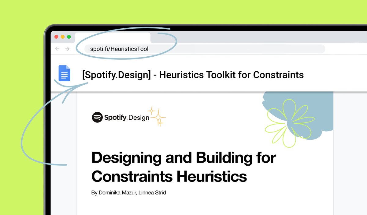
Check out the Heuristics Toolkit on the blog to learn how teams can design and build with constraints top of mind. https://t.co/UU8OVtWuXp
"Forget about extreme satisfaction and exceeding expectations — going from awful to meeting basic user needs would be a huge win."
-- @biggeidea on how the pandemic may have finally ended the scourge of customer "delight"
https://t.co/KK0yPsduDC
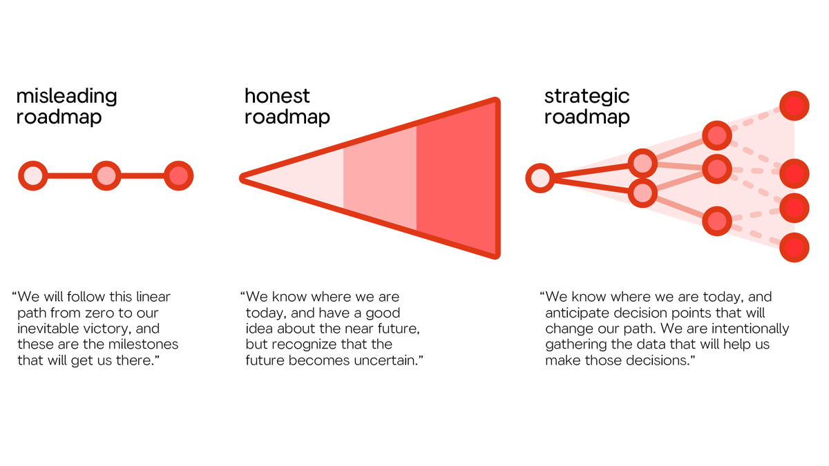
Linear roadmaps are misleading without a crystal ball for seeing the future. A roadmap that recognizes the existence of risk as time goes on is more honest. But an effective PM needs to anticipate possible branches, too - and create clear criteria for following each path.
A sensible null hypothesis for consumer products is that the user doesn't care about your product, doesn't have time to use it, doesn't understand its purpose, will skip any onboarding tutorials, won't read UI copy, will forget about it after signing up or installing it...
👇🏾
⚡️ UI design tip - Alternatives to disabled buttons.
❌ Disabled buttons can cause people to get stuck, they have very low contrast, and aren’t natively keyboard accessible.
(1/3) 👇
"Before you use transparency in a design project, consider *why* you are using it. And keep in mind that 'no substance is wholly transparent, and no material absolutely opaque'.” 💫 - @jfarrellstudio
https://t.co/uq1BkG9eLR
Cards for Humanity #figmaplugin
Cards for Humanity is Idean's tool for inclusive design. Deal the cards to get a person and a trait. Your challenge is to work out how you can design for their needs.
https://t.co/SI1ybVU6D2
@figmadesign
I recently came across the concept of "uniwidth" typefaces – every letter has the same width across different weights – and was surprised to find very little resources. So I put together my own 🤓✍️: https://t.co/G55OjJ4YYL