A freelance journalist who had never taken a statistics course wrote a 142-page book in 1954 that professional statisticians still hand to students before anything else, because nobody before him had bothered to explain the tricks in plain language.
His name was Darrell Huff. The book is called How to Lie with Statistics.
I read it in one sitting and spent the next three days noticing the tricks everywhere.
Over 1.5 million copies have sold in English alone. It became a standard college textbook in the 1960s and 70s. Seventy years later it is still in print, still assigned, still the first thing a working statistician reaches for when they want to teach someone to think clearly about numbers.
The man who wrote it was not a researcher. He was a freelancer who wrote how-to articles for magazines. He had no PhD, no academic post, no institutional affiliation. He just understood that numbers could lie without technically being wrong, and he thought someone should explain how.
His opening line sets the whole tone of the book.
"The crooks already know these tricks; honest men must learn them in self-defense."
That one sentence is the entire argument. The manipulation is not coming. It already happened. It happened this morning in the article you read and the chart someone showed you at work and the study your doctor quoted. The only question is whether you know what to look for.
Huff called the first trick the Well-Chosen Average.
When someone tells you the average salary at a company is $80,000, they have told you almost nothing. If the CEO earns $2 million and the 20 employees earn $30,000 each, the mean is $80,000. The median is $30,000. Both are technically correct. One is a lie. The person reporting the number chose which average to use, and they almost always chose the one that served their argument. Huff's rule: whenever you see an average with no description of which average it is, ask.
The second trick he named the Gee-Whiz Graph.
A line chart shows company profits rising. The line shoots nearly vertical, almost doubling in height across the chart. You feel impressed. Then you look at the y-axis and notice the chart does not start at zero. It starts at 94. The actual increase in profits was 3 percent. The dramatic visual was produced entirely by cropping the bottom of the chart. Nothing in the data changed. The picture changed everything.
Every news organization on earth still does this every day.
The third trick is the one that should change how you read every study you ever encounter. Huff called it Post Hoc Rides Again, which is short for the Latin phrase post hoc ergo propter hoc. After this, therefore because of this.
Cities with more churches have more violent crime. Therefore churches cause violence. The logic is airtight. The conclusion is absurd. Both church attendance and crime go up as population grows. The two numbers track each other because a third variable drives both. The correlation is real. The cause is invented.
Huff showed that this structure is not a rare mistake. It is the default pattern of almost every study reported in a newspaper, because causation is a boring word and because proves is a better headline than correlates with.
The fourth trick was the one that floored me. He called it the Semi-Attached Figure.
A headache pill company claims their product is twice as fast as the competition. The study behind the claim is real. The product was tested and the numbers are accurate. What the advertisement does not mention is that the study measured absorption rate into the bloodstream, not relief of headaches. The two things are related but not identical. The statistic is real. It is attached to the wrong conclusion.
Huff said this is the most dangerous trick of all because the number is never fabricated. You cannot fact-check a semi-attached figure by verifying the statistic. You have to ask whether the statistic actually measures what the claim requires it to measure.
Almost nobody asks.
There is one part of Huff's story that most people who recommend the book leave out.
Years after he wrote it, he was hired by the tobacco industry. He worked on a follow-up manuscript called How to Lie with Smoking Statistics, designed to cast doubt on the research connecting cigarettes to cancer. The book was never published. He testified before Congress in an attempt to undermine the statistical evidence against tobacco.
The man who wrote the clearest guide to spotting statistical deception spent the end of his career deploying those same tricks against evidence that was killing people.
That detail does not make the book wrong. The tricks he described are real and the defenses he taught are still the right ones. But it is a reminder that the tools in the book are neutral. Understanding how lies are built does not protect you from choosing to build one.
The crooks already know these tricks.
Some of them wrote the manual.
What is one statistic you have seen recently that you now think deserves a second look?
now that AI makes information consumption and transformation easier than ever I would like to bring back this old banger by Sasha Chapin about how books are not information transfer devices but subjectivity-merging devices
in fact I would say content consumption in general is more about subjectivity-merging than information transfer, which is why I am generally much more interested in writing by humans than by AI
Es la factura educativa.
Es el momento de institucionalizar los equipos de diseño educativo.
Los profesores solitarios tienen un techo. Y poco pueden hacer contra la IA… si permanecen aislados.
#DiseñoConversacional
La universidad medieval evaluaba con exámenes orales. Evaluar es exigir que el conocimiento se interiorice. Si la IA reduce el esfuerzo, la universidad debe reintroducirlo de otra forma. La IA está forzando otro cambio: menos tareas en casa, más interacción directa, más conversación socrática.
The New York Times: Si la escritura “aceptable” se automatiza, la educación superior debe centrarse en pensamiento crítico, identidad intelectual y evaluación relacional https://t.co/sBg3M1cwcF https://t.co/SAItfb3rGY
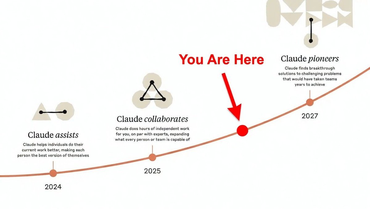
Anthropic is not a coding company. It is an intelligence company that chose to focus on coding first. As Claude's intelligence scales, it will be applied to every endeavor where human intelligence is useful. Understanding this is the key to understanding the future.
In the movie "A Beautiful Mind", Russell Crowe writes the following formulas on the blackboard in his MIT class.
Movie directors were told by advisers that this set of formulas was subtle enough to be out of reach for most undergraduates, yet accessible enough that Jennifer Connelly’s character might plausibly dream up a possible solution.
Source: A Passion for Mathematics: Numbers, Puzzles, Madness, Religion, and the Quest for Reality by
Clifford A. Pickover
It could be fun, but it shouldn’t be unusable.
The problem with the new icon is that they placed the light on the left and right sides, which makes the icon hard to see at smaller sizes, especially if users have the glass effect enabled.
Put the light in the center and increase the contrast a little so that, even if you blur the image a little, it is still clearly identifiable as the Spotify logo.
Esta noticia es terrible a unos niveles que no os hacéis a la idea. Quiero explicaros por qué esto es una catástrofe para los que amamos el cine y la televisión.
Dentro hilo: