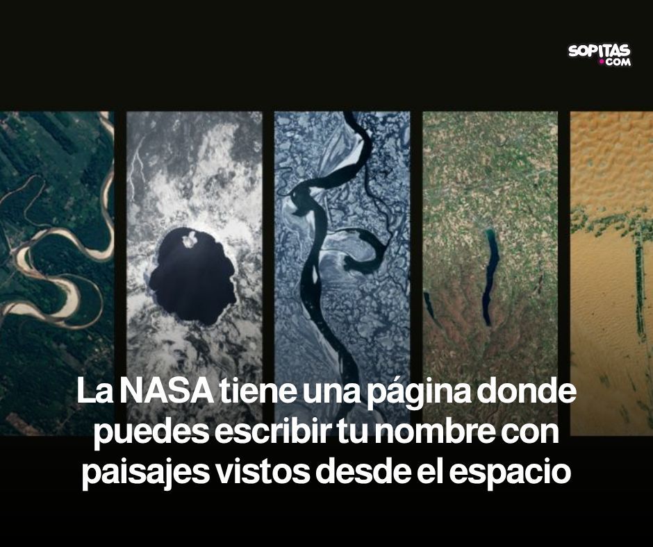
¿Te imaginas escribir tu nombre con paisajes vistos desde el espacio? La NASA lanzó una página interactiva que convierte imágenes satelitales de la Tierra en letras y se ve increíble ✨ https://t.co/EnZg9A8BFq
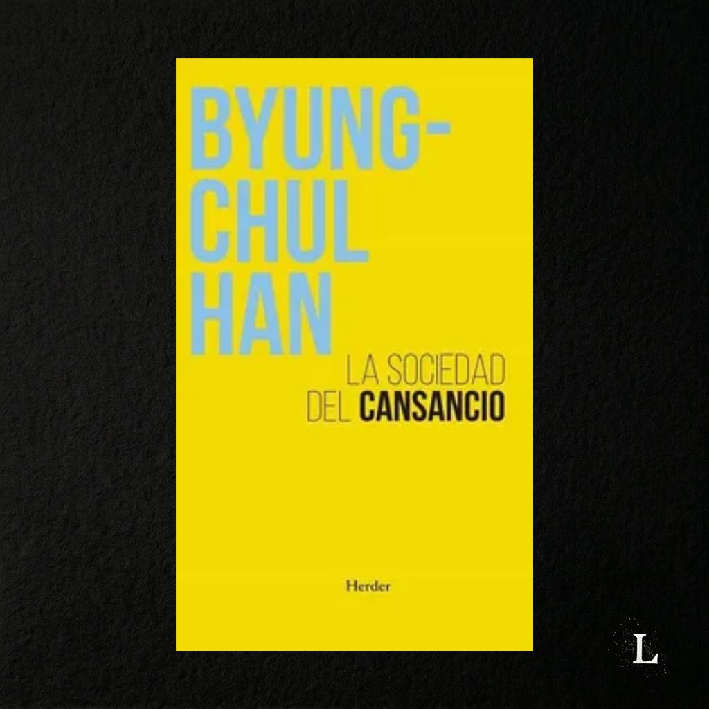
📖 La sociedad del cansancio — Byung-Chul Han (2010)
DESCARGA GRATUITA https://t.co/x6rxasvf3b
Prólogo
"El mito de Prometeo puede reinterpretarse considerándolo una escena del aparato psíquico del sujeto de rendimiento contemporáneo, que se violenta a sí mismo, que está en guerra consigo mismo. En realidad, el sujeto de rendimiento, que se cree en libertad, se halla tan encadenado como Prometeo. El águila que devora su hígado en constante crecimiento es su álter ego, con el cual está en guerra."
🧵1/8
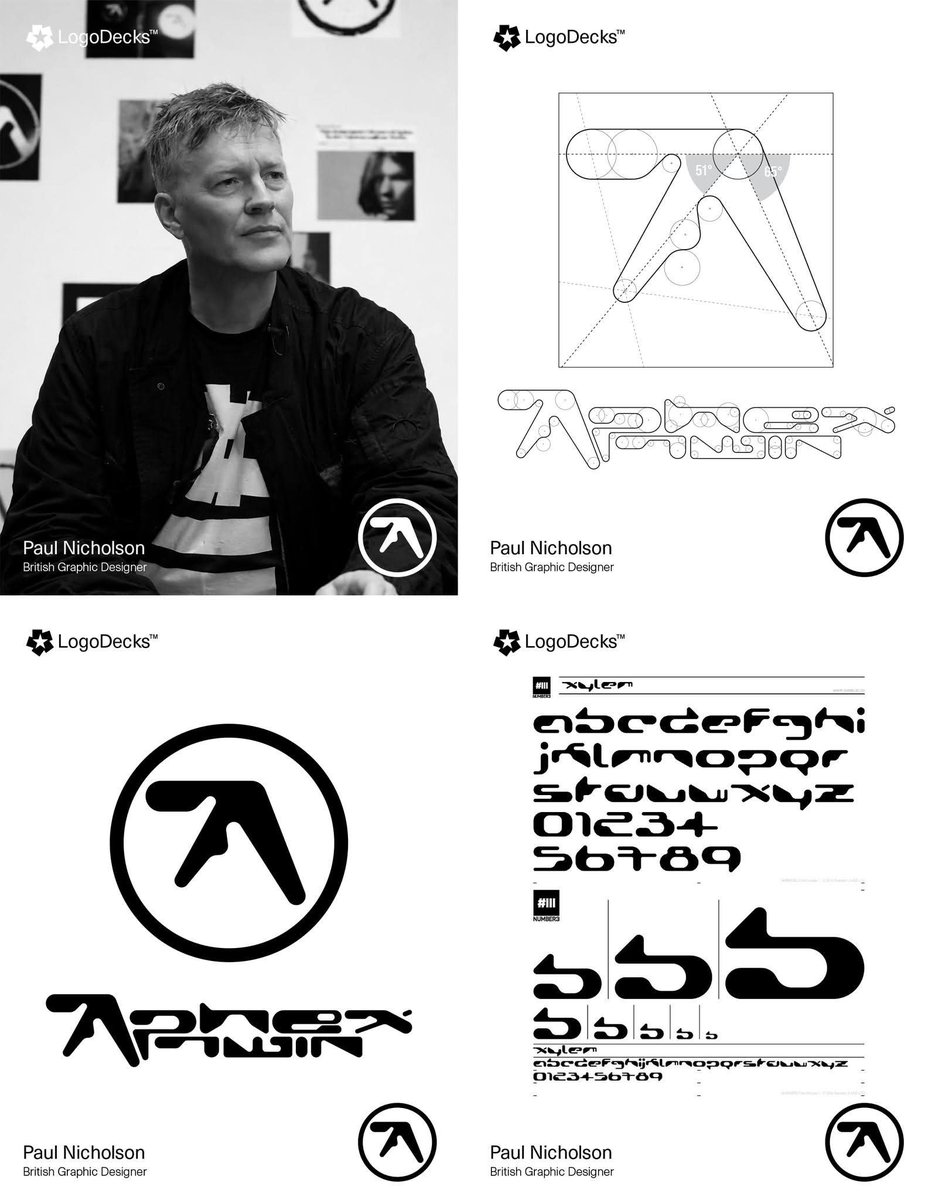
Aphex Twin’s Logo Wasn’t Drawn — It Was Engineered: The Paul Nicholson Story.
Paul Nicholson is a British graphic designer whose career spans music branding, typography, and visual identity work, most famously for his long-standing collaboration with Aphex Twin. Beginning in the early 1990s, Nicholson developed a reputation for clean, conceptual mark-making that merges technical drafting discipline with experimental visual language. His Aphex Twin logo became a defining example of this approach: a carefully constructed geometric form composed of controlled curves, and calculated negative space. Rather than sketching a loose symbol, Nicholson engineered the mark using measured proportions so that every stroke thickness and angle relates harmoniously to the whole. Beyond this iconic design, he has produced record sleeves, typography systems, and visual identities for electronic music labels and artists, consistently emphasizing structural clarity and symbolic strength. His work demonstrates how minimal shapes, when precisely constructed, can carry strong cultural meaning and remain visually durable across decades of reproduction and reinterpretation.
#logodecks