🔊 SOUND ON 🔊
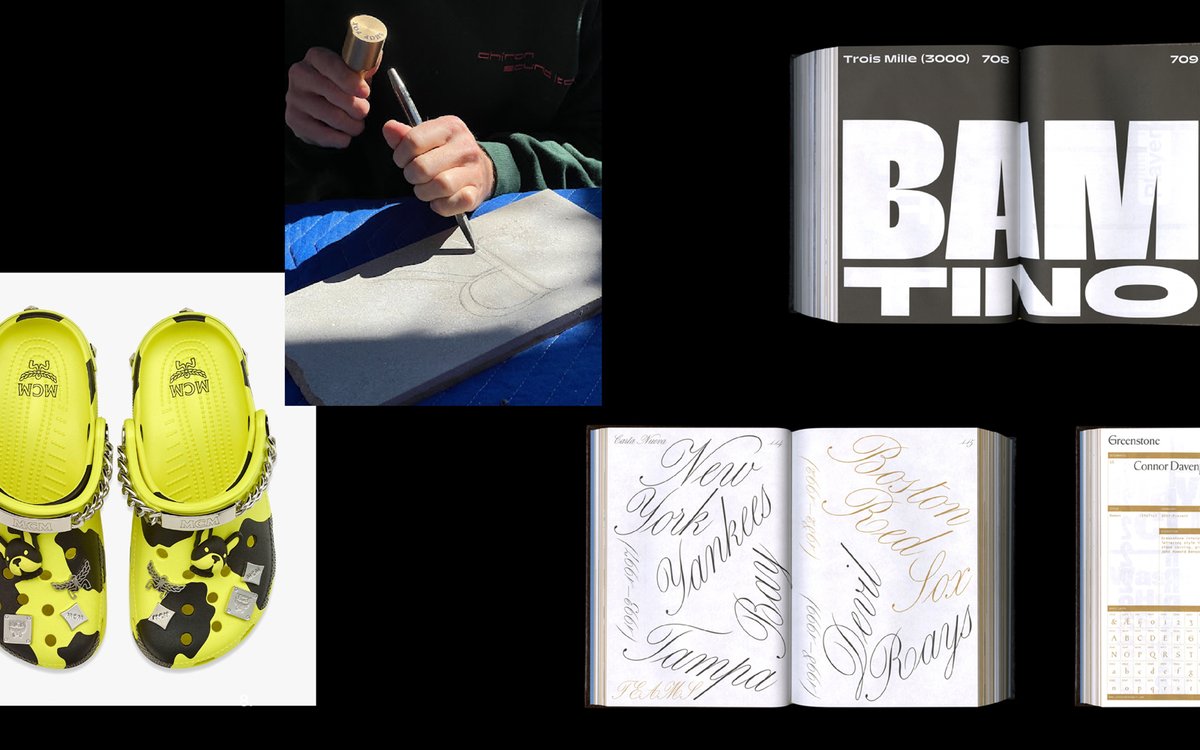
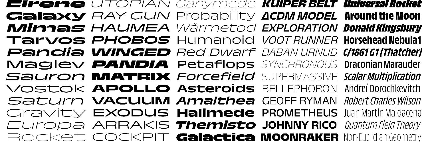
NEW RELEASE!!! we are extremely honored and overjoyed to present 🏁 Trois Mille 🏁 by 👑 @marcrouault 👑
5 years, 7 weights, 21 widths, 294 fonts, and over 20,000 midi-chlorians
This is a big one folks! 🚀🚀🚀
https://t.co/gZcWDcW1YD
Sharp FM 011! @lovefingers blesses us with a late summer golden hour of oddball favorites. Design and layout by @_JustinSloane using Doss Acid by @marcrouault and Octave by Josh Finklea ☁️ mix, tracklist, and full feature here https://t.co/EmmOEzgAOZ
End of Summer Update !!!
https://t.co/ipFPAFdpAY
🍻 Core team reunion in Pt. Reyes, CA
👽 New fonts by Lucas Sharp, @marcrouault
👩👧👧 Welcoming Emma Piercy & Lucile Billot
👩🎓 Congrats to the Malee scholars!
& more
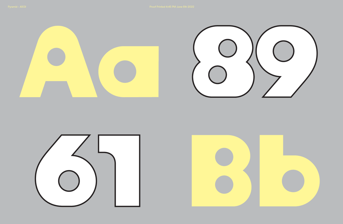
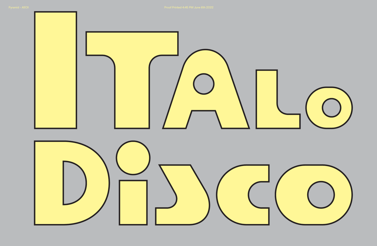
⚠️ Pyramid by @marcrouault ⚠️
type-in-progress takes inspo from the vernacular world of hi-fi audio logos, vintage rave flyers, retro-futurist aesthetics, and maybe even some Memphis-era shapes
Refreshingly wonky! This #FontFriday pick takes you to France 🇫🇷. Tarnac and Tarnac Sans, designed by @marcrouault, published by @SharpTypeCo, is a striking slab serif and sans-serif superfamily, that originated from classic French road sings. 🪧
Influences Capsule 3/3: Liquid Sky long sleeve tee & zippered tote available 10/27 at 11 AM ET.
Tee: https://t.co/YKxXyws5sP
Tote: https://t.co/Dm71yy6M4G
Design by Justin Hunt Slone, original art by @ZorroRey + typeface by @marcrouault.
NEW RELEASE:🐄🥖🇫🇷 Tarnac 🇫🇷🥖🐄
by @marcrouault
Tarnac is a fresh take on the Égyptienne slab-serif styles of early 20th century France.
https://t.co/n4pnuJYD2Y
We have a big one today friends
Carta is the debut typeface of our studio MVP, My-Lan Thuong
It's hard to put into words our admiration for this incredible woman and rare typographic talent. Carta is both a work of art and a feat of engineering.
https://t.co/tPSz4nN0DH
🔮
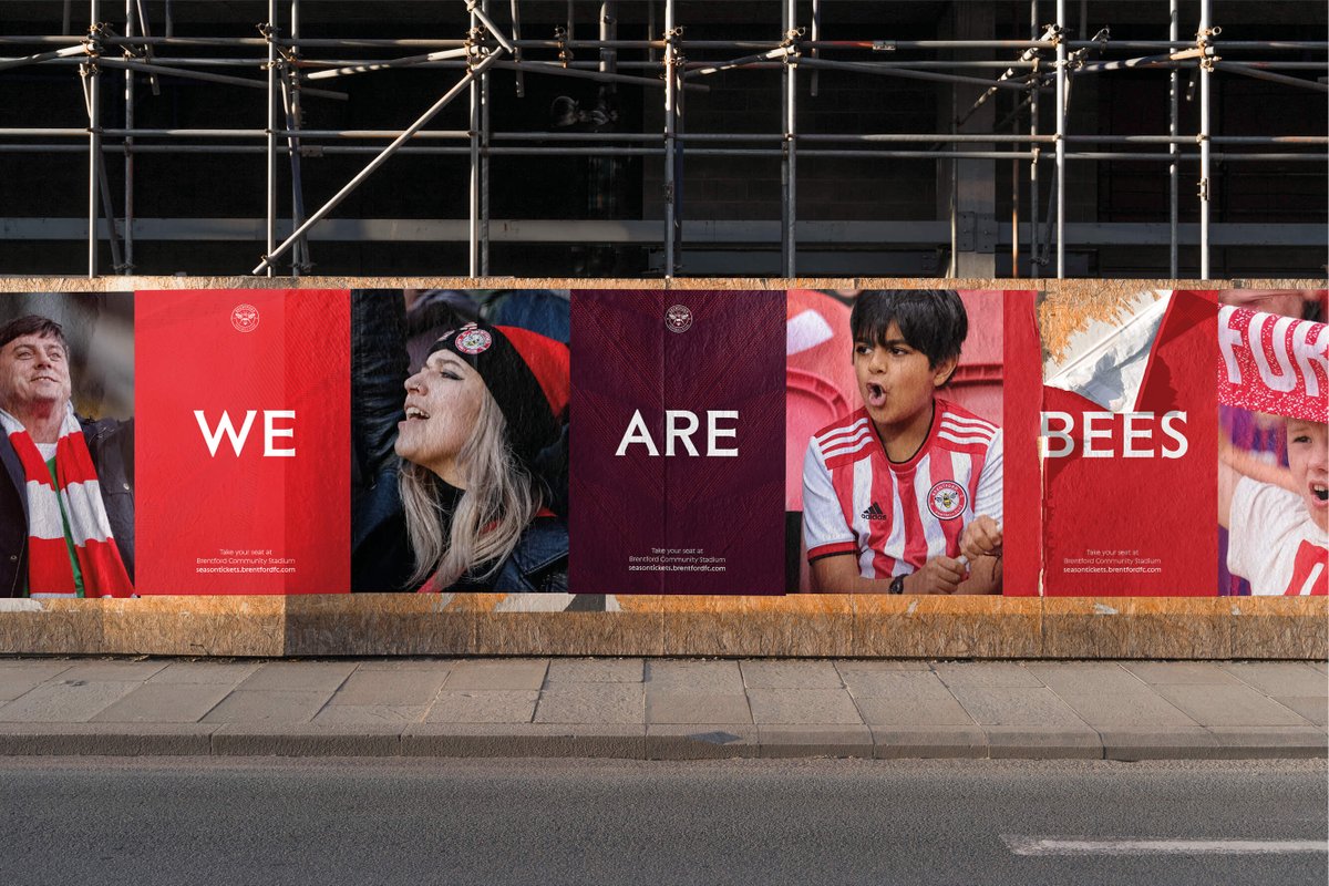
NEW F⚽️NT — Last week was revealed the @BrentfordFC rebranding by @ThisawayStudio
for which we designed an exclusive typeface, Sting.
https://t.co/ICn3Smqtta
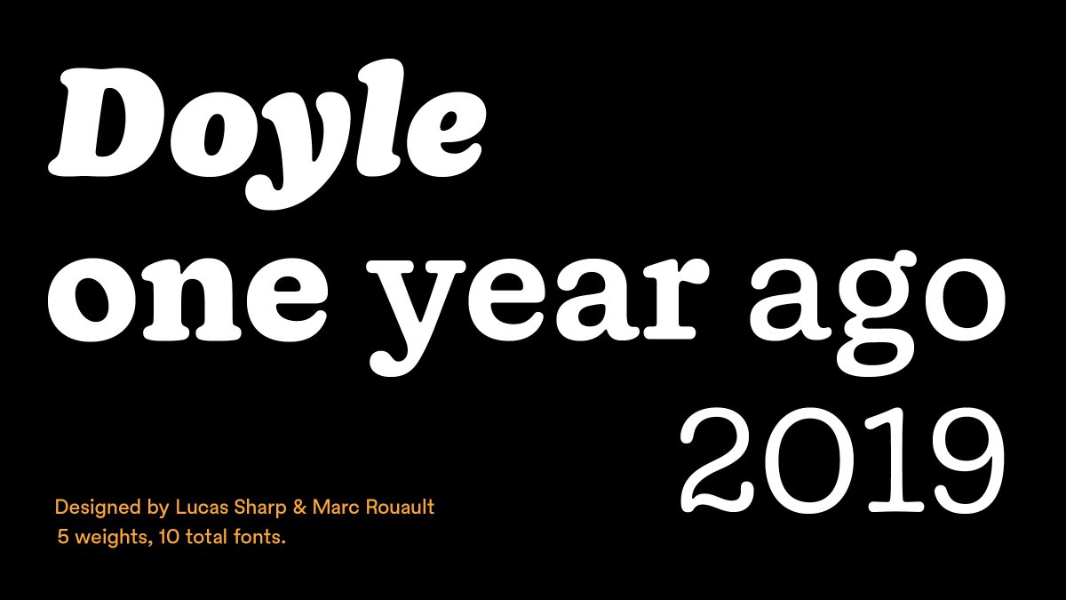
It's been a year since we released Doyle! Flexing from a light typewriter skeleton to a hearty and full posture, Doyle synthesizes classic styles in 20th century typography to create a quirky, expressive family.
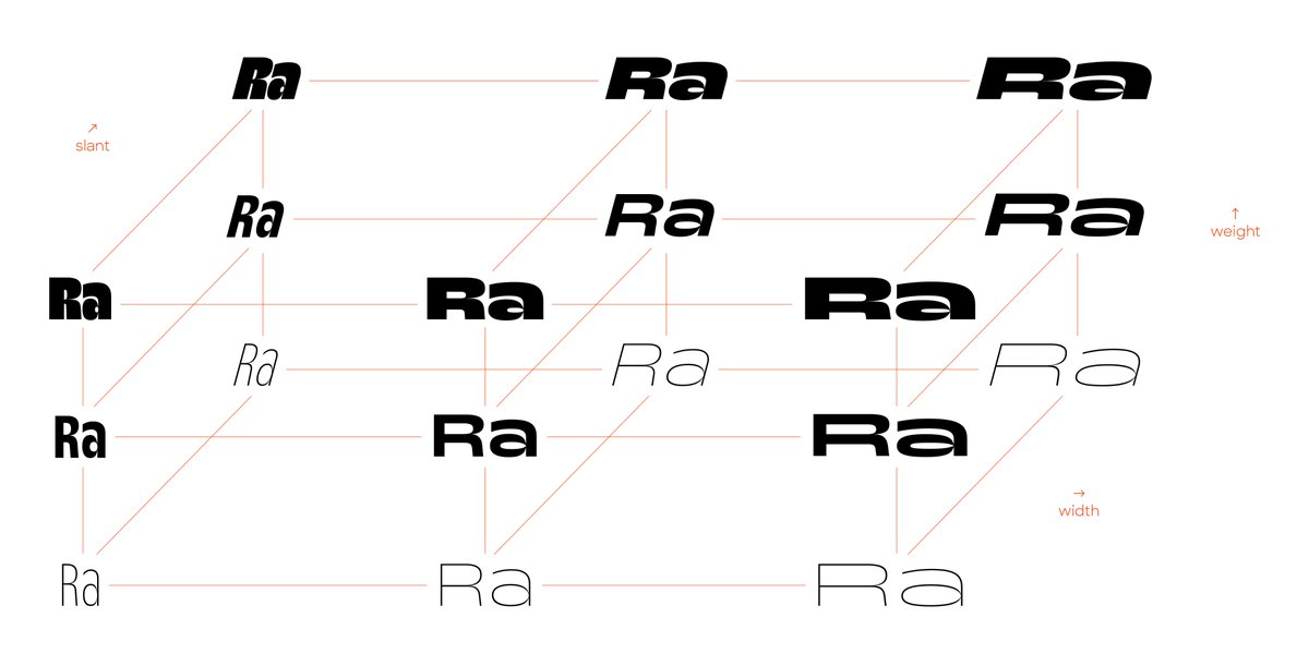
@ArrowType@Dunwich_Type@SharpTypeCo You right about the contrast issue between Black and Thin, then there is a roundness issue between Narrow and Wide. So it's 5 more masters for roman, same for italics.