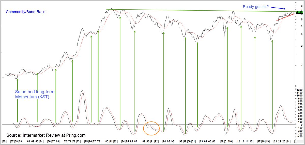
The commodity/bond ratio is the ultimate inflation/deflation relationship. It's now close to mega resistance at the 45-year trendline. The KST is bullish but hesitating. The ratio itself is just above the red support trendline. A resolution is coming soon probably on the upside.
Consumer expectations are low and warn of a possible recession. This chart shows the glass could be half full, as upside reversals from a depressed level were great stock buying opportunities . Only one false positive since 1979. But it's wiser to wait for an actual turn.
Consumer expectations are low and warn of a possible recession. This chart shows the glass could be half full, as upside reversals from a depressed level were great stock buying opportunities . Only one false positive since 1979. Cut it's wiser to wait for an actual turn.
This chart shows that gold discounts future commodity prices. To learn how this is the first step in the chronological cycle that determines future waves in the annualized CPI read the article Why a Firming Up in the CPI May be Closer than You Think https://t.co/UDNsuU5FdK
Our Global Financial Velocity (GFV) Indicator combines the momentum of global stocks, bonds and commodities into one series. The lines show equities are vulnerable when the GFV MA starts to turn down. With so many bulls going into 2025 the recent drop could be problematic.
When the price oscillator for Michigan Con Sent is above zero stocks are bullish. Below zero stocks are vulnerable but not necessarily bearish. Now the oscillator is rising and the Index is in an uptrend, signaling the all-clear. For more checkout https://t.co/CWhkt5p5SJ
This chart is potentially deflationary as the Commodity Bond ratio has begun to break down, joining the 10-year yield. Oil is right at the edge. All are below their 65-week EMA. This would be reversed with a break above the green line but now now it looks deflationary.
Arrows show upside reversals in the Coppock Curve for PPI Finished Goods is usually followed by an up wave in CPI inflation. March upswing likely to extend in April due to firm commodity prices. Go here to article on why Fed likely to raise not lower rates https://t.co/UDNsuU6d3i
This chart tells us the position of the long-term trend in 2024 is similar to the politically unstable year of 1968. To read the complete article go here
https://t.co/adkWLDPTmJ
Looking for a rate decline to stimulate stocks ? Think again. 6 times since 1964 the FF rate has hit a cyclical peak. Stocks declined because of a weaker economy. The 3 exceptions were preceded by a bear market. Either way stocks decline so pray for stable rates
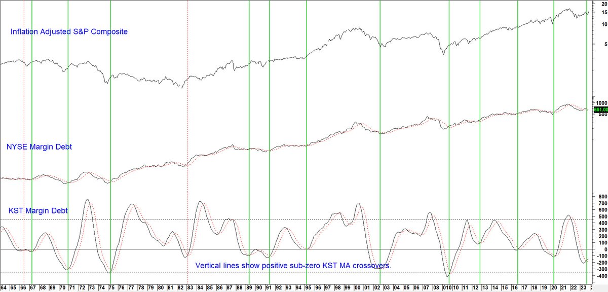
Expanding margin debt is bullish because it means improving confidence and more money flowing into equities. The vertical lines show when the smoothed momentum (KST) triggers sub-zero buy signals.
Its current bullish subdued level argues for a multi- month rally.
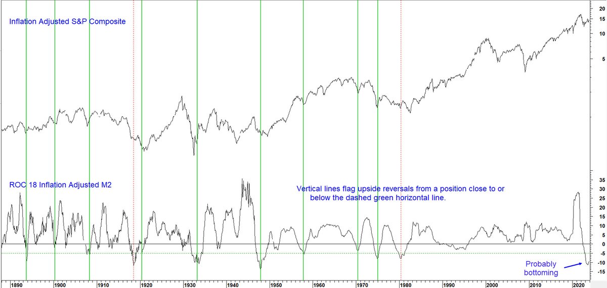
The vertical lines tell us when the indicator bottoms out from close to or below the -5% level. There were nine examples of a sub -5% reversal. The average annualized gain over 12-months for REAL stocks was 16.2%. Buy hold was 4%.
Read article here https://t.co/tc2qZr9quA
Is it different this time?
Our Commodity model has just given a buy signal but this has been preceded by a trend of rising rates. Invariably rates have fallen prior to previous signals reflecting an injection of liquidity. Will this put a cap on the bull market?
April saw our Financial Velocity Indicator trigger its eighteenth buy signal since 1965. Only two of those failed, so we think those are good odds to work with!
For more like this check out the Intermarket Review at https://t.co/CzIeIcQoeu
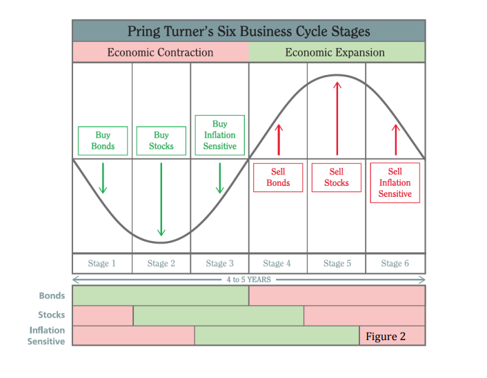
Pring-Turner stage analysis is a useful construct, linking stock, bond, & commodity cycles to fluctuations in the real economy. Guessing that stage 1 is currently underway, while acknowledging the potential for variability & overlap in a construct of this nature.
@mark_ungewitter Thx for sharing Mark!
We identify the stage with our Pring Turner barometers. They are constructed from proprietary technical, and inter-market relationships. At this point they are wavering between stage 6 or stage 1, but could change quickly given the volatility! Stay tuned!
This chart shows improvement in confidence leads economic recoveries. To read more about it and read a brief article "A Funny Thing Happened on the Way to the Recession", please click on the link below.
https://t.co/KLey7q0SeB