"Continue with Google" can increase B2B signup conversion by 20–60% (Auth0).
Teams treat it as a developer checkbox. It's actually one of the most underrated growth levers in B2B SaaS.
It's not just an auth feature. It's a product decision.
"The orange cat at sunset" is harder to crack than "P@ssw0rd!" and way easier to remember.
Complexity rules don't make passwords safer. They just make them more predictable.
Even the man who wrote them publicly apologized.
The best onboarding doesn't ask users to make decisions. It gives them enough context to make the right one.
Most SaaS invite flows fail this test - generic login page, no workspace, no inviter. Even though the invite link already knows everything.
Users don't think in terms of passkeys. They think in terms of fingerprints.
"Enable passkey for faster sign-in." describes a feature.
"Sign in with your fingerprint - no password needed." describes an outcome.
Same flow. Different conversion.
a very familiar internet journey:
login → wrong password → wrong password → forgot password.
i type the wrong password with absolute confidence. every. single. time.
anyone else? 🥲
#UXDesign
"onboarding" in most B2B SaaS:
- empty dashboard
- sidebar of features you don't recognize
- link to a help article
that's not onboarding. that's a starting point.
the first screen should have one job: tell the user what to do next.
#ProductDesign
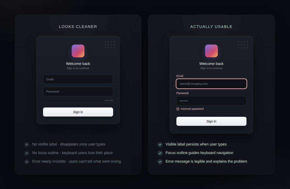
labels, focus outlines, error messages.
the things teams remove first to "clean up" the login screen are usually the ones holding it up.
the screen looks cleaner. until someone tries to use it.
#ProductDesign
"just use magic links" is one of the most common recommendations in auth UX.
it's often right. but magic links don't remove friction. they move it.
the real question isn't "should we use magic links?" it's "which friction are we asking users to accept?"
#Authentication
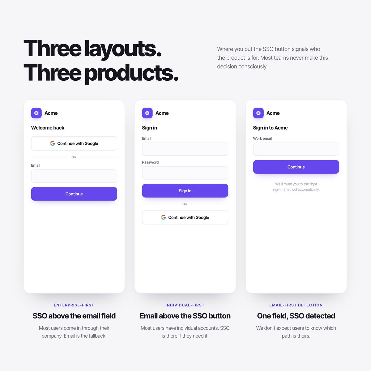
Open three B2B SaaS products. Look at where they put the SSO button.
It's in a different place on each one.
SSO above email signals enterprise. SSO below signals self-serve. Email-first signals neither.
Questions that look like design questions are product questions.
#B2BSaaS
Pulled every password reset error state we’d designed into one Figma frame.
There were 23. I expected 10.
What stood out was the inconsistency:
- same problems explained differently
- errors with no next step
- tone shifting from human to legal disclaimer
#Authentication
Open your product's login screen. Look at the placeholder text in the email field.
Can you read it instantly? On your phone? In sunlight?
WCAG requires 4.5:1 contrast. Most placeholder text fails it. The fix is one hex value away.
#Accessibility
Most password reset flows end with a step that does nothing.
User clicks the reset link. Sets a new password. Confirms it. Then the product sends you to the login screen to type it all in again.
You proved you own the email 30 seconds ago.
Just log them in!
#UX#ProductDesign
Why don't buildings have signs saying "you are entering the building"?
Because the space communicates through light, material, ceiling height.
Most login screens skip this. Every option at equal weight.
You can't signpost your way out of a bad layout.
#UX
Microsoft is rolling out passkey changes across entra ID tenants this spring. More B2B users about to hit enrollment prompts whether the product designed for it or not.
B2B SaaS passkey adoption is at 28%. fintech is at 60%.
That gap is a design problem, not a protocol problem.
@sathyajith_ps That last line is the real issue. Identity recovery assumes continuity, but reality allows identity drift. The weakest link often isn’t auth it’s the recovery path.
Instagram removing the preview screen for DM "Instants" is wild to me. 🫣
They crammed the new Instants button into an already bloated space, but the worst part is the zero friction. You tap and it sends instantly. 😭
Who else fell for the "Instants" send?
#UX#Instagram