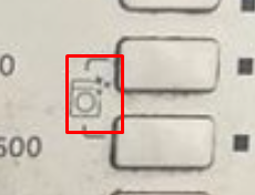
@designloomco Really beautiful, the shadows, the textures. Only clock hands bug me a little bit. They look to sharp compare to other elements. I can understand if this is intentional, to show time more precisely.
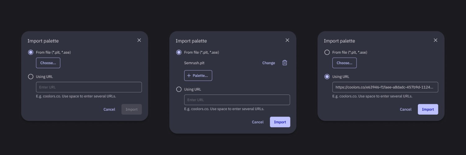
@DenisJeliazkov Why no default selected? "Chevrons" looks broken (every had it's own form, slughtly diff from closest one) on my full hd monitor, but I guess its compression did this :(
@_designwizard If we can ignore dark mode, using more bold colors is dangerous but still a viable method of presenting brand. So if you want to push brand colors more go ahead, I’m all in for that. So both good for different reasons choose yours. I stand for dark mode —safer and closer 2 others
@imlucasfields I can read it, but it strikes me that simple shape has so much effects (metal, shadows) to it. Also there are no adaptation in this logotype, it steel and static, more like:
@hobdaydesign Scenario needs to be odly specific, to consider multitasking view in your app. Also multitask has 2 views (vertical + horizontal) and there is a swipe on the bar to switch between apps, which also has a different behavior. But the point about “find it impressive” still stands.
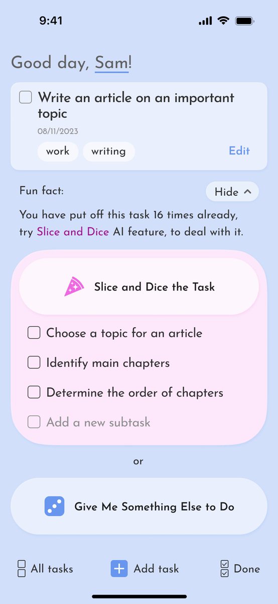
2024 январь #ddw - Detepr Design Workout. s09e01: One Item List. Средняя оценка 1.75 из 5. Первый раз получил письменный отзыв: «Очень сложная иерархия. Подумал, что розовая карточка это тоже таска»