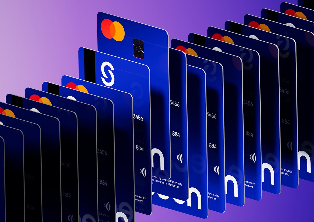
I’ve designed 20 fintech websites.
Most designers don't realise designing for fintech is TOUGH.
Those Dribbble mockups fall apart the second real users touch them.
Those crazy colours/gradients would never build trust.
Buttons can't seem too salesy.
There's no room for any error because users will think something's off and not trust it.
It gets even wilder.
EVERYTHING need to be compliant with the law.
Mastercard will shut down your merchant account if its logo is 2px off-brand, NOT KIDDING.
Visa has an 82-page brand guide that you have to STRICTLY follow.
Privacy policies and APR rates must be shown without ruining the UX.
I could go on and on.
Building a fintech website takes much more eye for detail and knowledge than any other industry.
Because a beautiful design means NOTHING if it can't pass legal review.
I co-designed an internal Airbnb product.
They have offices across multiple continents and chefs are cooking fresh meals for employees, breakfast, lunch and dinner.
They needed a product that would manage it all.
Managers could approve menus, check ingredients for allergies, and ensure everything was compliant.
Employees could see what was being served that day at their office, Dublin, San Francisco, wherever.
What stood out to me was that the design quality was identical to what customers see when they book a stay on the app.
Same design system, same attention to detail and same level of craft.
Great brands don't only design for customers.
They design even for their own people.
Years ago, I was designing for Google.
Working with their PMs was humbling.
They'd catch mistakes I didn't even see.
They'd show me exactly how many pixels I should move the buttons.
The PMs were as good as the designers.
No wonder Google is a world-class brand.
Some AI brand guidelines out there are terrible.
Random product shots with tote bags, billboards that make no sense.
Brand guidelines need to be product-focused.
Show:
- real colours that work digitally and pass accessibility standards
- a logo that scales from dashboard icons to landing pages
- typography that's readable on screens, not just posters
- website hero explorations so founders can see what they'll actually launch with
- buttons, icons, layouts, the pieces that define the brand in the product
The best guidelines combine brand attributes with real UI.
Not a logo on a mug.
I've designed 20 fintech websites.
These are legal requirements that kill designs before they launch (99% designers don't know these):
- Privacy policies and APR rates must be shown without ruining the UX
- Accessibility requirements aren't optional – WCAG compliance is mandatory for financial services
Then the partnership rules kick in:
- Visa has an 82-page brand guide you have to strictly follow
- Mastercard will shut down your merchant account if its logo is 2px off-brand
Then market restrictions:
- EU users need different consent flows than US users because of GDPR"
- Certain states require additional licensing disclosures on every page"
(e.g., money transmitter licenses vary by state)
I could keep it coming...
Nothing sexy about fintech websites, tons of legal stuff.
But that's why I keep designing them, because it's like putting together a puzzle.
Don't hire designers to make the products.
1. Open Lovable
2. Tell it what product you want
Boom, it's done.
But caution, when you do that, you'll have a bleak, terrible-looking product that will never survive the market.
AI can build a product in minutes.
But it can't figure out your positioning, your users' pain points, or why your product should exist.
That's the designer's job.
I've seen startups fail before launch because they didn't design.
"Get to PMF, ignore everything else. Design later."
This advice kills products, even if it makes sense on paper.
Shipping products taught me that PMF IS design.
A good design tells people, "this feels safe".
A good design makes them trust you with their money.
Design doesn't distract from PMF, it helps it.
Without it, the MVP might die before getting a real chance.
It feels broken.
It feels amateur.
It feels like a risky bet.
The right people won't even bother testing it.
I'm not saying spend months on your logo.
But don't ship garbage and expect users to see past it.