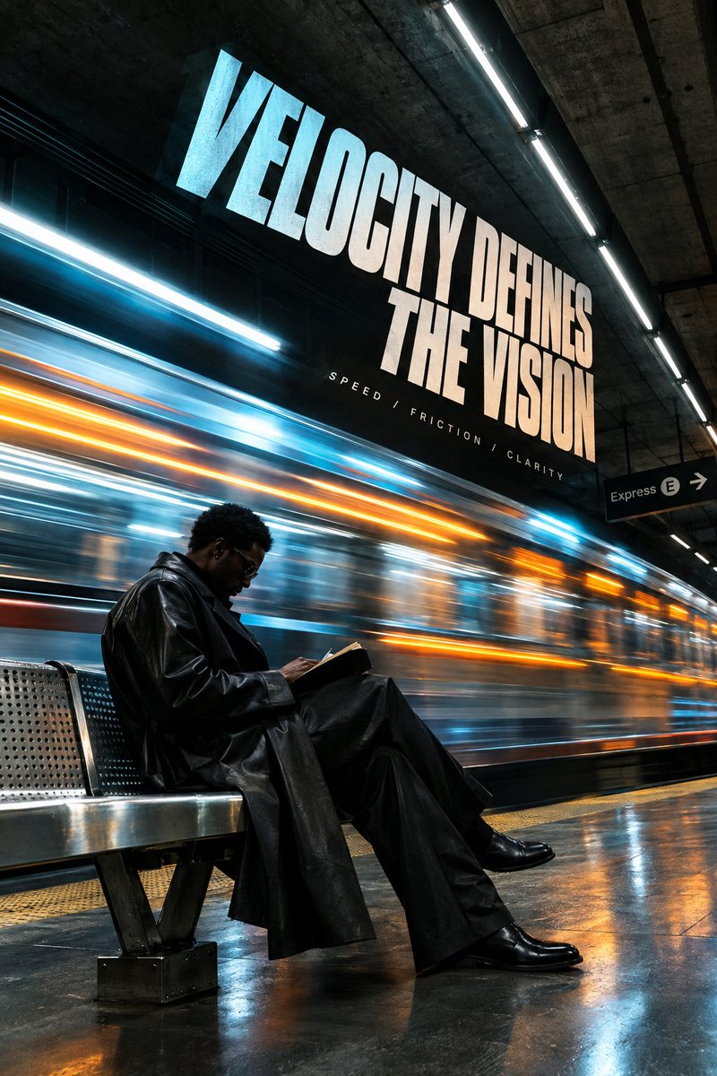
Tired of text looking like a flat sticker slapped on top of an image.
Wanted to see what happens when typography actually lives inside the scene, warped along real walls, catching room lighting, and getting blocked when someone walks in front of it.
1. subway velocity
2. raw concrete steps
3. 70s listening room
4. vintage op-art print
which room handles the letters best?
@avstorm Seeing digital graphics built out as real physical objects never gets old. The material finishes on that glass block and the ribbon apple are ridiculous.
SUBWAY VELOCITY // STUDY 02
Expanding on the motion/velocity concept from my pinned drop. Integrating heavy editorial typography so it feels embedded in high-speed, cinematic moments, not just pasted on top.
Focused on natural film grain, the high-shutter blur of the transit line, and italicized weight that carries the visual momentum of the scene.
Form is nothing without flow. 👇
Tired of text looking like a flat sticker slapped on top of an image.
Wanted to see what happens when typography actually lives inside the scene, warped along real walls, catching room lighting, and getting blocked when someone walks in front of it.
1. subway velocity
2. raw concrete steps
3. 70s listening room
4. vintage op-art print
which room handles the letters best?
@RikOostenbroek The luminous bleed on these gradients is seamless. Getting that much rich saturation and organic depth without visible banding on an OLED panel is an art form in itself.
@ciguleva The tactile grain and chalky paper tooth completely cut through the usual digital sheen. Blending that dry stippled texture with deep cosmic void values in the eyes makes the entire portrait feel tangible rather than rendered.
The best 3D artists almost always start with a foundation in 2D graphic design.
When you master typographic weight and flat vector hierarchy first, stepping into 3D isn't just throwing geometry around, it’s finally giving graphic intent real light falloff, specular depth, and spatial presence.
I started doing 3D in 2011 and I wouldn't swap it for anything else. When I first got into design, I focused on 2D work like branding and vector illustration, but I felt I was lacking control over light and shadow. So I decided to try C4D. The rest is history.
@PeterTarka That shift from flat vector space to physical light and shadow is where graphic design turns into tangible architecture, the graphic restraint never left the work.