Het Infographicscongres is terug en op vrijdag 11 Maart 2022, in Theater Gooiland te Hilversum! Zet de datum alvast in je agenda. We hopen je daar weer te zien!
@simongerman600 Actually it is a very weak example for this one reason: The width of the chart isn't defined mathematically. How did they calculate the "relative power"? Ridiculous!
Tim Goheen, Director of School of Communication @scrippsou at @ohiou chatting with famous British designer Ken Garland during @HS_Augsburg
International Design Week 2015. Ken Garland passed away today. He will be remembered. https://t.co/lhuWzbjepK
Almost all people in the #infographics business are struggeling with @adobe@illustrator chart tool. once introduced and almost never ever developed any further, we are still waiting for Project Lincoln to appear. IT IS DESPERATELY NEEDED. https://t.co/jmBvDPkNKA
There is a tread for @Illustrator feature requests that has become a support group for those hating @Adobe's chart tool. You would think that with all the people at @AdobeDesign, they'd come up with a better tool than this one from the '90s. Fun to read. https://t.co/bpzXrlkHGx
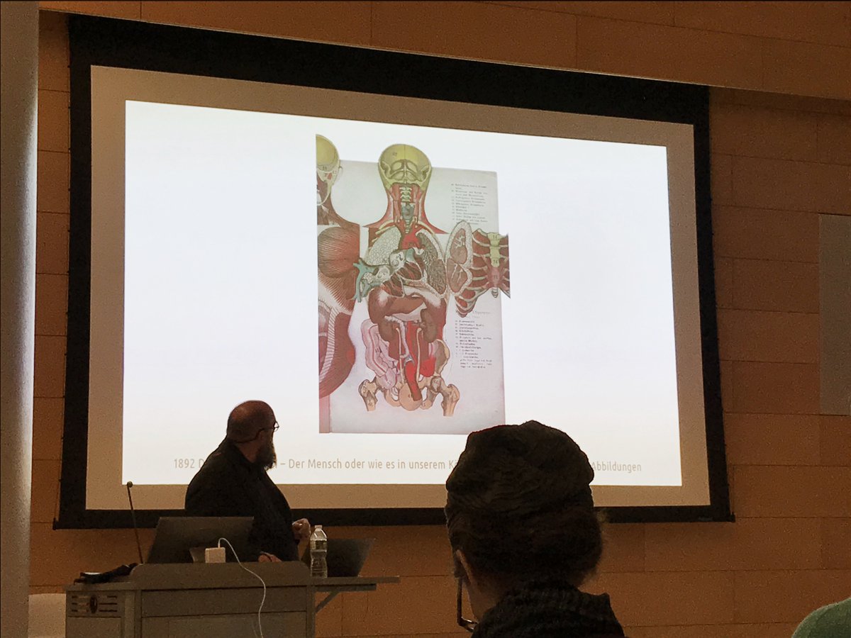
Last night's Info Design NYC Meetup with @mstoll was a blast! Wonderful group and so many amazing examples like this 1892 anatomy guide by Dr. P. Ebenhöch. Real interactive explanation. #informationdesign
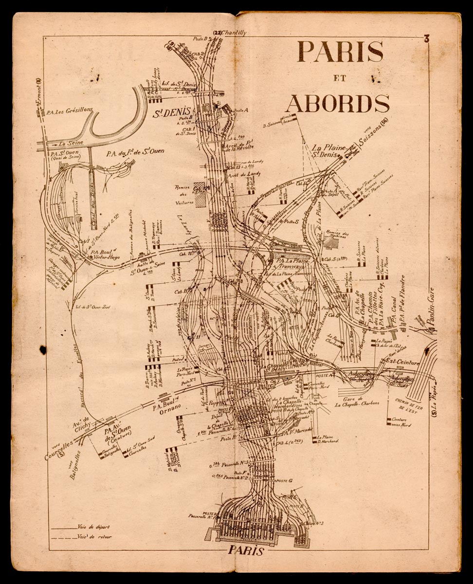
1934 Carnet de Marches-Types pour Trains spéciaux. A Minard like synchronised presentation of railroad data, probably for use by the engine driver underway. Recently gifted to my collection. Thank you very much! #history#informationdesign#minard