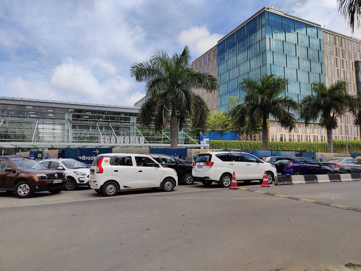
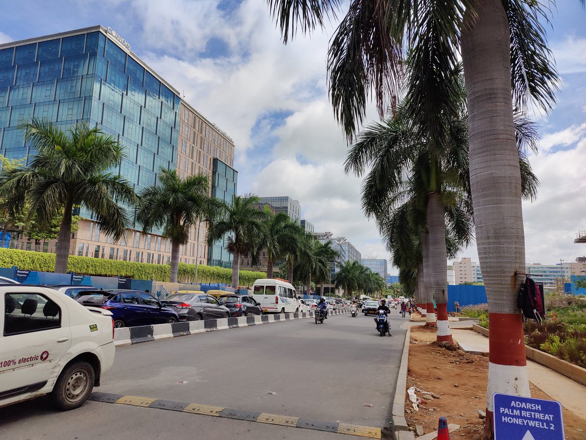
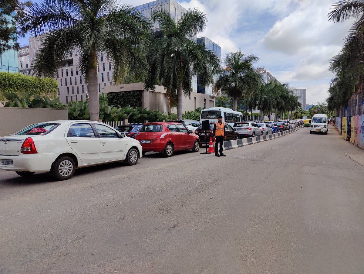
@IndiGo6E can you help me understand how I can cancel my return journey flight, when my to journey flight is cancelled by you? All your customer care hotlines are busy and so called AI assistant does not even send a message.
@OfficialStarAir really disappointed with Star air. They cancelled our flight last minute, have given no option of Refund. And worst case their customer care hotline is just a bot with no way to connect and get a response. Its been 1 week and still waiting
@DGCAIndia@MoCA_GoI
15 years ago, I helped design Google Maps.
I still use it everyday.
Last week, the team dramatically changed the map’s visual design.
I don’t love it.
It feels colder, less accurate and less human.
But more importantly, they missed a key opportunity to simplify and scale.
–––
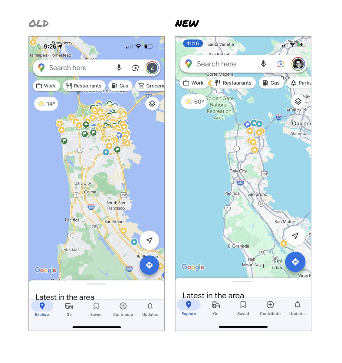
Google Maps has started to widely roll out updated map colors:
- All roads are now gray
- Water changed from blue to teal
- Parks and open spaces are now mint green
It seems the goal was to improve usability and make the maps more readable.
Admittedly, I do think major roads, traffic, and trails stand out more now.
But the colors of water and parks/open spaces blend together.
And to me, the palette feels colder and more computer generated.
But color choices aside…
If the goal was better usability, the team missed a big opportunity:
Google Maps should have cleaned up the crud overlaying the map.
–––
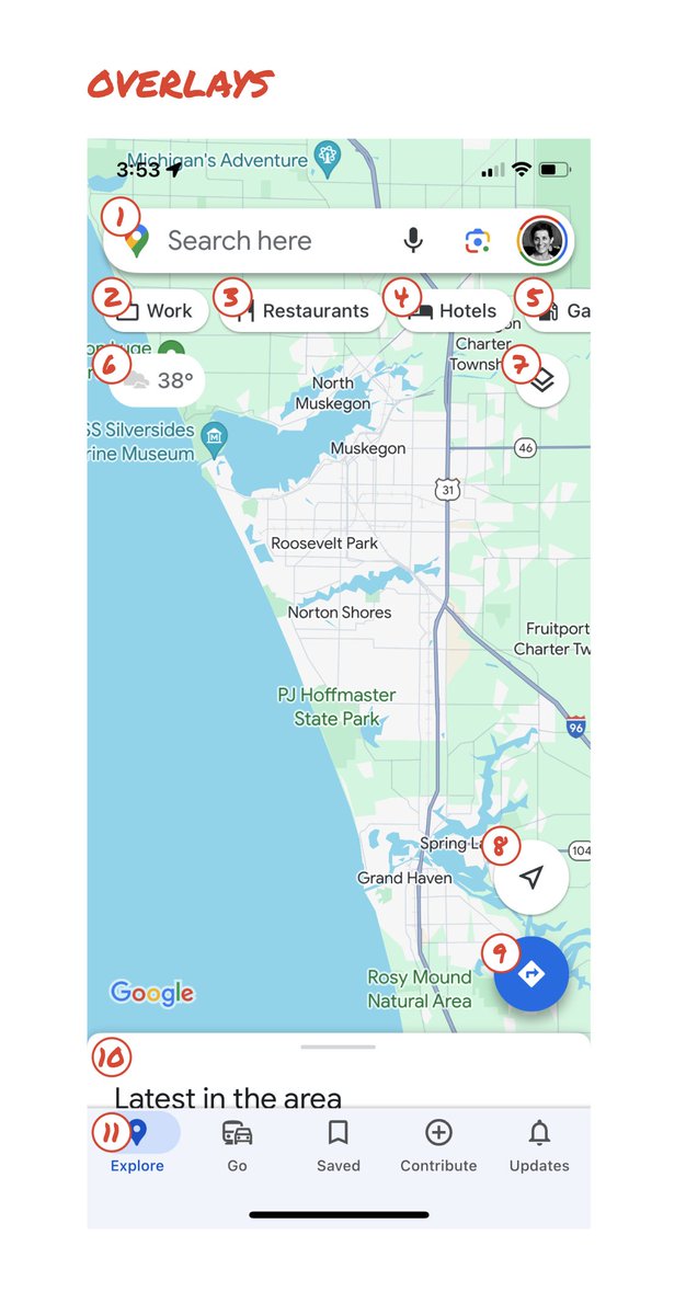
So much stuff has accumulated on top of the map.
Currently there are ~11 different elements obscuring it:
- Search box
- 8 pills overlayed in 4 rows
- A peeking card for “latest in the area”
- A bottom nav bar
(Personally, I would LOVE to see usage metrics for all these overlays.)
The map should be sacred real estate.
Only things that are highly useful to many people should obscure it.
There should be a very limited number of features that can cover the map view.
And there are multiple ways to add new features without overlaying them directly on the map.
–––
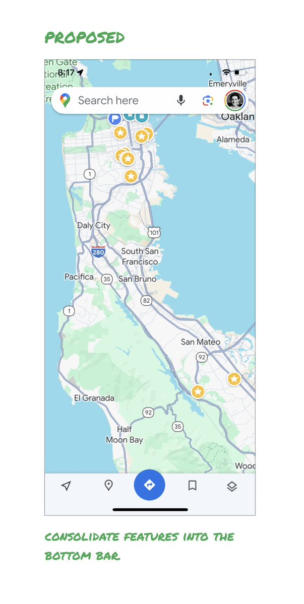
Here’s how it could look:
- Keep the search box
- Keep the bottom bar
- Remove everything else from the map
- Roll the most used features into the bottom bar
- Bury the less used features elsewhere in the app
I assume the search box and directions are top priority and should remain prominent.
My Location and map layers (satellite, traffic, etc.) could move to the bottom bar.
The explore overlays (restaurants, gas, etc.) could live in the bottom bar in “Explore” and open as cards.
The additional space in the bottom bar could be used for Saved, as a ��More” option, or could be removed entirely.
There are many variations of how features could be arranged.
But the key points are:
- Dramatically simplify
- Strongly prioritize map visibility
- Bury legacy and low use features
–––
It’s normal for products to accumulate features over time.
But it’s also super important to stay vigilant and continually clean them up.
In many ways, it’s interesting to see history repeating itself.
In 2007, I was 1 of 2 designers on Google Maps.
At that time, Maps had already become a cluttered mess.
We were wedging new features into any space we could find in the UI.
The user experience was suffering and the product was growing increasingly complicated.
We had to rethink the app to be simple and scale for the future.
It seems like it’s time for Google Maps to do this again…
–––
For more on design + tips for early stage founders, follow me on X: @elizlaraki
Disturbing story but not entirely unexpected considering how people with power and money behave in India.
While some deals might fail due diligence, I believe the bulk of the blame lies with the sharks.
https://t.co/97Z4vzPkIT
Which is the best mango drink in the market?
I’ve met people who think products like Tropicana are healthy so I decided to make this video!
I compared Frooti, Maaza, Slice, Paperboat, Tropicana and Raw Pressery in less than 2 minutes.
.
.
#FoodPharmer
Not sure about the authenticity, but having your thoughts/dream being accessible to interpretation seems scary!
The 3D/Sonar rendering seems like the Dark Knight scene 🙂
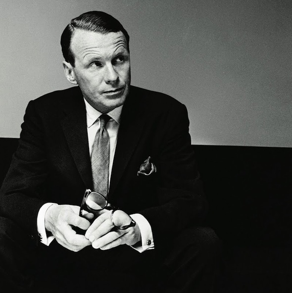
At 38, he was broke.
At 41, he became known as the GODFATHER of advertising.
Here are 5 of David Ogilvy’s time-tested writing tips to help you write well in the digital age:
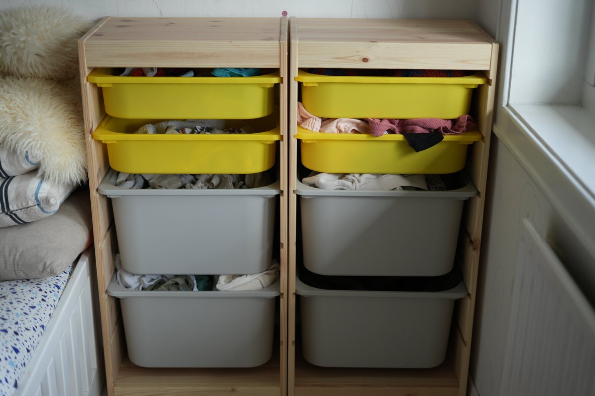
Laundry is a battle you can't win. Especially if you have kids.
After our second baby, the laundry situation in our home went crazy. There were piles of unsorted laundry EVERYWHERE.
Well, not anymore. Because we DIY'd a system.
Introducing the "Trofast Laundry System" 👇👇👇
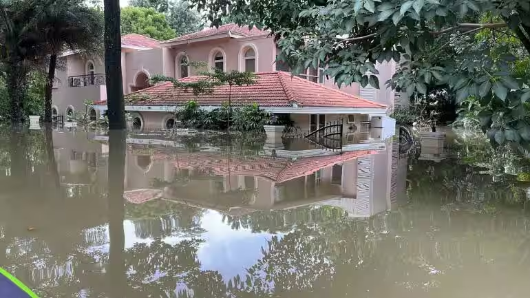
🧵At Epsilon, located on Yemalur Main Road, there are around 150 villas, of which 105 are occupied. A basic villa in Epsilon costs Rs 10 crore and goes up to Rs 20-30 crore. Last year the flooding was so bad that the average financial loss per villa was around Rs 50 lakh.
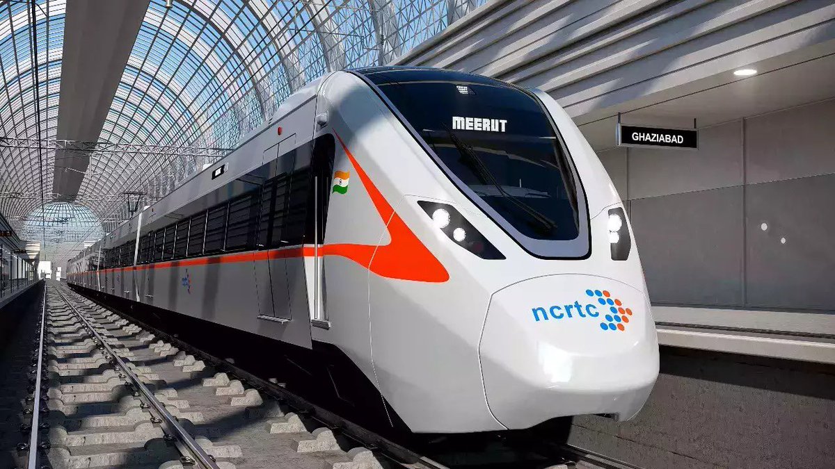
India just launched its fastest train, and no, it's not the bullet train — it's RRTS
RRTS will enable people from tier 2 cities to work & earn in Delhi without having to live in Delhi
How? By reducing the travel time from 3 hrs to just 55 mins
Here's how RRTS is reshaping NCR: