@mdneuzerling haha, if it's a {ggplot2} chart, and you still wish to visualise zeros on a logarithmic scale you can use the pseudo log scale:
+ scale_y_continuous(trans=scales::pseudo_log_trans(base = 10))
@bookfriend4@_TanHo@tanya_shapiro@PipingHotData no OP but I guess this allows you to take lines out of a ggplot recipe without leaving any trailing '+'s, making it easier to trial different recipes by commenting lines out. A similar trick with dplyr pipes is to end with a pipe into identity()
@VictimOfMaths perhaps I'm missing something here but I don't follow; can you not just divide the number of cases for each age-bin by the population for that age-bin?
@beeonaposy Here's some good open-source chart-junk examples:
https://t.co/RBCJMkmuSu
As for common mistakes the typical ones I point out are:
- Bar charts with axis not at zero
- Pie charts that don't add up to a meaningful total / many many segments
- Outliers included by breaking axis
@nic_crane Off the top of my head the factoextra website has a bunch of really good worked-examples on the main functions: https://t.co/KKHWhwDD9m
Kinda lift's from the FactoMineR package which similarly has it's own (less-modern) site:
https://t.co/2Pf8PAvenj.
@bosco_rosco Reminder: Hopkins was banned of here and people like you still give her unnecessary press so you can make a low-effort joke and a crack at how women should look all in one
Nice one
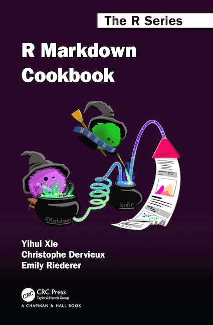
In celebration of the publication of the new R Markdown Cookbook by @xieyihui; @chrisderv and @EmilyRiederer, I would like to give away two copies. The rules are simple: just retweet this message and follow me and @CRC_MathStats and I will choose a winner next week. Good luck!
@thomasp85 The word that most follows the progression you described (surface to volume) to me is 'edges'
integrate an edge to get a surface
integrate a surface to get a volume
etc
@mattcampux @AlbertoCairo Depends on what the feature you're trying to display
Take C, it's very clear that groups 1+2 nearly make up half of the total from the pie, which is not obvious from the bar chart.
This example is nice, but it's literally designed to show pie charts in their worst light