The Golden Ratio Secret Behind Warner Bros.’ Sleek 2019 Makeover.
In 2019, Emily Oberman and her team at Pentagram spearheaded a bold modernisation of the legendary Warner Bros. shield. Recognizing the need for a versatile "digital-first" identity, Oberman streamlined the 1923 classic by removing the iconic sash and refining the proportions of the "WB" letters using the golden ratio. The redesign transitioned the brand from a static, heavy emblem to a sleek, flat-blue monogram that thrives across social media and mobile platforms. By introducing the custom "Warner Bros. Sans" typeface, Oberman created a cohesive visual language that successfully bridges the studio’s storied Hollywood heritage with a contemporary, minimalist aesthetic.
#logodecks
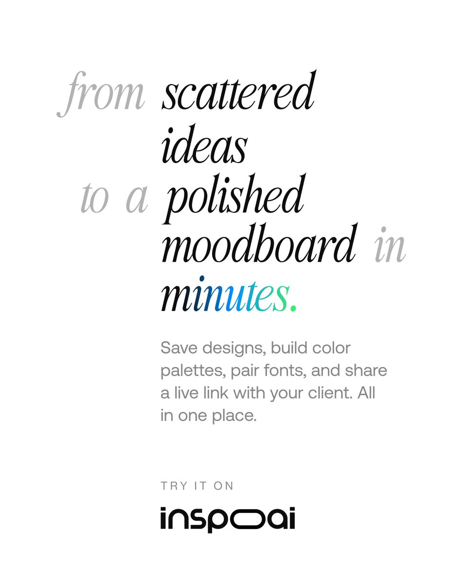
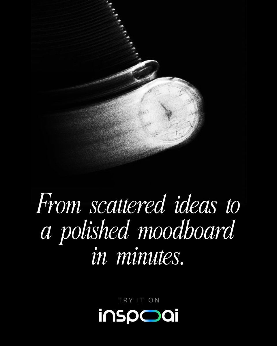
Stop losing hours to moodboard chaos.
Scattered screenshots. Endless tabs. Half-finished Pinterest boards.InspoAI brings them together into a polished moodboard in minutes.Your vision, finally organized. https://t.co/fqNSFZitWc
#InspoAI#Moodboard#CreativeTools#AIForCreatives