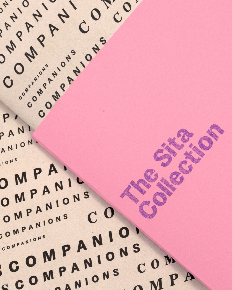
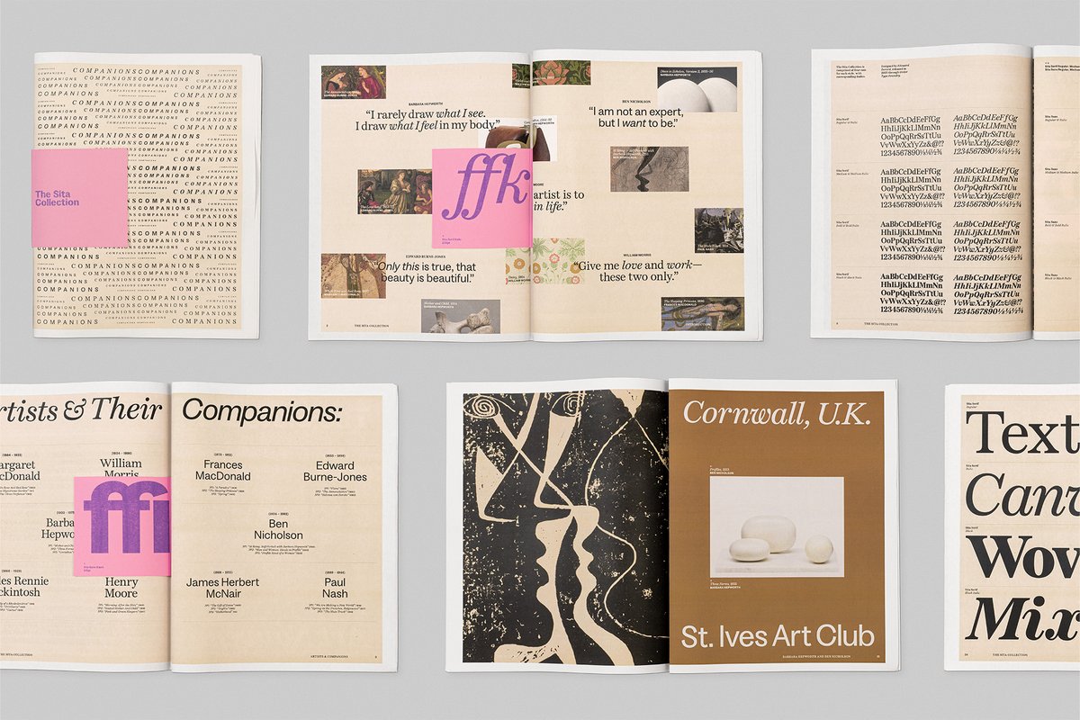
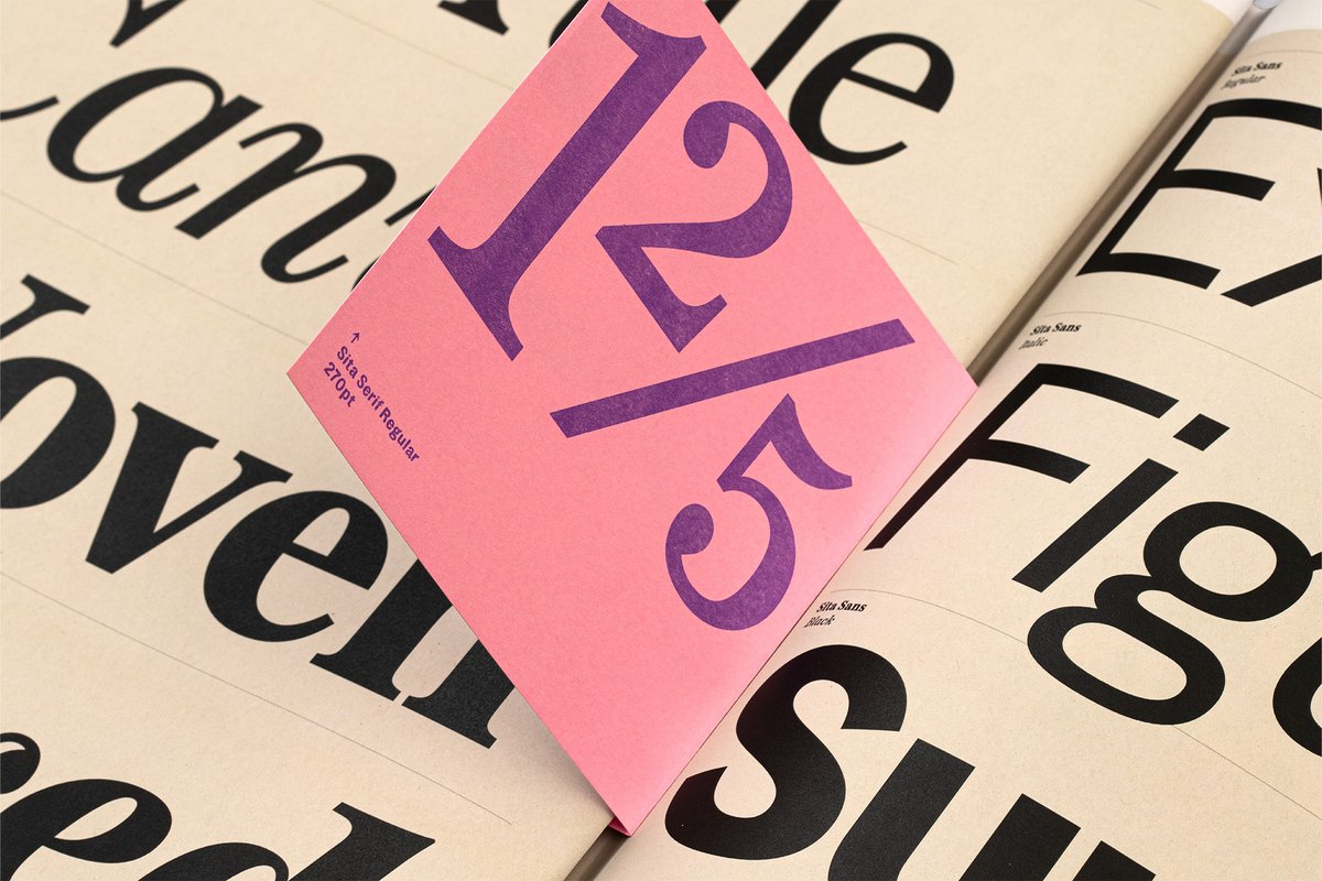
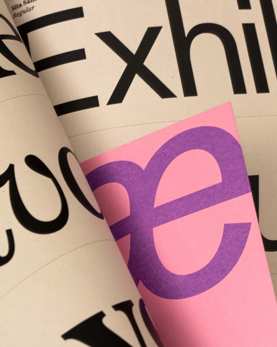
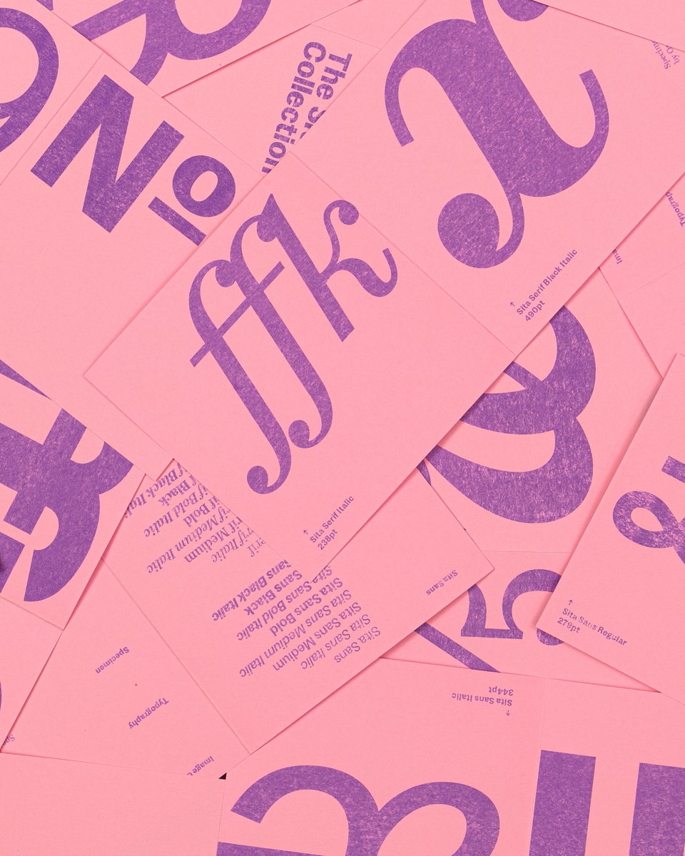
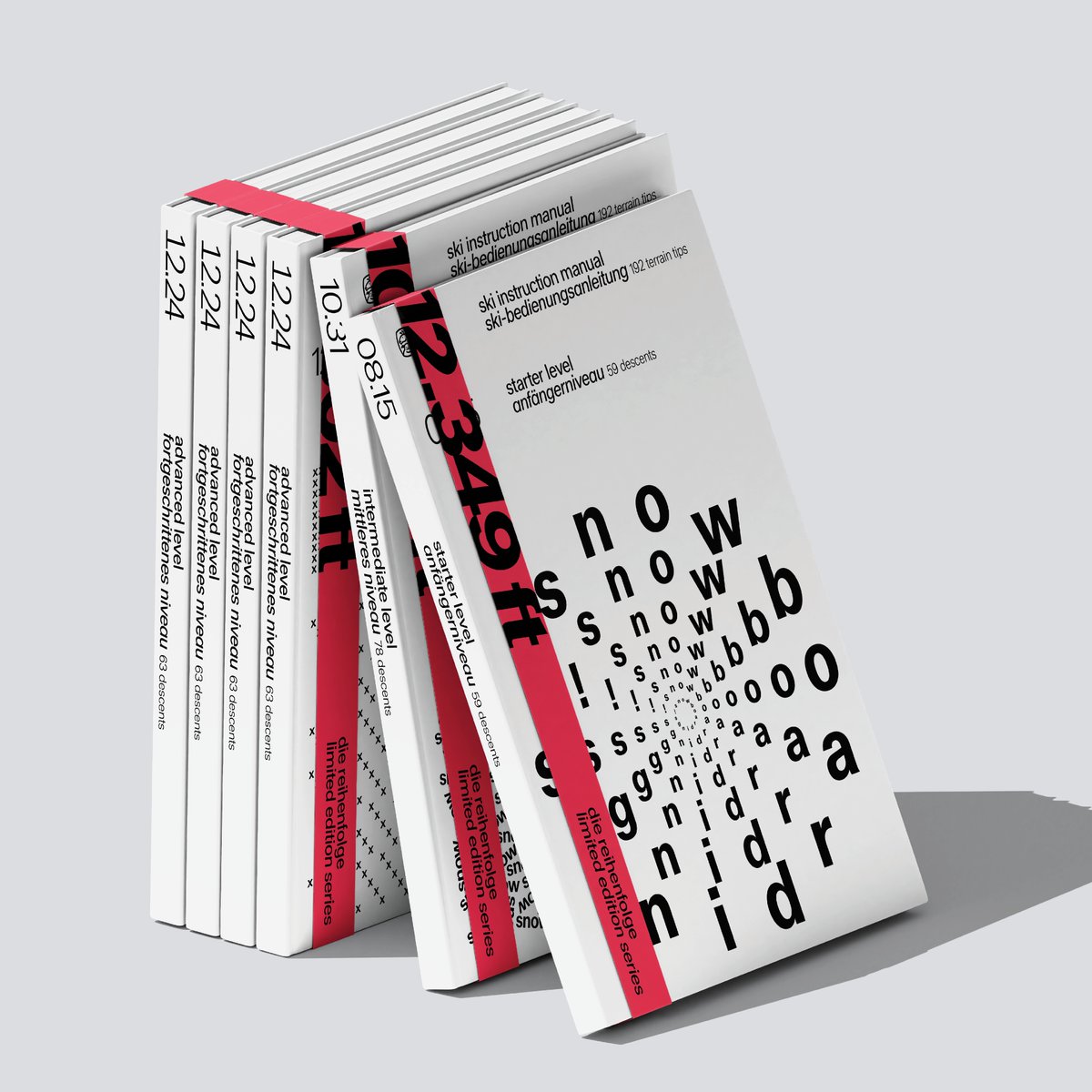
The Sita Collection is a superfamily rooted in 19th-century Scottish typographic history that offers a contemporary interpretation of the past to suit modern needs for digital and print typesetting 🌷Designed by Edouard Berard. See full case study here: https://t.co/TeAfRigXah
Brooklyn-based @ordertypefound’s Sita superfamily blends British typographic history with modern design, creating a dual-natured typographic system where serif and sans styles function as distinct but harmonious voices that can work together or independently.
Download free trial fonts from the link below ↓
The Sita Collection is a superfamily rooted in 19th-century Scottish typographic history that offers a contemporary interpretation of the past to suit modern needs for digital and print typesetting 🌷Designed by Edouard Berard. See full case study here: https://t.co/TeAfRigXah
The Sita Collection reinterprets the relationship between the serif and sans, moving beyond the traditional view of these styles as separate entities and instead presenting them as complementary elements of a unified system 🖋️
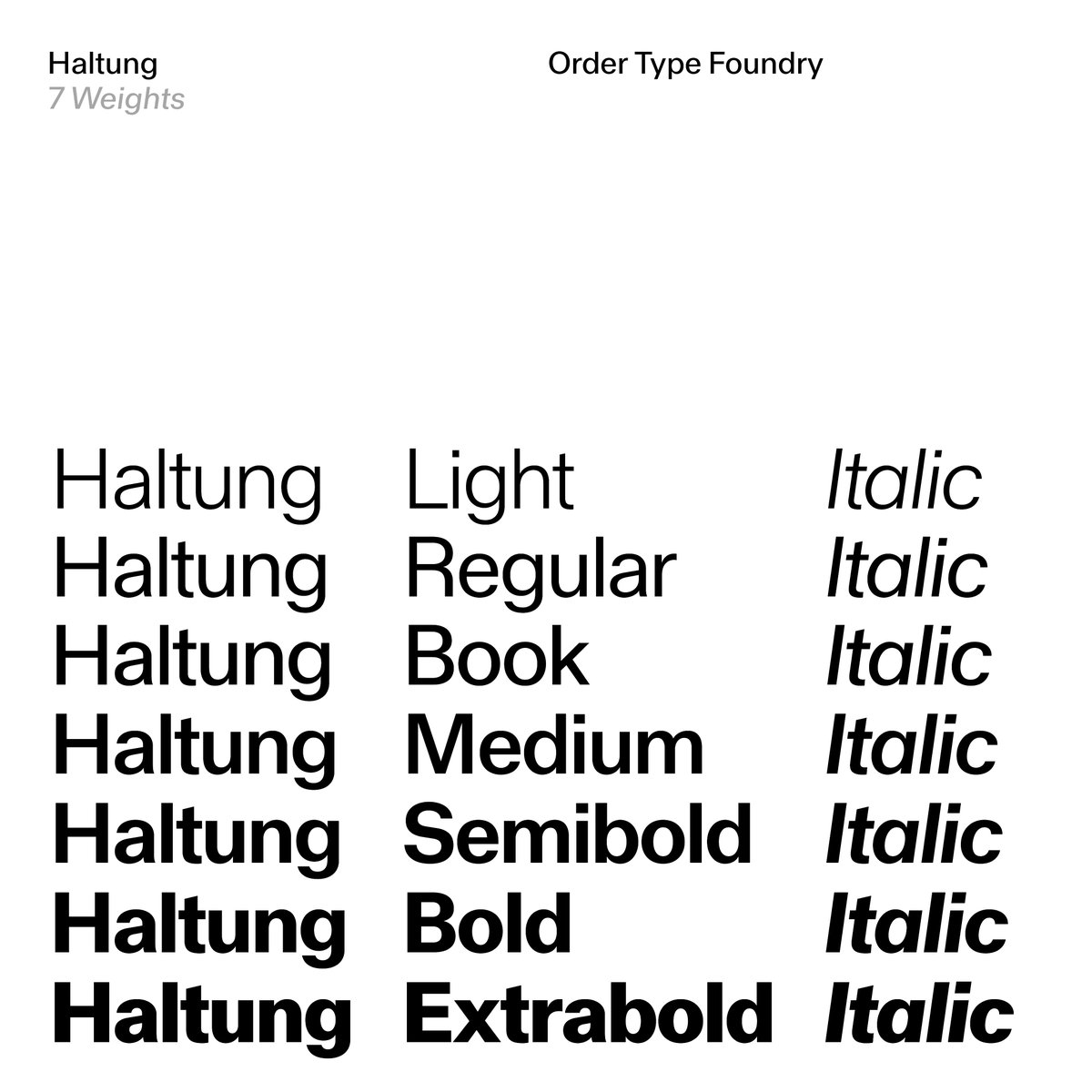
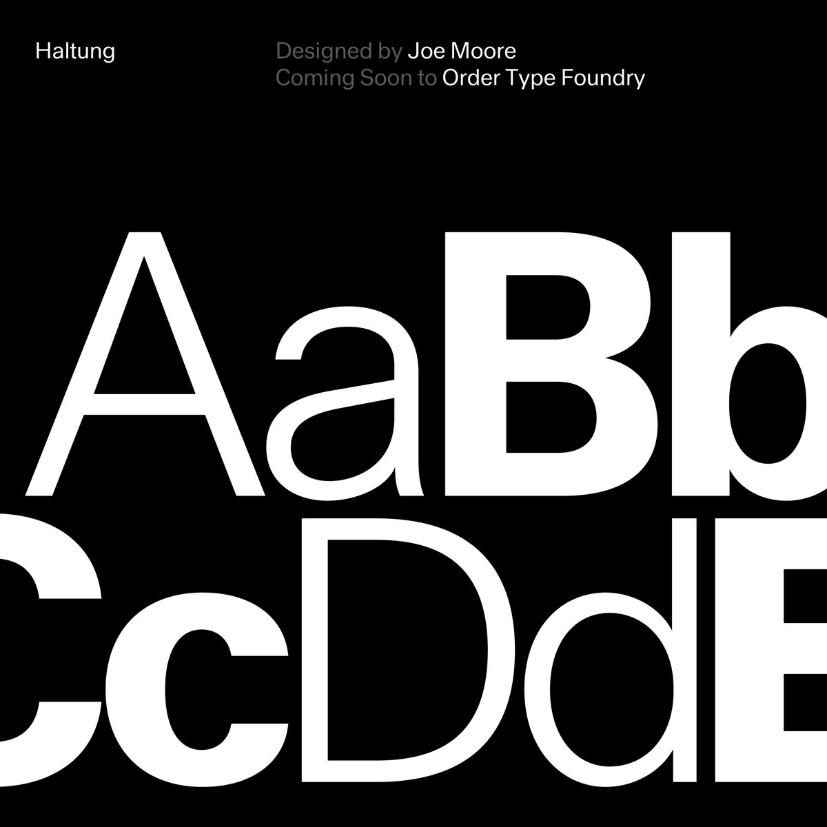
Haltung is a neo-grotesk typeface inspired by a common attitude and design sensibility spanning these three generations 🖋️📐 Designed by Joe Moore. See the full case study here: https://t.co/Vidw8i153R
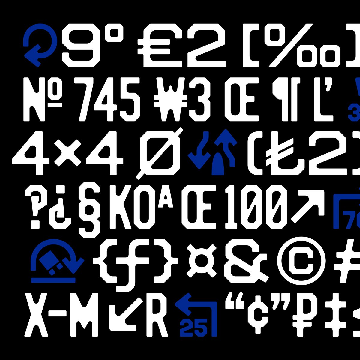
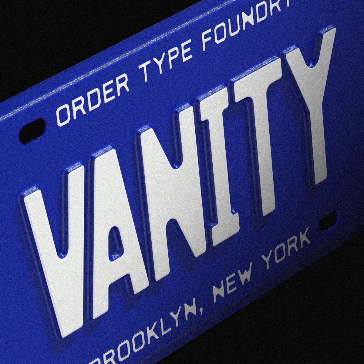
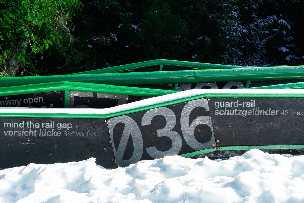
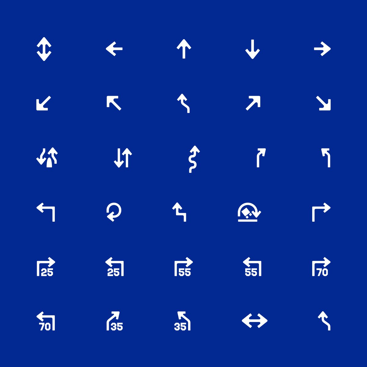
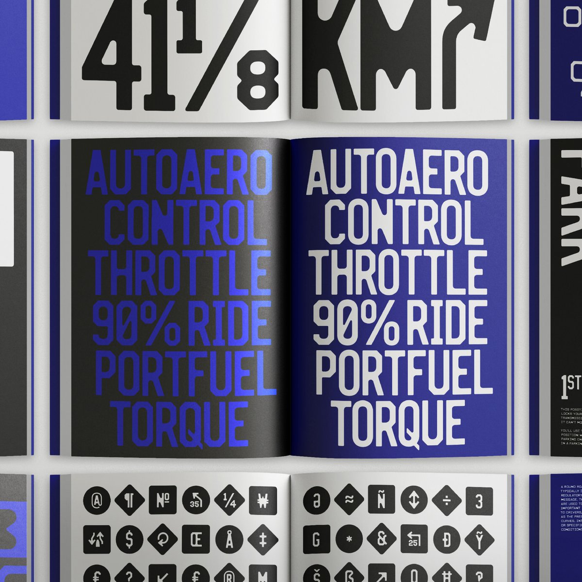
The typeface features a special set of roadway glyphs in addition to a standard arrow set. Learn more about the special features of Vanity at the case study: https://t.co/dwWAJXml3g
Vanity is an octic unicase typeface that captures the printed effect of letterforms on New Jersey license plates from the 1930s to the 1990s 🏎️🏁 Full case study here: https://t.co/dwWAJXml3g
Haltung is an upcoming release in development by Joe Moore. 🛠️
From the sans-serif lettering of Walter Käch to Frutigers Univers, to the students of the Basel school under Emil Ruder, Haltung is a typeface inspired by a common attitude and design sensibility. Stay tuned!
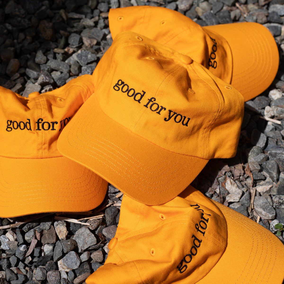
Stringer Dad Hat 🌻 Just in time for summer, our latest release “Stringer” is embroidered with black thread on a gold twill cap. Visit here to purchase: https://t.co/XL9ypKJQvI
Also available in Brooklyn @standardsmanual
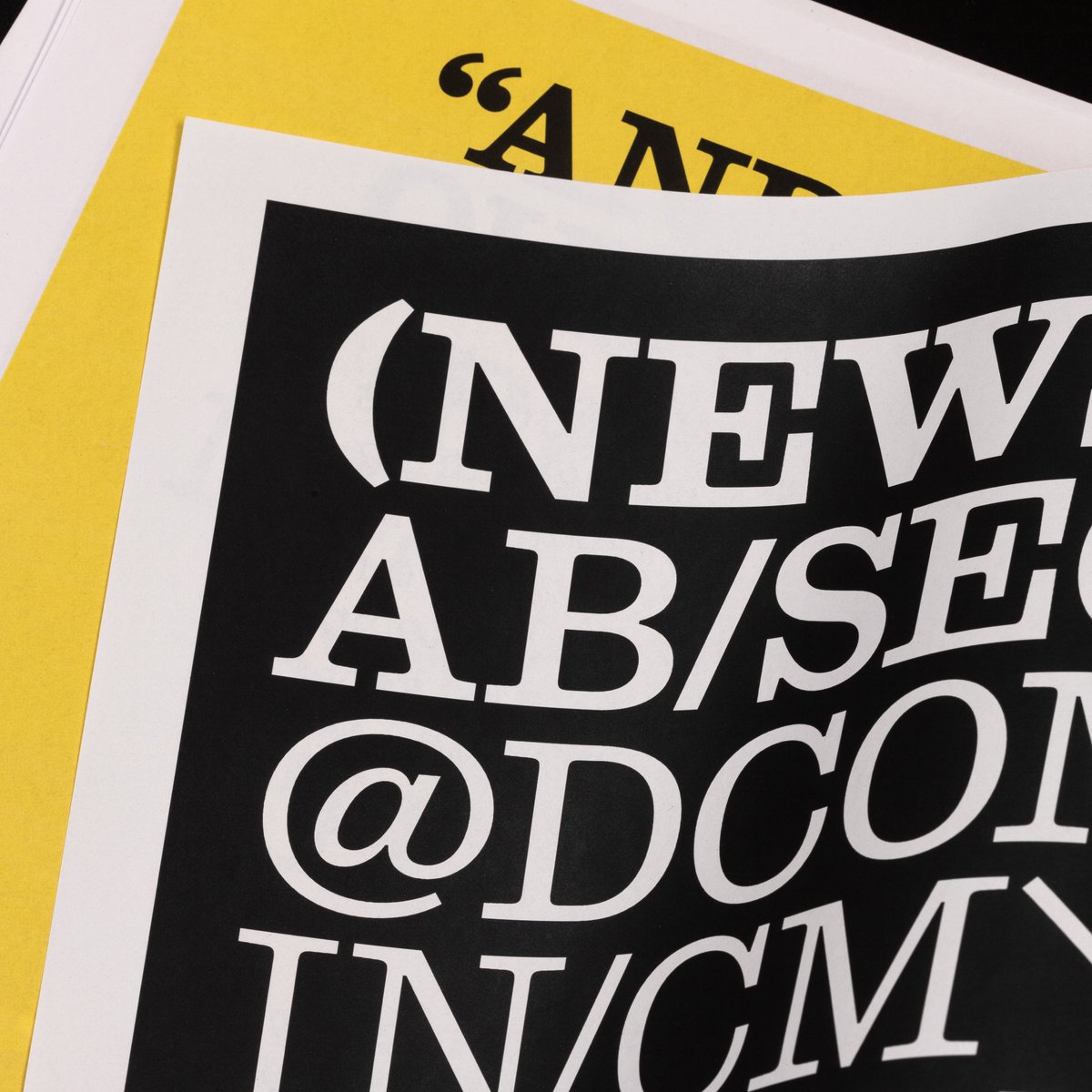
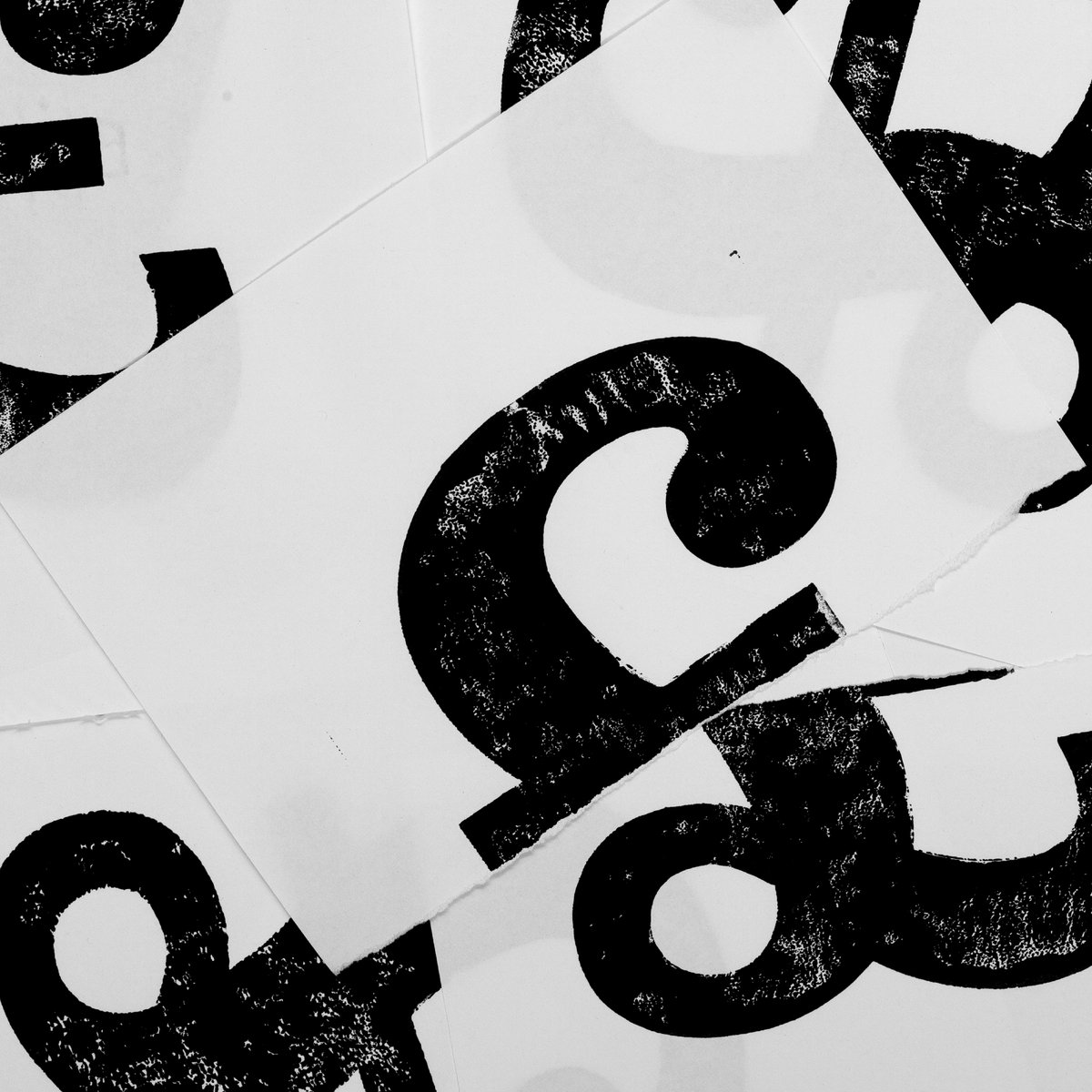
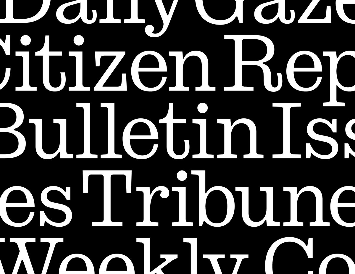
Stringer 🗞️ is a bracketed slab-serif revived from Ionics of the early 20th century. Its namesake is a testament to the use of Ionics in newspapers, with “stringer” being a freelance journalist. Designed by @emklaebe. Full case study: https://t.co/kBIKrXE7Uy
Introducing Stringer 📰 designed by @emklaebe
Stringer is a bracketed slab-serif revived from Ionics of the early 20th century and adapted for modern day typesetting. Its namesake is a testament to the use of Ionics in newspapers, with “stringer” being a freelance journalist🗞️