This is one of the things I’m changing in the new version of Pagy.
Deep selection makes it impossible to select parent layers if they don’t have padding or gaps in them (unless you rely on a layers panel, which I’m trying to avoid).
On the other hand, the default behavior of Figma and Sketch is not great to me either, because:
1) Double-clicking multiple times is annoying.
2) You get zero indication of what you’re selecting if the children don’t have visual styles delimiting their bounding box.
So I’m going for a middle ground: shallow selection but with single-click drilling.
Selecting a container enables hover highlighting and further single-click selection on its children.
The only downside I see is that you can’t drag a container after selecting it (if there are children below the pointer), but I think that’s a good compromise.
I’ve been working on a complete revamp of Pagy’s layout system and editor (for the last time), as the current one turned out to have many limitations.
This is also part of a small pivot to target actual web designers and agencies instead of non-technical people (but while still keeping it as simple as possible for them).
Still lots to do but here’s a sneak peek:
Made some small improvements to dragging blocks within rows.
Now if a block moves all the way over another they’ll swap places, if not they’ll just overlap, all in a single gesture.
Finally shipped mobile-specific editing!
Now changing a style on the mobile view will only apply on that view.
Currently works with text blocks, stacks, and rows (letting you reverse their content order on mobile), but will expand it to other blocks as needed.
Can't believe I've been using @pagyco for over 2 years now! It's allowed me to explore and share so many renditions of myself from my 1st online course when I just started freelancing to my current landing page.
Forever grateful for high quality + easy to use tools ❤️
Small update, now you can name global sections so they’re easier to differentiate if you have multiple, similar-looking ones.
Also renamed them from “Shared sections” to “Global sections” since that seems clearer in hindsight.
It hurts to see a beautiful piece of software like this one, not getting the love they deserve while some dumb crud apps made in 1 day explodes.
But I guess this is life
Introducing https://t.co/pHRPujS1Ac
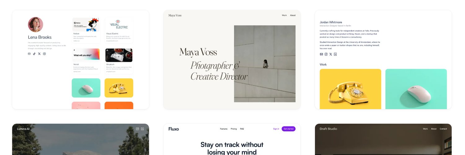
A curated collection of the most beautifully simple websites on the web.
Featuring no scroll hijacking, no loading screens, and no annoying animations.
A few minor updates I shipped recently after painfully watching too many user sessions with questionable results:
Aligning elements within a row is now done at the row level instead of dragging the individual children up/down.
The latter seemed more intuitive initially, but turns out it makes it hard to align things if there is little height difference, plus it led to many people placing items in non-ideal places.
This also allowed me to add a new Stretch setting, useful for making columns have the same height.
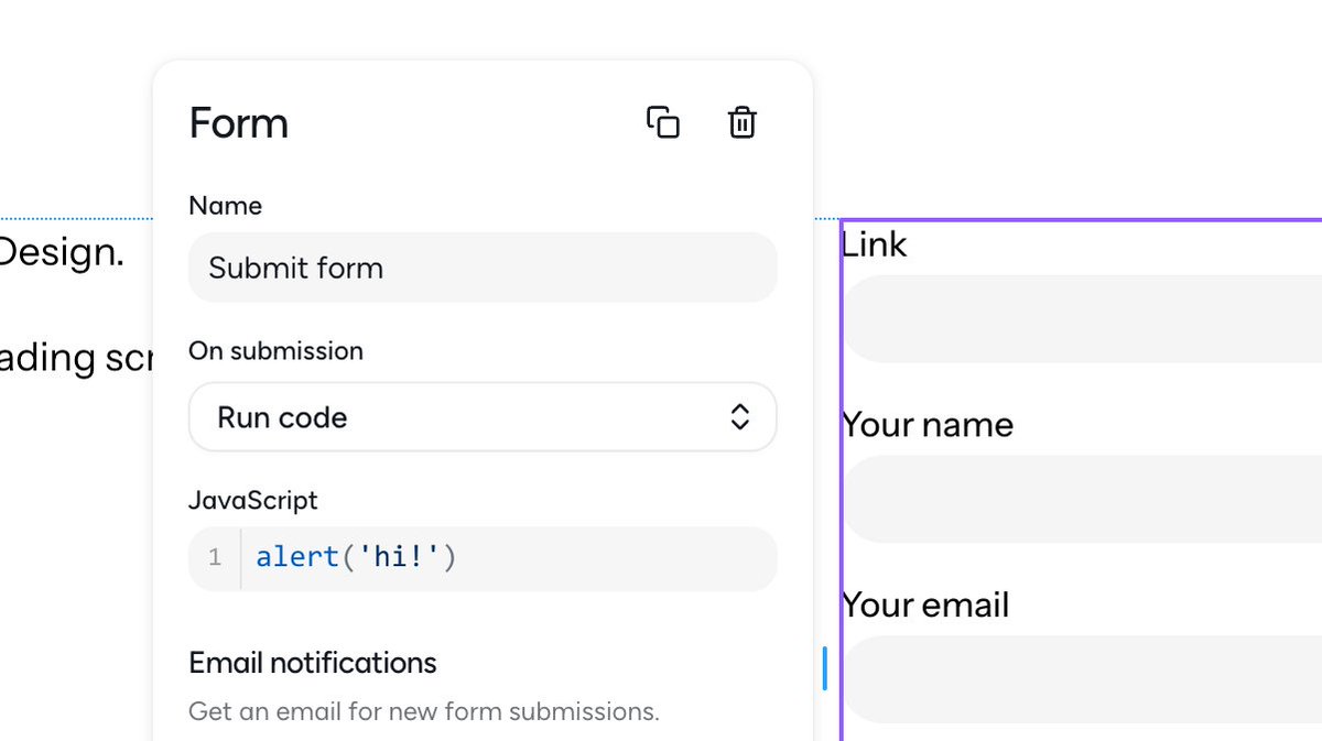
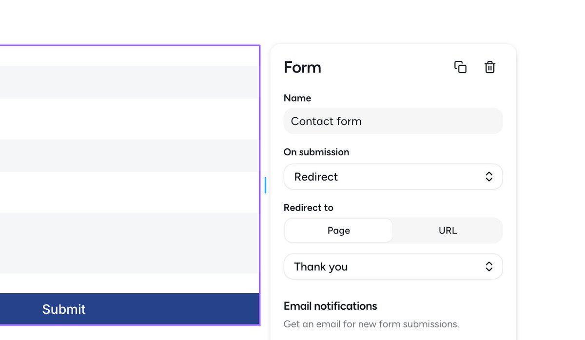
Now you can redirect to other pages after forms are submitted.
UTM params are persisted if you need to track conversions (will also add a setting soon to include them in the submissions themselves).
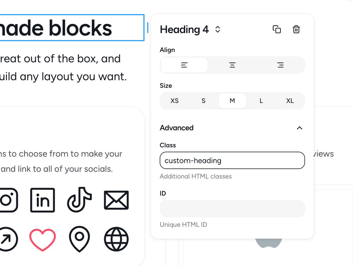
Finally added a setting that lets you add custom classes and IDs to every block.
This is one of those feature requests I kept ignoring because I wanted to keep it simple “for everyone”, not realizing it’s quite useful for a large segment of users who are more willing to pay.
Working on improving Pagy’s conversion and activation rates.
I just added the free trial back (which I had removed when I added the free plan) so people can experience the full value the app without having to upgrade first.
Also improved the onboarding flow and how features are gated, plus moved a couple of them to the paid plans (custom domains are still free though!).