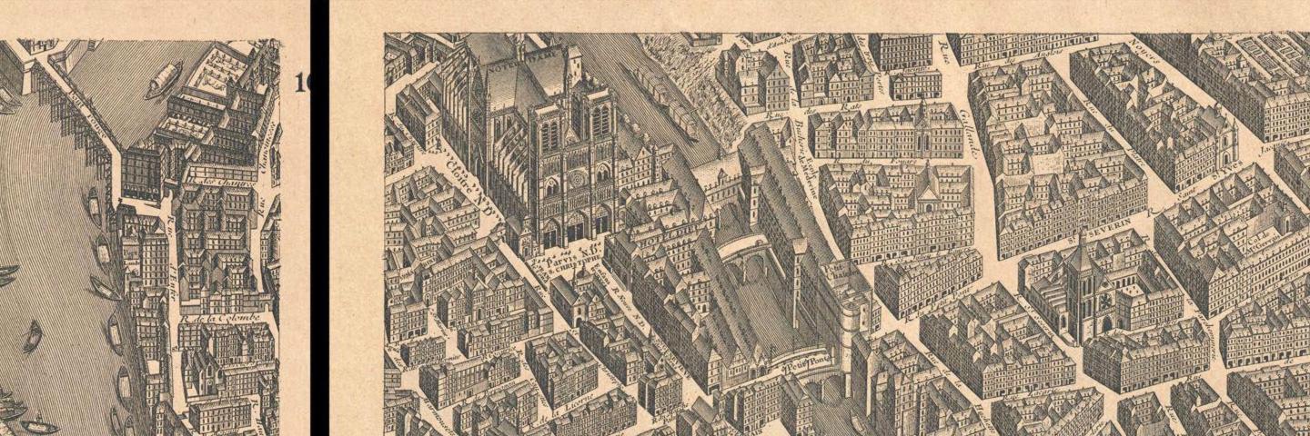
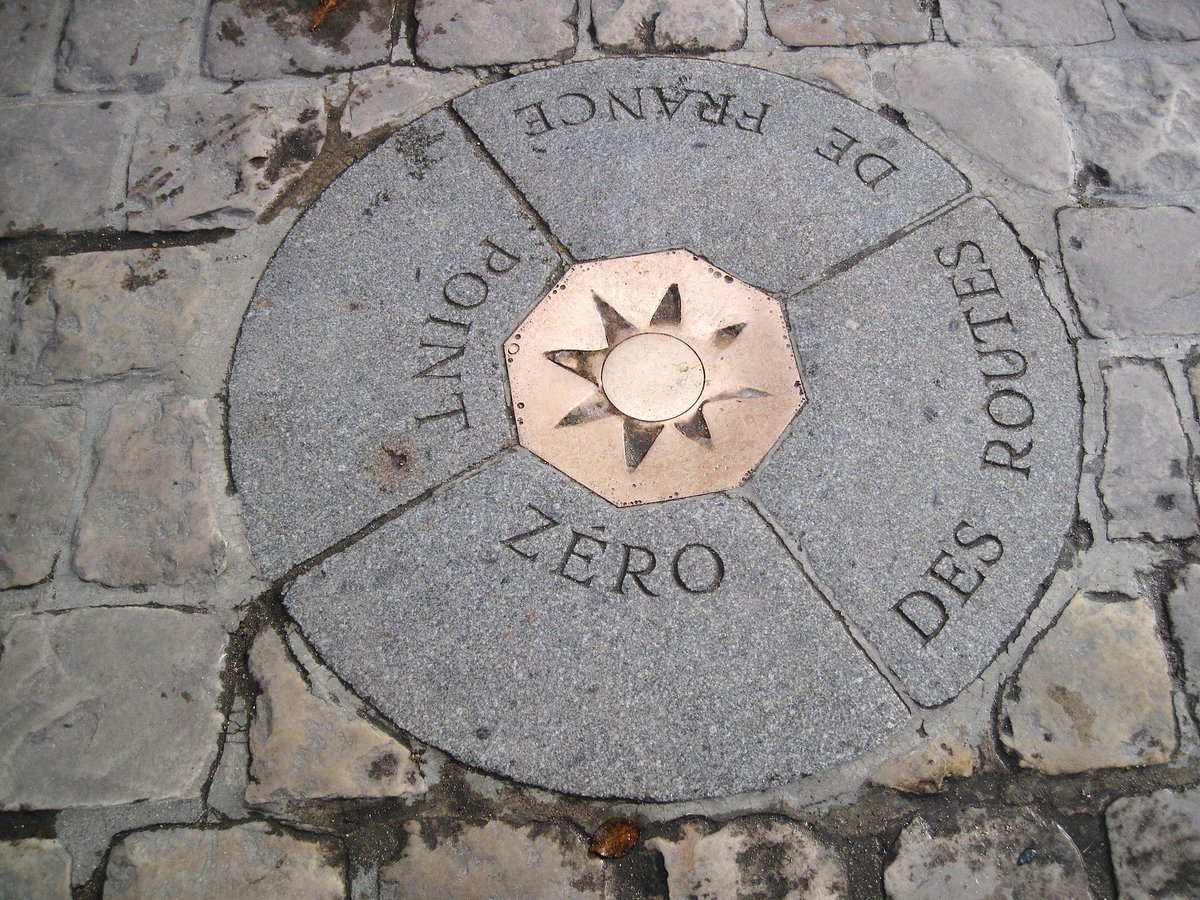
#NotreDame is not just a church or even a historical monument: it's a fundamental anchor of France's geography. The Kilometer Zero point lies 50m outside of its main entrance and is considered the official centre of Paris. The spire was also part of the French geodesic grid.
Lors de la crise sanitaire, la #Suède a choisi d’appeler à la responsabilité individuelle alors que le modèle sociétal du pays repose largement sur la confiance mutuelle entre population et État.
Pour quels résultats ?
https://t.co/pGnMTQu9nR
B-roll of our reconstruct piece tracing how the virus spread in the U.S.: a diagram showing New York's role in seeding outbreaks across the country. The final cut => https://t.co/rFeXBg7p1v
Another exquisite job by the @nytgraphics team: data sourcing, analysis, visualization and scrollytelling all on point to evaluate where and how the US screwed up their covid response https://t.co/2AkLH6NSaW
Nouvelle version de l'Observatoire du #Covid_19 lancé en mars. Au programme, une série de 4 indicateurs pour 32 pays européens.
Objectifs ? À dérouler ⬇️
https://t.co/ORqP4Lpy7W
Comment faire un premier bilan de la crise sanitaire pour les pays européens et suivre la suite de leurs tribulations au temps du covid ? Avec moult 📈📊 bien sûr.
Un outil réalisé avec @darioaschero et l'équipe de l'Observatoire du covid-19 @GEG_org https://t.co/evQgBONHXw
"Une telle amnésie sélective à l’égard de leur propre héritage impérial conduit inéluctablement de nombreux Européens blancs à éprouver à l’égard des États-Unis un faux sentiment de supériorité autour du racisme." https://t.co/fqNNVa1z56
Thread) Today I share with you a giant effort to provide an unprecedented estimation of the global cover and geography of human settlements (HSs). We produced a 10 m resolution binary mask outlining HSs and built a model to explain settlement formation https://t.co/PMSuhwyX5H
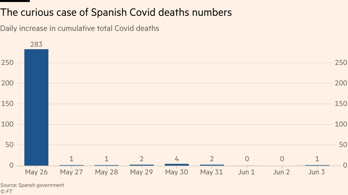
7/ To be clear, this is what Spain’s data for daily deaths looks like over the last week or so 🤔🤔🤔🤔
Guess when they introduced the counting method change...
In response to the #Covid_19 pandemic, the Human Mortality Database established a new data resource: Short-term Mortality Fluctuations (STMF) data series for 13 countries: e.g. Denmark, Sweden, Finland, Germany, Belgium, England, Portugal, Spain, the USA https://t.co/xs1ggQ0qtL
✨{cartograflow} update 1.0.1 is on its way to CRAN
> support #sf objects
> compatible with future #dplyr
> allow overlays for map design in #cartography
> deals with XY csv or spatial files
>> detailed vignettes here : https://t.co/NnUBfSFERt
#flowmap#cartostats#RStats
Our first #DatavisZRH webinar takes place this Wednesday, May 13, 17:00 – 18:00. Ilya Boyandin will help us better understand flow maps and present his award-winning open-source flow map visualization tool. https://t.co/LzCfD63Tjv
Et voilà un de ces euphémismes statistiques: la Seine-Saint-Denis et le Val D'Oise sont les derniers départements en surmortalité exceptionnelle https://t.co/qsiCWSKJPU