Recently created with @recifs a tool to synchronize independant @vega_vis charts (also HTML inputs, @d3js_org vizs etc) with Crossfilter and d3.dispatch. 📊📈
My @observablehq notebook guide is here : https://t.co/xfC5Fubdwe
With help from @LIRISLyon@romsson and @lapply
@ALeaument Si un.e journaliste arrive à trouver un peu les données je serais ravi d'aider au nettoyage des données et à la visualisation web pour en faire un truc interactif et bien propre, pourquoi pas avec une carte des manifs interdites !
Together with @espinielli and @recifs, we have been working on few @observablehq to display the impact of the Ukraine 🇺🇦 invasion on commercial aviation. These topics have already been covered on other media, but we publish here data and code for producing the visualisation!
For the past few months, I've been working on an interactive reference + learning resource for the open source @observablehq Plot visualization library. And now it's out! Happy plotting :)
https://t.co/w3iEDdFJV5
After 50+ issues and PRs, @recifs and I are pleased to announce that Observable Plot 0.4.0 is now available. Arrows, vectors, symbols, multiline text, and more! https://t.co/mdxEeDFtb2
Gros changement de la rentrée : adieu le bâtiment Claude Chappe, bienvenue au bâtiment Hedy Lamarr en @tc_insalyon @insadelyon ! 🤩🥳
https://t.co/XEXTeeUI9M
We're excited to announce Observable Plot, a new open-source library for faster and easier data exploration on the web! 📈🚀
Plot's concise API and thoughtful defaults are designed for a more joyful visualization process, try out the beta and let us know!
https://t.co/855uQuyTAi
[THREAD]🦔🔥
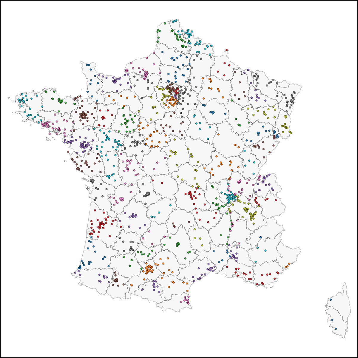
Aujourd'hui est un grand jour, 566 jours de travail plus tard nous mettons en ligne sur @visionscarto toutes les données de localisation des "aires d'accueil des gens du voyage" qui dans leur très grande majorité sont reléguées et polluées.⤵️
https://t.co/JYm23WwsRh
C'est vrai que les étudiant·es qui n'ont pas à manger et en profitent pour télécharger sur pirate bay c'est choquant. Il faut mettre fin à ce problème.
@Rafumab @visionscarto @recifs bravo !!! c'est un travail de dingue et vous êtes bien entouré 🙂
c'est magnifique quand les outils de visualisation peuvent aider une cause militante !
Première data visualisation des "aires d'accueil des gens du voyage" françaises fait par @visionscarto et @recifs à partir de mon travail de recensement 😍🔥🔥🔥
On va enfin pouvoir produire les données démontrant la mise à l'écart "gdv" et l'ampleur du racisme environnemental💪
It’s been ten years since I pushed the first release of D3.js to GitHub. Have I learned anything? I hope so… but it’s a journey. https://t.co/MM4K870IiJ








![Rafumab's tweet photo. [THREAD]🦔🔥
Aujourd'hui est un grand jour, 566 jours de travail plus tard nous mettons en ligne sur @visionscarto toutes les données de localisation des "aires d'accueil des gens du voyage" qui dans leur très grande majorité sont reléguées et polluées.⤵️
https://t.co/JYm23WwsRh https://t.co/EJVoW2y3fl](https://pbs.twimg.com/media/EzAAcvFWYAIzl-d.png)