Elevating data experiences, experimenting with developing intuitive data exploration and visualisation tools that enable users to analyse complex data at scale.
Drawing from the abolitionists’ database project, Anca Sarb identifies five key lessons about data collection, analysis, and advocacy.
https://t.co/7jO5WUspB4
Enjoyed building this project for the DVS Industry challenge this year https://t.co/KrDj8ZUwHY - while it didn't win, the feedback was positive so grateful for the learnings <3
All the 🏆winners 🏆 of the World Dataviz Prize 2023 #wdvp sharing a $50K prize pot.
https://t.co/rXSyAUTKR3
Thank you to all entrants and the @WorldGovSummit team for supporting this amazing prize.
I’m sad to report that I am leaving @themarkup to pursue other projects, which I will announce soon. It was an honor and a privilege to found @themarkup five years ago to create an investigative newsroom that integrated engineers and journalists. /1
I collaborated with the talented @ReutersGraphics team to produce a piece showing the species we lost and the ones that we are close to losing. I hope it will inspire people to do more to conserve our planet and its various inhabitants 🐢🐍🐘🦏��
🔗https://t.co/2Ce8oeFtYZ
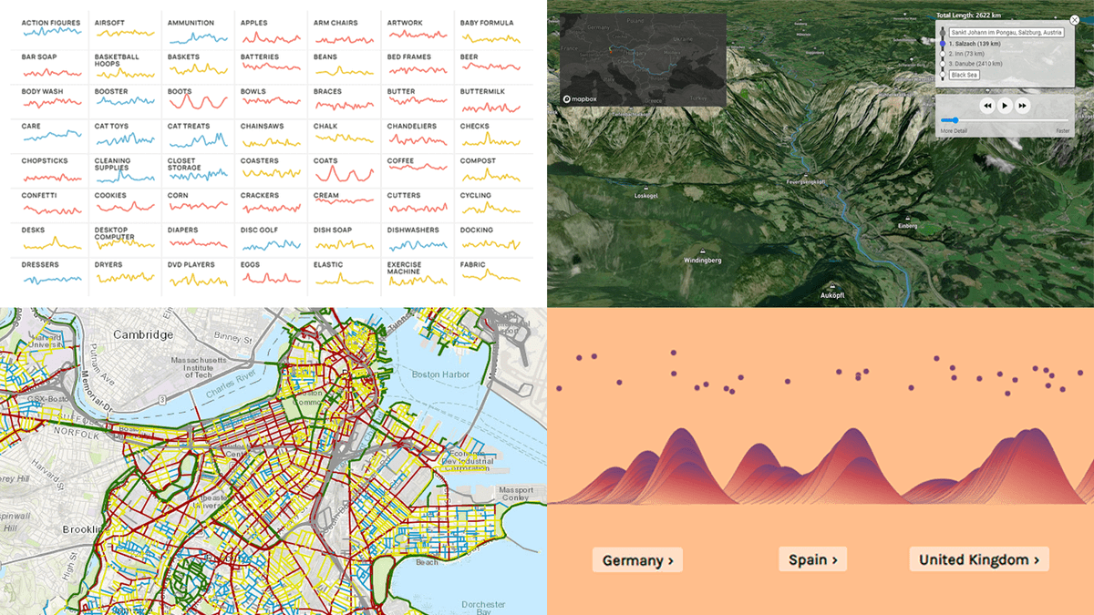
📊 ICYMI, here are some of the most amazing #dataviz projects we've recently come across 👏
📌 Street traffic stress on cyclists in Boston
📌 Shopping search behavior patterns
📌 Thoughts and feelings about immigration in Europe
📌 Raindrop flowpath
https://t.co/cfSWVo9x9a
I recently went back to my #storytellingwithdata September challenge and recreated it in #Tableau https://t.co/icF9c4uSt2.
Quite happy with the result, since it's very close to the original that I build using datawrapper & illustrator.
This week's @TheEconomist data newsletter by @MatterofMatt shows how we have tracked the pandemic in one small print chart—and how that chart has evolved over time https://t.co/NnfUUDt4TQ
@zittrain This is awesome work!
Is the summary data for the charts in the NYT link rot article publicly available anywhere, or any of the underlying raw data? I am doing a course on data vis and I would love to use this in an assignment.
Thanks!
U.S.'s latest wave of Covid-19 is being shaped by vaccination rates, with highly-inoculated areas dodging the worst health outcomes so far as Delta variant spreads and sates see surges in hospitalizations
https://t.co/hQmIrs4uQN
w/@randyyeipWSJ @jon_kamp@Brabbott42
https://t.co/K3qgByDHoQ
In 2010, Eric Schmidt, then the CEO of Google, shared a concern with the world: “Every two days, we create as much information as we did from the dawn of civilization until 2003.
This is brilliant (ish /via @simonw) - visual representation of a regular express using https://t.co/vk7fHRQaiP
(Type in your regex and and gives youthe syntax/railroad diagram)
My absolute favorite quote from the article 😎
“where the hours of yelling at your computer weren’t rendered into the final design. The point at which your effort, knowledge, input and time for your visualisation hides its work and appears magical is where it becomes elegant."