Campers ask four things: which site fits, what it costs, what's on this weekend, how to get there.
Tentpole, a dark campground template for Framer, answers them in that order. Plus a camp store board: firewood, ice, s'mores kits, item by item.
https://t.co/jXYVDbBfWn
@_Miguel_Recio_ Leading with cases is the right call, that's what people search for. Is the Spanish version a separate locale in Framer, or its own set of pages?
@kcinimoDM Telling a clinic site through one patient's day is a nice frame. Does the live clinic map read locations from the CMS, or are they set inside the component?
Built a bowling alley template where lane time is the main event: 60, 90 and 120 minutes as giant numerals, each with its price and what fits in it. Parties come as ticket stubs: Spare, Strike and Turkey.
Tenpin: https://t.co/nhghpWdSdv
Ice cream trucks move every day, so the site has to say where the truck is right now. Sundae opens with a Today row: the stop, the address, the hours and a Get directions button. Below it sits a ruled board of this week's stops.
https://t.co/2zyCvwcali
@TheKhushalDewra@framer 4 was the right call. The veil stops the silk fighting the headline, and for a finance site calm reads as trust. How does the silk hold up in the dark mode version?
@rabbyframer@framer Morphing per section is a nice way to show where one part ends. Is it tied to scroll position or does it snap when the section enters? Scroll-linked feels smoother but can get heavy on older phones.
A church site built around Sunday morning. Steeple opens with a board set like a printed bulletin: series, passage, speaker, kids check-in. Plan a visit walks a first-timer through the morning, 8:40 to 10:15.
https://t.co/tuCHL0OORk
@SaruarZ Reports usually come down to assets or similarity: photos without a clear license, a font that can't be redistributed, or a layout close to another listing. I'd ask Framer support which part was flagged, swap anything unclear, then resubmit with a short note on what changed.
@monirul_polash@framer Before going free I'd change who it's for. A studio template competes with hundreds of others in the trending tab, while one clearly for a single type of business is what people actually pay for. Try naming that niche in the subtitle and give it two weeks.
Salus is a clinic site built around one question: when can I get seen? The availability board works like a departures board, each clinician's week and next open time, fed straight from the CMS.
https://t.co/Fgvy0ckmjT
@vinnlai Good call shipping legal and cookie pages, most templates skip them and buyers notice right before launch. Is the text in the CMS so they can swap it without touching the layout?
@nik_shabunko@framer Consultant sites mostly win on one thing: how fast a visitor gets what you do and how to book you. One clear offer plus a booking link on the first screen beats most paid ones. Curious what you put above the fold.
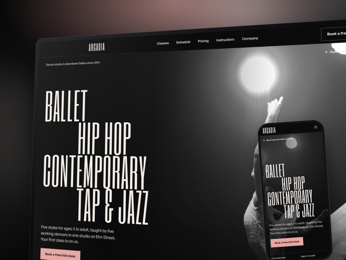
Releve is a dark Framer template for dance studios. The timetable is a real weekly board, Monday to Saturday on hairlines, every class linked to its own page, with day tabs on phones.
https://t.co/mcnvsxJYUl
@liana_tme@framer Curious how the skills handle a rebrand when the new logo has a very different weight. Does the agent also adjust nav spacing and button sizes, or does it only swap colors and fonts?
@zubiasheraz@figma@framer Leading with the product doing the job is right for finance. Do the card, receipt and month-close moments each get their own section further down, or is the hero the only place they show up?
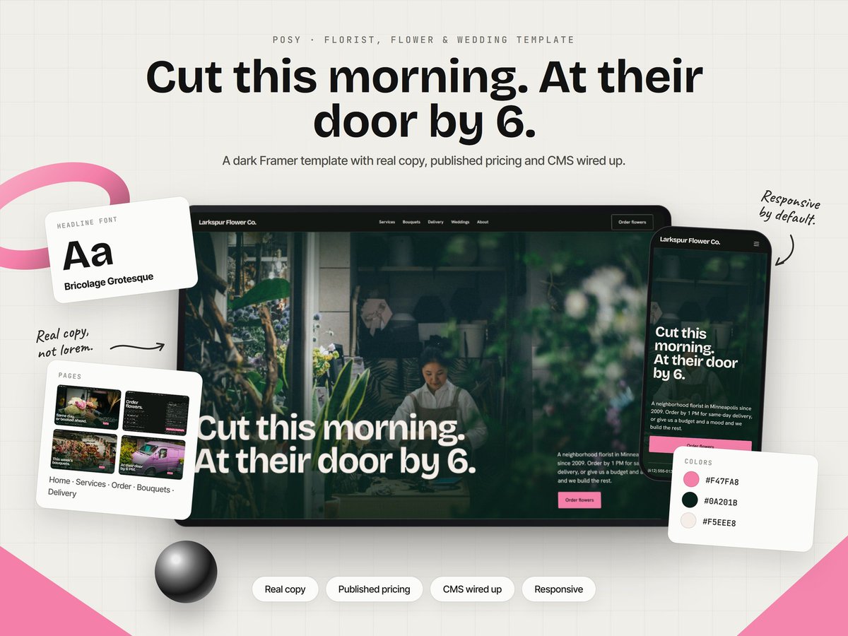
Posy is a florist template where ordering looks like a real order ticket, card message and all. It stays pinned while three big numbered steps scroll past. Plus a bouquet board with this week's prices on a peony pink field. No phone call needed.
https://t.co/k687NMbkj9
@mata_ngu_yen@framer With this little on the page, the spacing and type are the whole design, so those tiny fixes are exactly what people feel even if they can't name them. Curious how the project pages hold up with only 2-3 images per case.