Lumbre is live on the Framer Marketplace.
A template for small hotels with their own restaurant: rooms, a seasonal menu, the area around the house, events and a journal.
18 pages · English + Spanish · 3 palettes · 4 breakpoints.
Light and dark mode from one set of 21 colour tokens.
A toggle in the header, and every page, card and form follows. Change a token and both themes update.
How I made the scroll walk in Lumbre:
1. Four still photos of the same house.
2. Piloted the hardest move (outside → inside) in three video models. Flux 3 won.
3. The window kept turning transparent. Fixed it by editing one keyframe.
4. About 20 MB of frames → 7.6 MB in AVIF.
Total AI cost: about $8.
@0xCharlota Common in health startups. The product grows up clinically and the site still talks like a wellness app from year one. With 3 audiences landing on it, did you give patients and employers separate paths or keep one homepage?
@pentaclay Same design, different shelf. That says more about ranking than about the template. Did you keep the same thumbnail and title on both, or did Webflow get a different listing?
@samgosah@framer@framercommerce Sizing is where I'd expect a clothing store to lose the sale, and most Shopify themes give it one JPG chart. You made fit and bra guides real pages. Good call. Are they linked from every product page or only from the menu?
@chase_mccoy@claudeai Three weeks from sketch to launch only works when the system has already said no to most things. I'm more curious about the other side. Was there a component the system made harder to change?
@Hammad7525@framer The booking step is where therapy sites lose people. Someone nervous about a first session wants to see price, length and who they'll talk to before any calendar. Does Havenly show the therapist before the slot picker?
@LLiepenieks And it's always the old one. Prices from two seasons ago, a dish they stopped making in spring. Guests notice that before they notice the photos.
Lumbre in 40 seconds.
A Framer template for small hotels with their own restaurant: rooms, a menu with the 14 allergens, booking that goes to the hotel's own engine, English and Spanish, three palettes.
@CristianMielu@framer Putting the notes inside the skills is smart, the agent reads them every single time. For the audit I'd open the 3 or 4 demo pages and count which variants actually show up there. The ones I never see on a page are the first I'd cut.
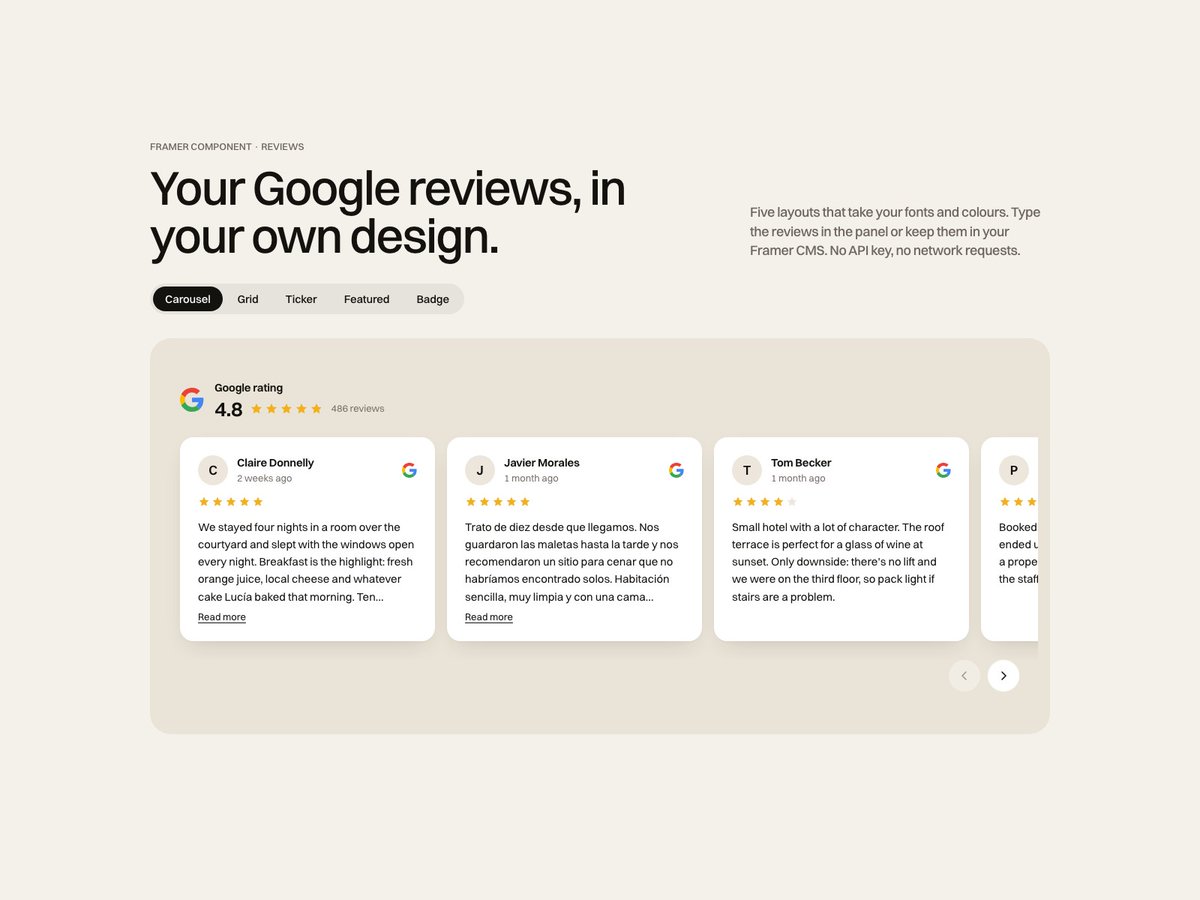
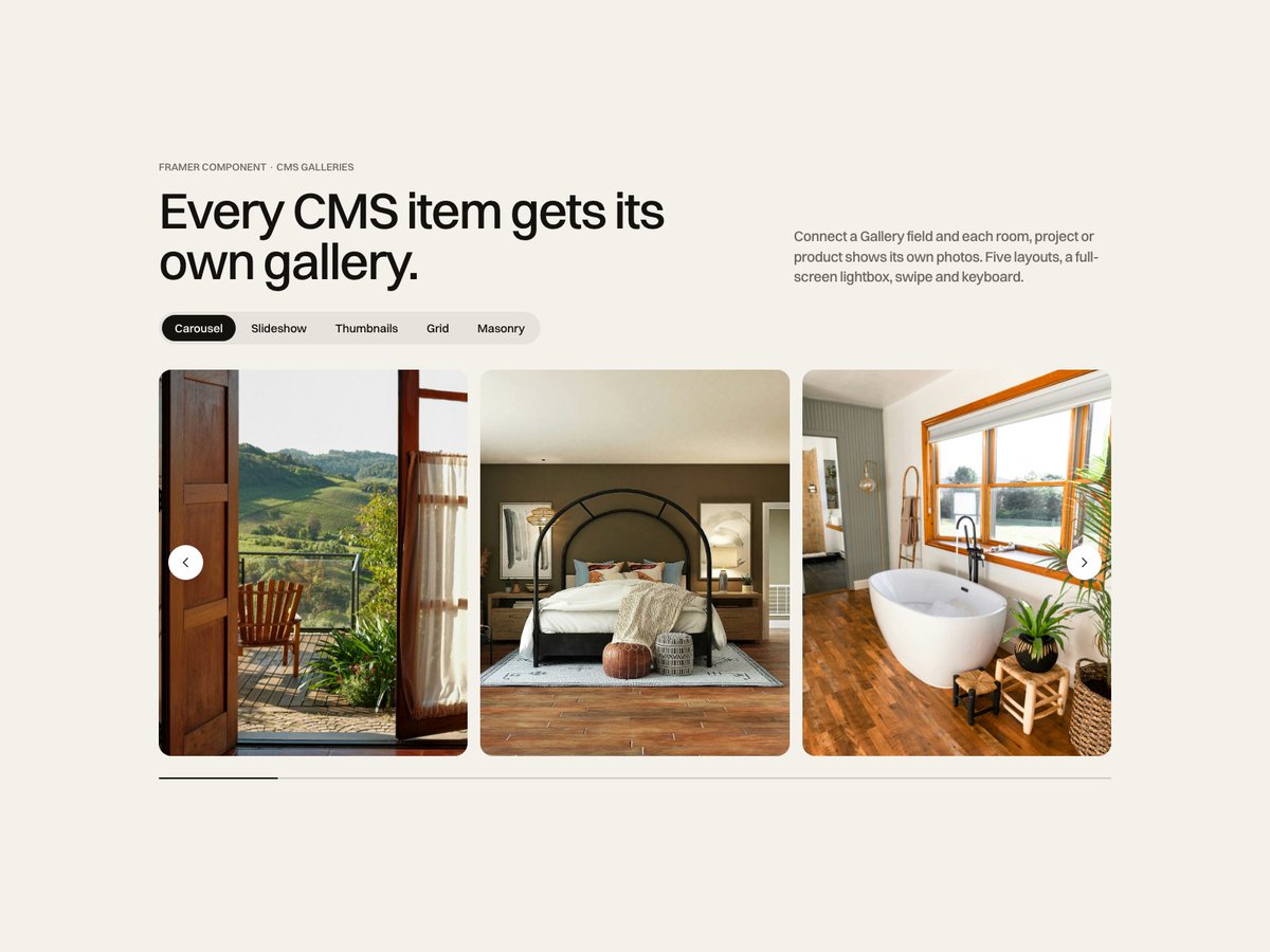
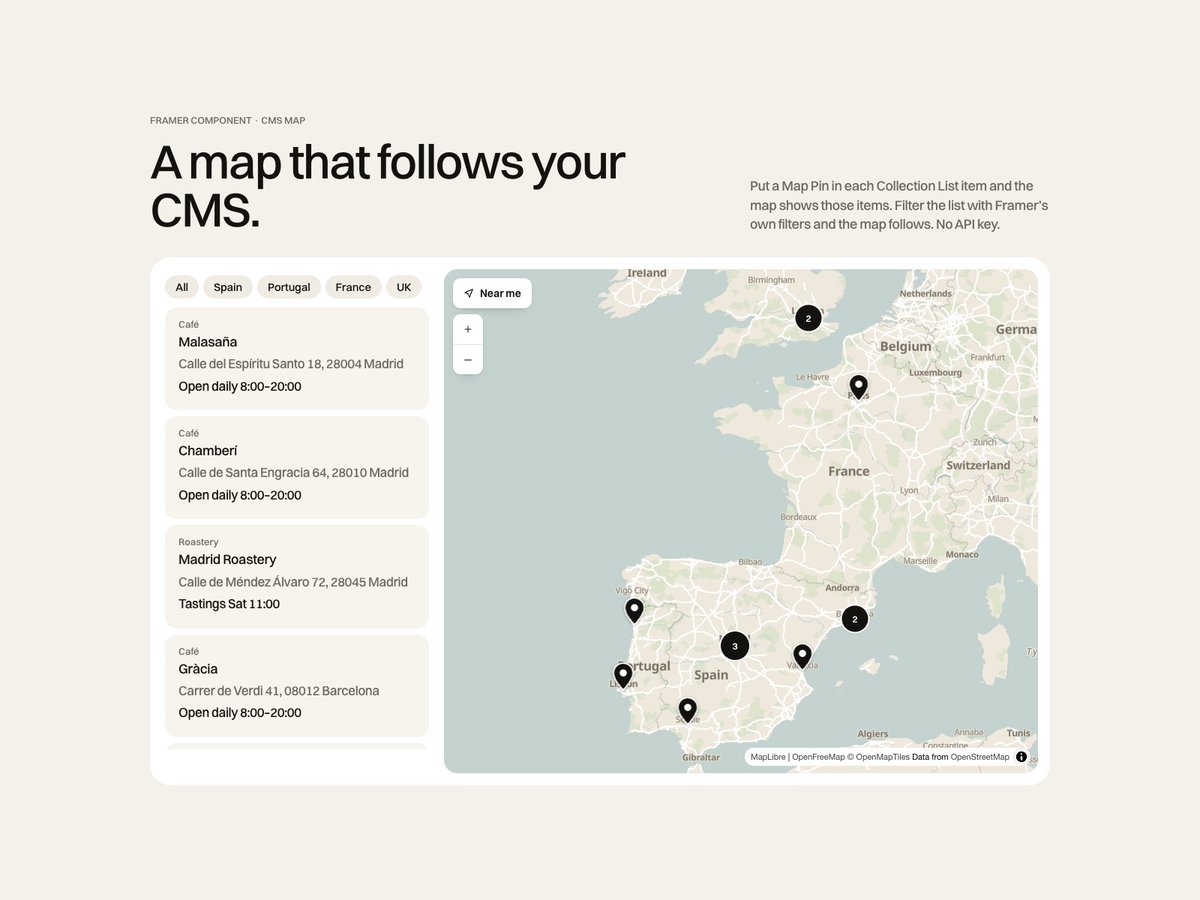
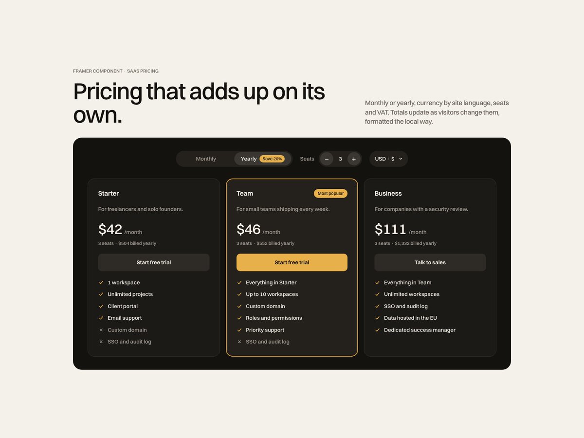
Four new components on the Framer Marketplace, all built around the CMS:
CMS Gallery Kit: every CMS item gets its own gallery.
CMS Locations Map: a map that follows your Collection List.
Google Reviews Kit: your reviews, your design.
Pricing Switch: SaaS pricing that adds up.
@thekenwaydesign@framer Most sites write the Vision as the Mission with a different verb. Splitting them by time, today versus where it's going, is a simple rule that fixes that. Did the client write a first draft, or did you start from blank?
@yahyavision The loops do the work. Same stroke weight in the wordmark and in the pattern, so it still reads as OVO on pieces without the logo. How do you stop them turning into decoration on the busier layouts?
@joodalooped Agree on web. For brand identity I'd say 90% is consistency. Drawing the logo is the easy part. Using it the same way for five years is the hard one.
@jayneil@SarvamAI@kamini_300 Note 1 is the one teams skip. A logo can look good and still fail because it sits too close to something people already know. Checking the category and the local market before presenting saves a painful second round.
@ishaan_builds Feedback is free, so people give it. Buying needs one question answered fast: is this for me? Most people replying to 'rate my landing page' aren't the buyer, so they never test that part.
@Franklin119ai 7/10 from me. Calm and clean, but 'clean, bold and expressive' asks a lot from one muted portrait. A second shot with more contrast next to it would prove 'bold'. And I'd make one of the two buttons clearly the main one.