After 3 years in the making, I just launched my big new project! Font Proofer is a tool for typeface designers to test their work-in-progress fonts. https://t.co/AraiPwYxJs
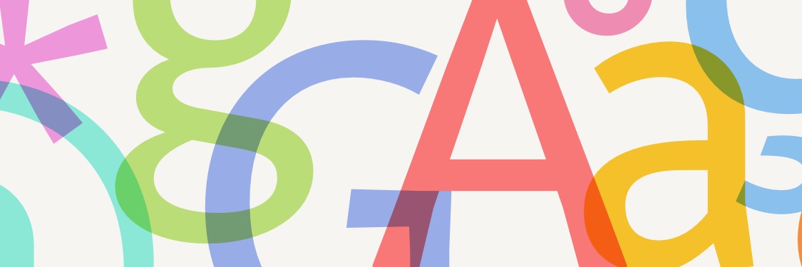
Check out these brilliant typefaces made with Font Proofer in recent months!
https://t.co/YAJpUYy3r6
(From the Font Proofer newsletter. You can subscribe at the bottom of fontproofer dot com).
Hello, world! Meet my new novel.
This is a story about two spies locked in a room with a gun.
This is a story about how semiconductors are refactoring 21st century geopolitics.
This is a story about finding yourself before they find you.
After 3 years in the making, I just launched my big new project! Font Proofer is a tool for typeface designers to test their work-in-progress fonts. https://t.co/AraiPwYxJs
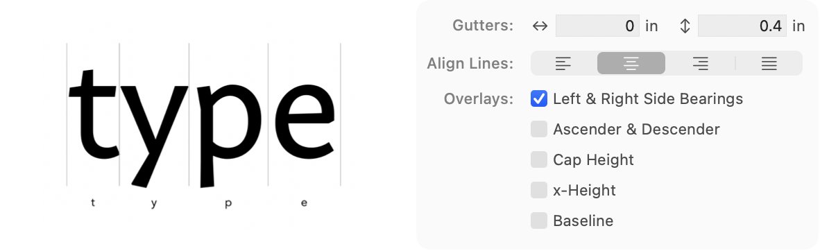
The new Font Proofer update also improves the Glyph Grid layout, letting you justify or align glyphs like lines of text and control exactly which metric lines to show (ex: only left and right side bearings). Many more improvements to Glyph Grid coming soon!
This also now works with 🔗 aliases to folders and font files. So you can organize your font files however you want, and add them all to a proof in a couple seconds.
Last week’s Font Proofer update brings a lot quality-of-life improvements, including the ability to drag and drop a 📂 folder to add all of its font binaries to a proof—including those in its subfolders! It finds font files up to 4 subfolders deep.
It would be great to see design tool makers help make this project a reality, as it will be a valuable resource for app localization and documentation, where precise wording is vital. 💪 @sketch@pieteromvlee@emanuelsa@figma@zoink@marcedwards@framer
I’m so excited about the “Words of Type” Kickstarter project! We need more great multilingual resources about typography. And the lectures and workshops are great rewards. I just signed up for a bunch of them! Let’s help make this project a reality! https://t.co/BbUCJbPUjh
@mttymtt Not sure about Typographics but one past speaker told me their compensation was a free ticket to the conference the following year (presumably that year too). ATypI charges speakers $250 for a discounted ticket (but I think 25%-33% of their attendees in Paris were speakers).
@hobdaydesign Thanks Anthony! Not standard at all—I haven't even seen such a feature elsewhere. The icon was surprisingly hard to figure out. For a while I was going to choose a variation on the standard text indent icon, but user feedback wasn’t strong compared to the dots.
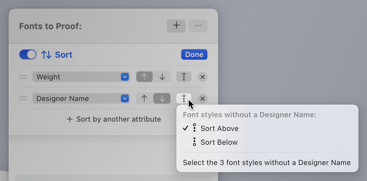
A breakthrough while designing Font Proofer’s new Sorting feature was letting you choose how to sort font styles *without* a value. I haven’t seen this any other software. Info like a designer name, width value, or custom axis value could be missing—especially in some formats.
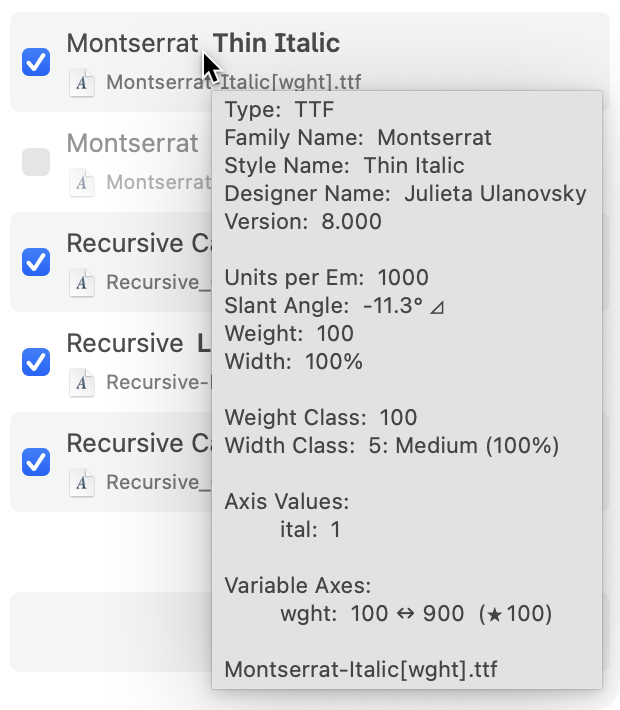
One of the things that makes Font Proofer’s new Sorting feature so powerful is that it reconciles font info from different formats (static and variable binaries, UFOs, Glyphs masters, and Glyphs instances)—so you can sort any combination of them. And you can now see this info:
Font Proofer can now automatically *sort* your font styles! Although sorting seems simple, fonts are so complex and diverse that it was a fascinating challenge. You can sort by 24 attributes—including weight, slant angle, format, version, and axis values.
https://t.co/Xve8cthkh6