From Metro Signs to TV Icons: The Architect Who Built São Paulo’s Identity.
João Carlos Cauduro, alongside his partner Ludovico Martino, revolutionised Brazilian visual identity in 1969 with the creation of the TV2 Cultura logo. Moving away from the era’s ornate and literal broadcast symbols, Cauduro applied a strict "Total Design" philosophy rooted in geometric precision and functionalism. The result was the iconic "bonequinho" (little doll), a minimalist silhouette of a human figure constructed from simple shapes. This figure was designed to humanise the medium, reflecting the station’s educational mission to put the viewer and culture at the centre of its programming.
The logo’s enduring power lies in its modularity and clarity. Because it was built on a rigorous grid, it remained legible across various media, from static print to early television animations. Beyond its technical excellence, Cauduro’s design became a symbol of modern São Paulo, helping to define the city’s aesthetic landscape. Decades later, the logo remains almost entirely unchanged, serving as a testament to Cauduro's vision of timeless, sustainable design.
#logodecks
@fffabs This looks super clean, big fan of the ellipse concept, reminded me of an (really old) illustration I did, maybe it can be useful for you in the process!
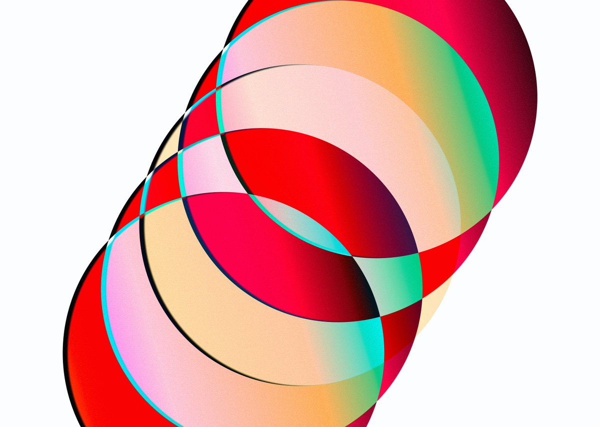
Loved the new @meetgranola brand, I remember exploring a spiral for the Newdle logo but dropped it because mine looked too much like Dreamcast 😆. Kudos to the team involved!
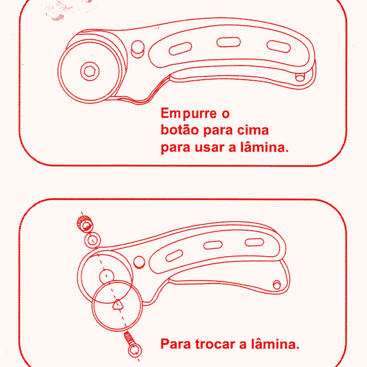
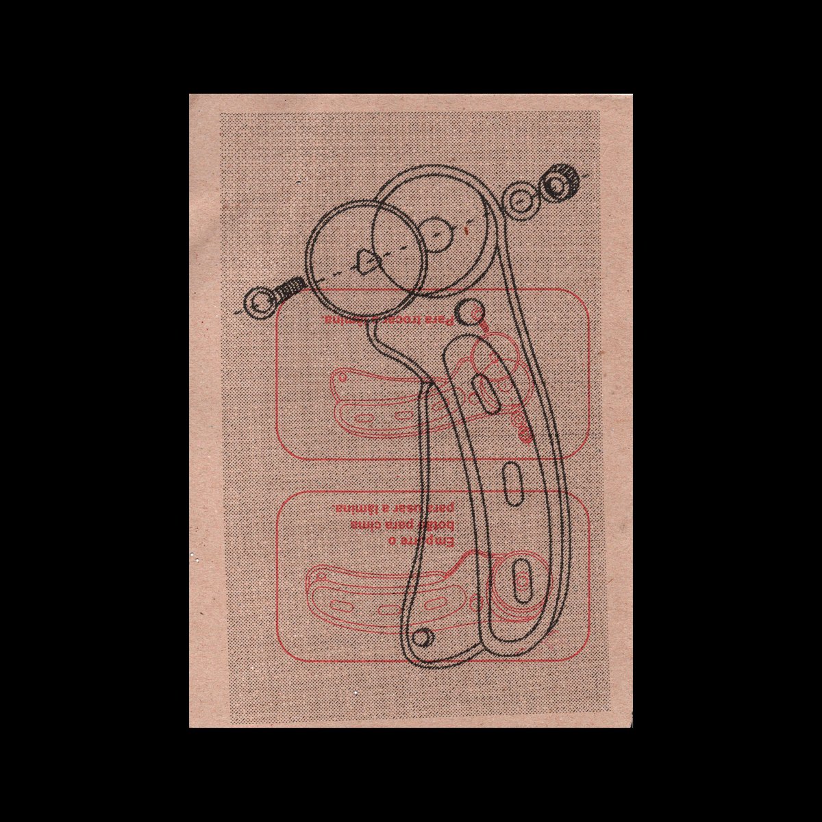
"Instruções de montagem" was a personal project in which I collected and made collages of assembly instructions for objects my wife and I bought in 2020.