This Times Roman lowercase ‘g’ looks the way it does because typefaces like this evolved from calligraphy. Look how effortlessly the broad nib pen creates these kind of forms. #calligraphy#typedesign
My thesis on /Designing italics/ is now freely available, with suggestions of how to find the good stuff in the midst of the dry academic prose. https://t.co/nqMzpX01lO
@UniRdg_Typo#Italics
Design is hard enough without total strangers commenting on your design without full knowledge of the process that lead to the outcome. Be nice. Or just shut up.
The Sega-CNN connection:
Sega's logo is based on the font Yagi Double, designed by American type designer Robert Trogman. The original Sega logo actually used Yagi Double before 1982.
American news channel CNN still uses Yagi Double in their logo.


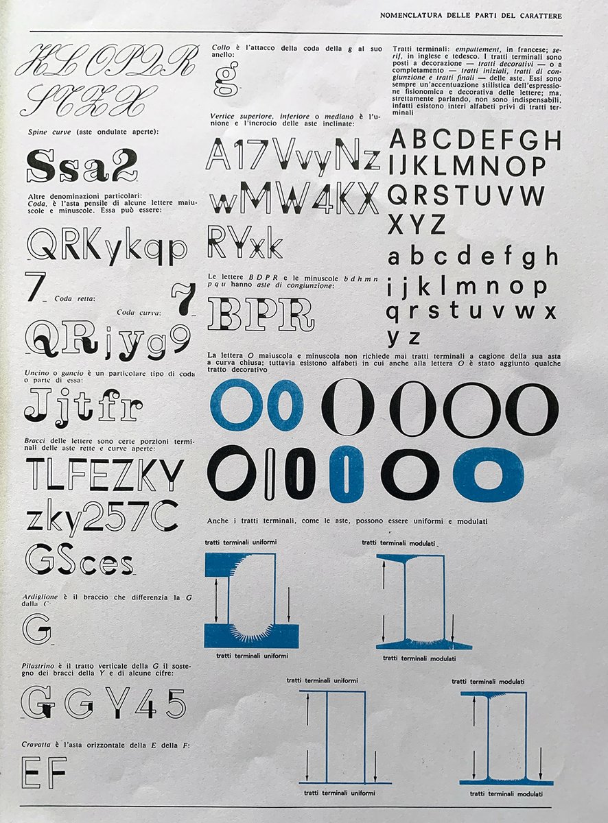









![adehogue's tweet photo. [Re]introducing The Ultimate Guide to the Bézier Method (for lettering)!.
The second edition is now available in my shop!
https://t.co/wEFPWSo0bw https://t.co/ct3igQY5xN](https://pbs.twimg.com/media/E0tkqWmXoAEgZ7M.jpg)