Good designers making impactful brands with Brutal Types' fonts. Check this https://t.co/kKrWBQr63Q graphics designed by https://t.co/asvdHT8Zfl using our Kraai font. https://t.co/07ZvmmzeVc
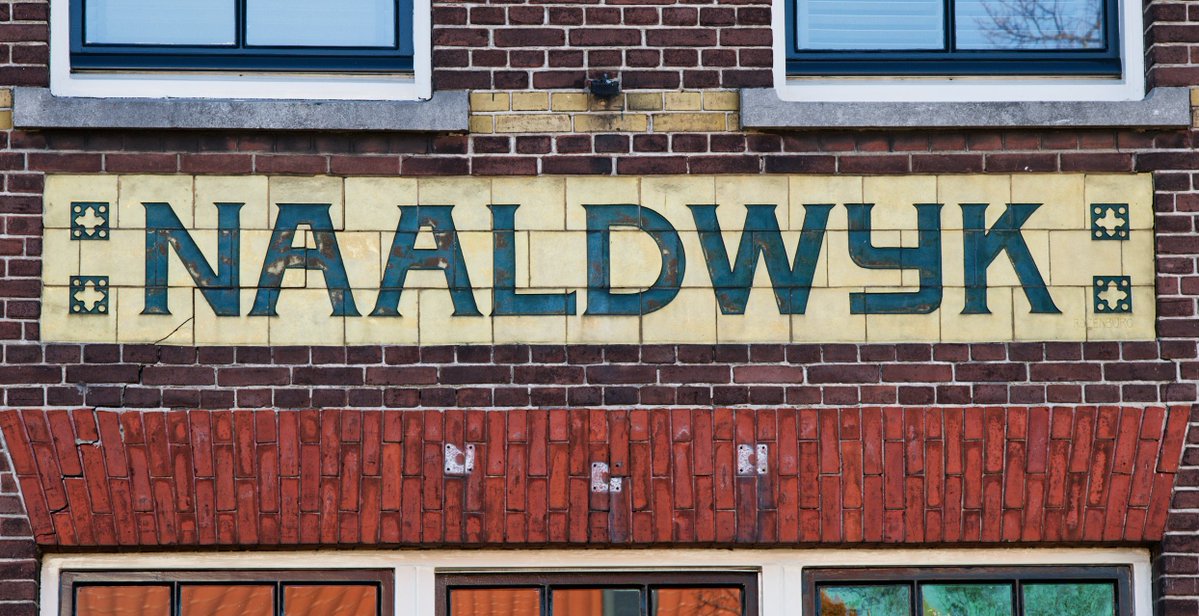
Introducing Tramstop, a font inspired by the lettering found at a former tram station located at Verspycklaan 1 in Naaldwijk, the Netherlands. https://t.co/Lw5x9LEVF0
Hay una cultura tóxica que está saliendo de la industria de la IA y que intenta constantemente que dejemos de pensar.
El mensaje está por todos lados. No leas el código, simplemente hacé vibe-coding. No intentes entender todo el texto, dejá que la IA te lo resuma. No te molestes en educarte, ya es demasiado tarde.
No te preocupes por los errores. Confiá en que todo se va a arreglar en la próxima versión.
El tema es siempre el mismo: no pienses demasiado. Solo seguí tragando bazofia.
This gesture is widely recognized as a discreet way for someone to signal they need help, allowing victims to ask for assistance without drawing attention.
Be on the lookout!
Introducing Aktie, a display typeface designed by P. Mastrangelo and R. Espinoza, inspired by the alphabet created by Dutch designer Anton Kurvers, for the architecture book series Moderneschoonheid, published by Kosmos Uitgevers between 1931 and 1933. https://t.co/5mtpo7UFYt
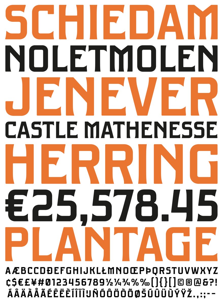
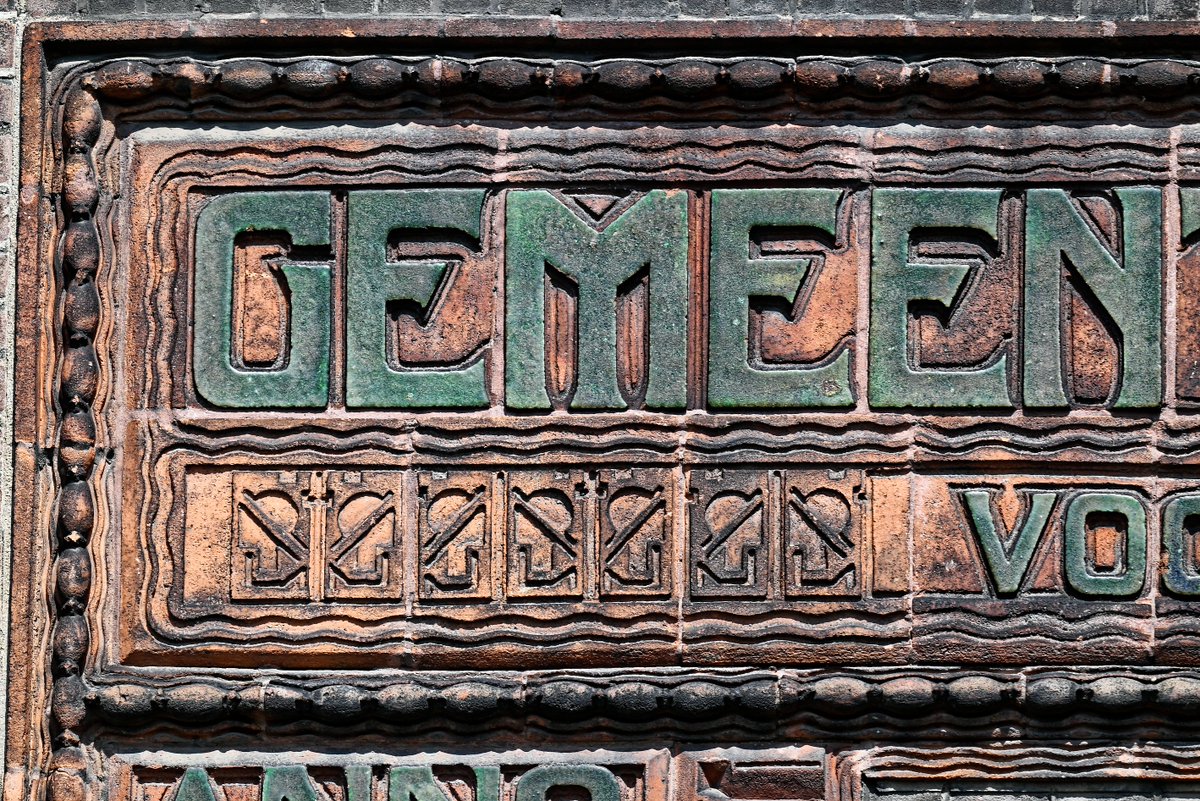
Introducing Edisonplein, a display typeface inspired by the lettering at the entrance of the former “Gemeenteschool J. voor GLO” a Dutch public school located at Edisonplein 20–46 in Schiedam, the Netherlands. https://t.co/Thxh7H2Cx1
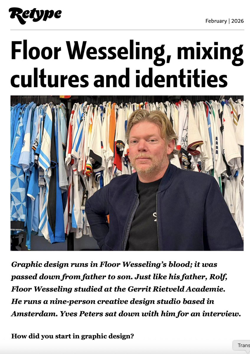
We strongly recommend this interview with Floor Wesseling, one of the most original voices in Amsterdam’s graphic design scene: https://t.co/ZqqcQB54HV
Introducing Brikka, a modular display typeface inspired by the lettering painted into the brick wall of the former yarn manufacturer Goudsche Machinale Garenspinnerij, located along the Turfsingel in Gouda, the Netherlands. https://t.co/kHhAwBOR2M
Introducing Marien, a modular, neo-constructivist display typeface inspired by a piece of 1930s lettering found on a façade stone at Mariënburg 92 in Nijmegen, the Netherlands. https://t.co/n45x2nifrY
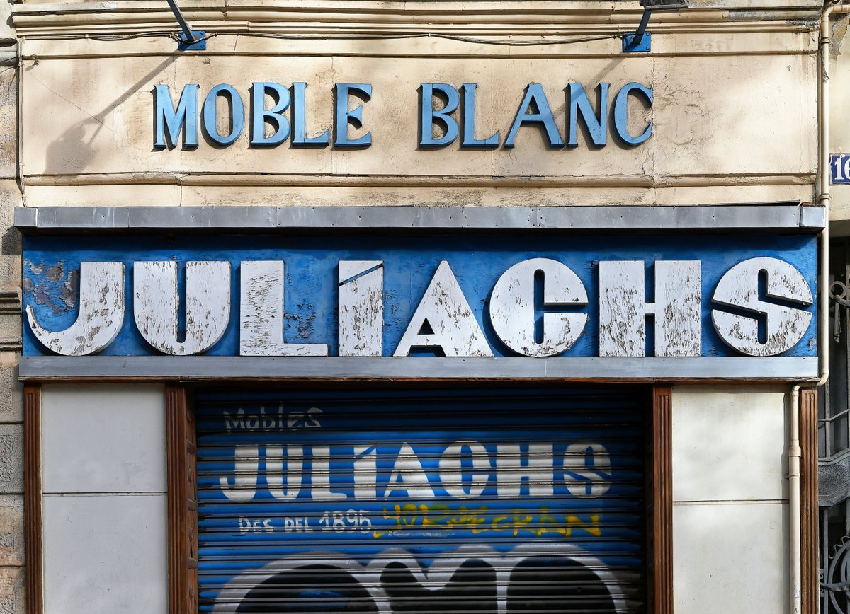
Introducing Urgell, a display typeface inspired by a vintage Deco-style street sign located at Comte d’Urgell 16 in Barcelona, Catalonia.https://t.co/rx3omyUEHD
Move the furniture, roll up the carpet, let's dance and sing along to this classic:
'When That Man Is Dead And Gone', superb lyrics written by Irving Berlin in 1941, sung by Mildred Bailey:
https://t.co/rMfUoqbwkk
Introducing Paysbas, a modular typeface designed by Ramiro Espinoza and inspired by the lettering used to identify the Dutch Pavilion at the 1925 Exposition internationale des arts décoratifs et industriels modernes in Paris. https://t.co/ZsW1xNBRbI
Introducing Minicus, a compressed modular typeface designed by Paula Mastrangelo and inspired by the lettering on a plaque at Tweede Jan Steenstraat 113 in Amsterdam, the Netherlands. https://t.co/AucS9DjxMQ