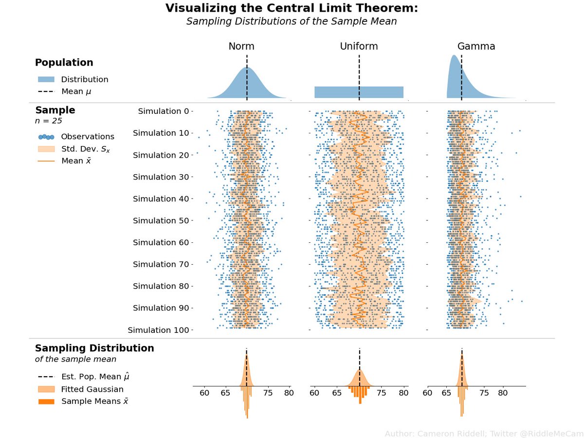
Been working on some visualizations in @matplotlib to highlight statistical concepts. This one intends to demonstrate (via simulation) the Central Limit Theorem: the sampling distribution of the mean is gaussian if given a large enough sample size regardless* of the population.
Check out "What we learned applying Diataxis to HoloViz libraries" by @MaximeLiquet https://t.co/4ATPQrVeXu.
Thanks to @RiddleMeCam for the invitation.
#Python#Diataxis
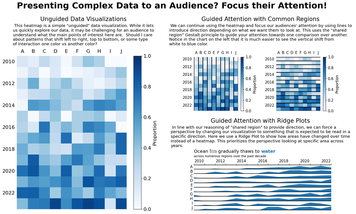
Recently held a dataviz session for @theAGU, part of their annual data viz competition for students https://t.co/veF4ESzGv9. The viz were great, but they often lacked focus for an audience to quickly understand what was going on.
(link below for the code & discussion)
@theAGU When presenting data, it’s key to guide your audience through a chart as you would with text! In this viz, I enhance a basic heatmap and add features that guide attention towards specific perspectives to support a narrative!
Code + more: https://t.co/CHDch75Ip1
My favorite, funniest looking import I use since I keep replacing things I used to do in @pandas_dev with @DataPolars for data processing.
That said, @pandas_dev is still an incredibly flexible tool with many diverse/useful functions making it a true data swiss-army knife.
@pandas_dev@DataPolars If you liked this thread, then take a more in-depth look at my blog post on this topic: https://t.co/M54tARsyv1 where show these patterns in DuckDB and recreate them in both Polars and pandas.
Why do I always say you need good Python skills to make the most of your @pandas_dev and @DataPolars data tools?
Let's take a convenient SQL feature as an example: groupby sets, rollup, and cube. These aren't implemented these Python DataFrame libraries...
@pandas_dev@DataPolars Convenience: Finally let’s insert these into a more ergonomic API, we can use its registration mechanism to implement something that builds upon the existing style of Polars and is relatively self-contained.
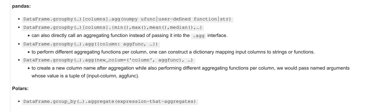
I love using both @pandas_dev and @DataPolars, but I will say that in terms of a consistent API, @DataPolars `group_by` context + expressions really takes the cake.
See the rest of this comparison for group & window functions on my most recent blog post: https://t.co/GonPoIxCFI
@R_Graph_Gallery Here's a straightforward Python example I modeled after the one you shared in R. The code exists as a gist here: https://t.co/dDIXPrluVh
There are many ways one can provide intentionality in data visualization, the important thing is to begin thinking critically about what you want to visualize and how you can support that goal.
Check out recent blog post for more on this topic
https://t.co/OzVQiB65iZ
Exploratory data visualization is much more than just "putting data on the screen." When you visualize data you facilitate the obvious comparisons, and it is important to be intentional with what is obvious. 🧵
https://t.co/OzVQiB65iZ
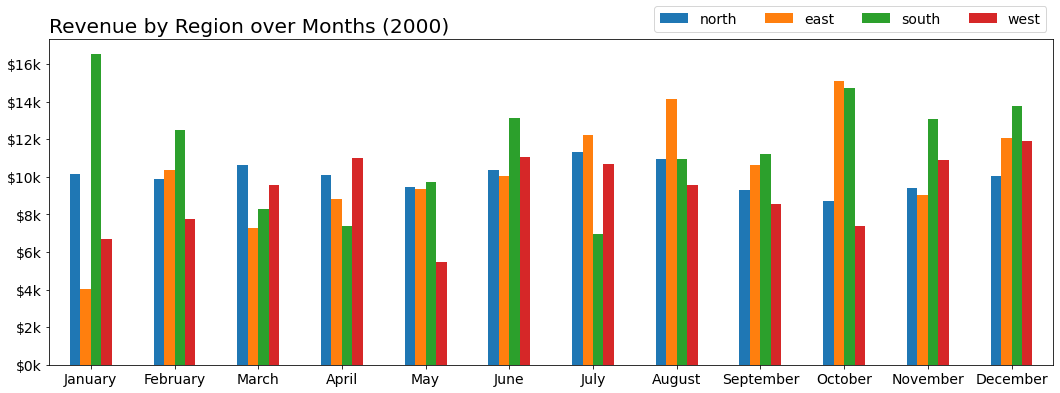
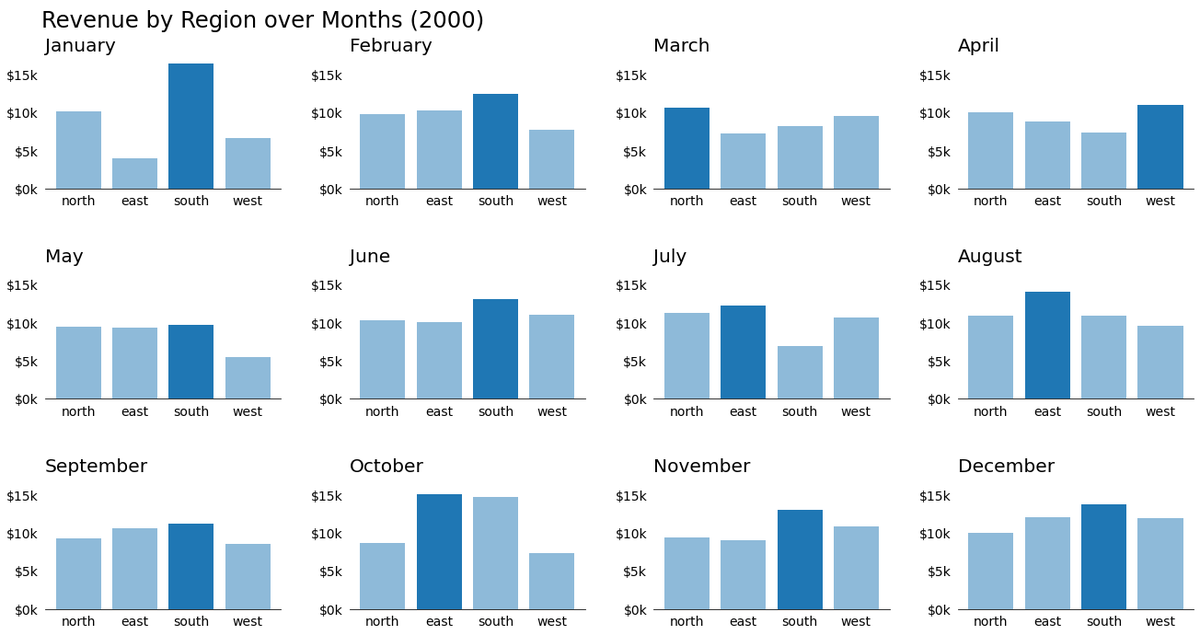
By removing some (colorful) noise from our visualization, we can supplement information through that same channel, such as highlighting the maximum value within each month without re-introducing visual competition.