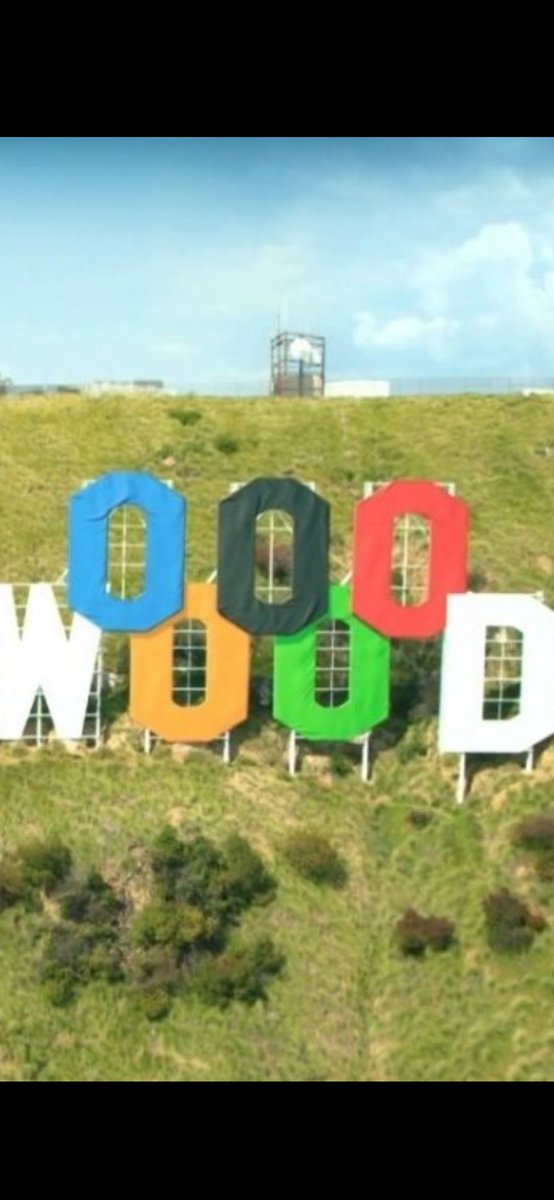
Yes this is a poor redesign. Let’s talk about the typography of this horror.
1- type style: geometric sans serifs are seen as neutral but a better way to describe them is as static fonts. They are rigid and do not move. Why would you use this for a brand that has sports cars??
@art_is_found Definitely pay it. I know a lady who had the same story, didn’t pay and got arrested upon arrival. 135 euros is a cheap price to avoid 10 hours in custody in several years.
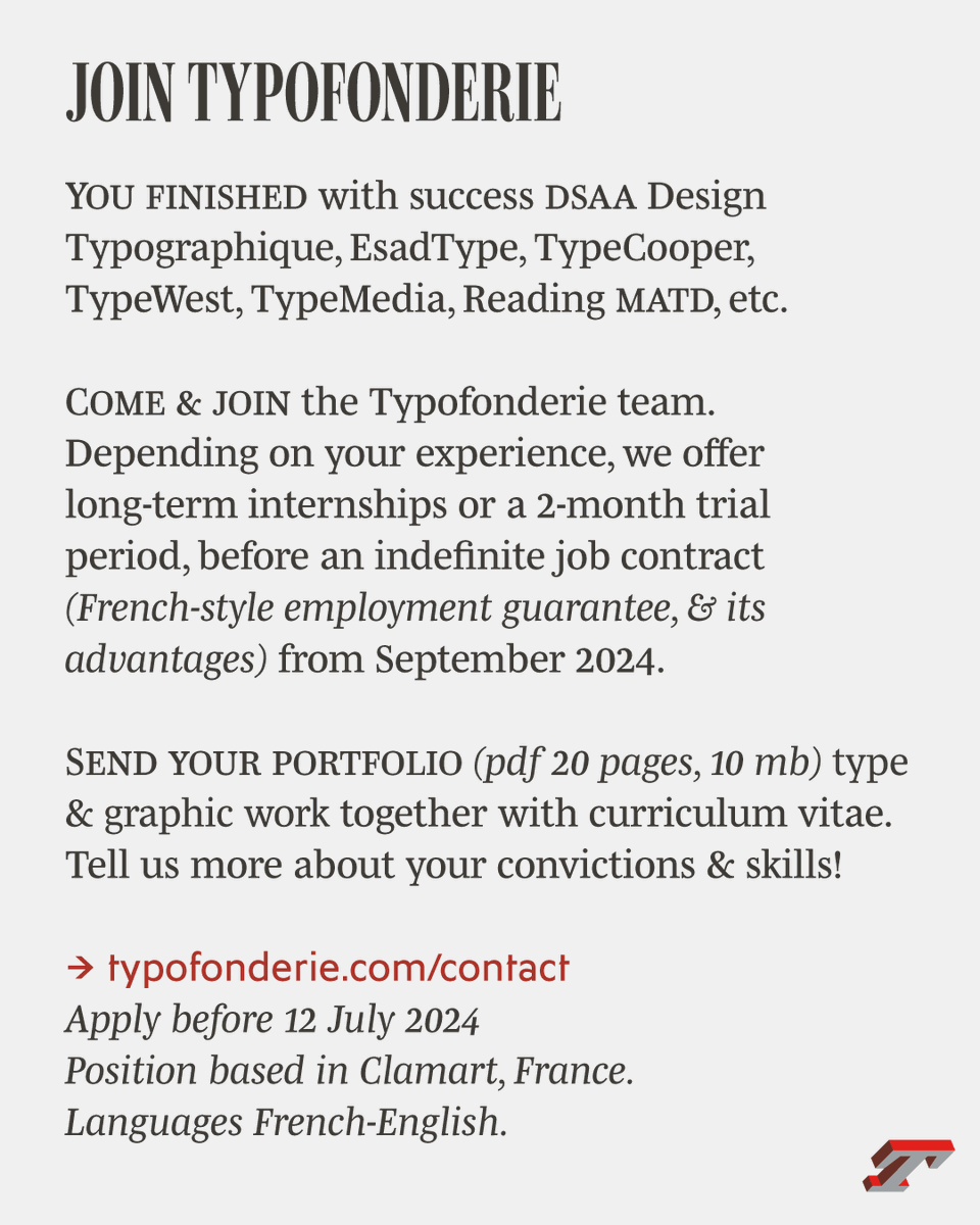
Come and join the Typofonderie team, depending on your experience, we offer long-term internships, or a 2-month trial period before an indefinite contract (French-style employment guarantee, and its advantages) from September 2024.
➽ https://t.co/6IohMDTQvn