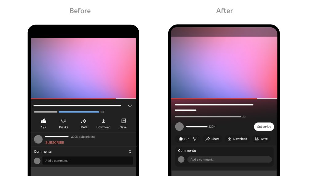
YouTube's identity just got a refresh. The new @YouTube color palette features a brand gradient that elevates the UX and reinforces the brand. Say hello to a softer shade of red and eye-catching magenta-infused gradients.
Incoming! New YouTube updates 📲
We just announced fresh design updates & new features gradually rolling out across devices globally 🌎
Listing our favs below + full blog post here: https://t.co/M3Zrhv6TdC
Take a bow apple. This is definitely amongst the neatest moves in UX. Being practical enough to spot the opportunity to work with the hardware instead of against it is much harder than most people understand.
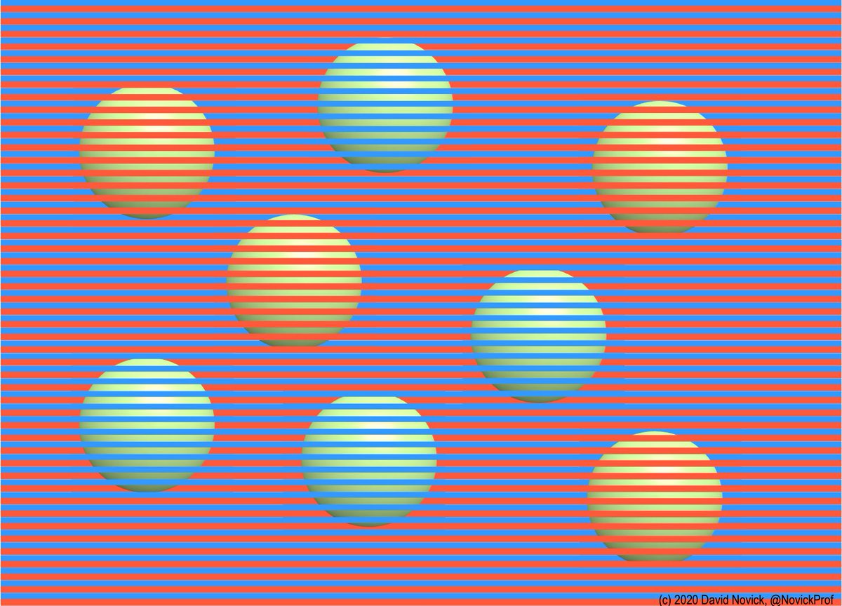
You can access all my latest color illusions at https://t.co/6r2PMbMkyK, and my Web page on color illusions (https://t.co/MrcZxPk2uO) has an explanation of the Munker illusion plus nearly all of my earlier color illusions, including the dynamic color-reversal illusion.
Just had a great 1:1 with a mentee on @superpeer. We spent 60mins preparing for an upcoming whiteboard interview session. We identified a problem area, business opportunity & wire-framed some initial product concepts!
Checkout my Superpeer page below. 🙌
https://t.co/anvE27PWrd
Fun fact: we also found that placing certain shades of green and red next to each other created an unpleasant color vibration, so we introduced a very subtle gradient to the main icon to mitigate that, making the icon more accessible.
Waymo One is now in @GoogleMaps. Tap the ride-hailing option when you’re in the Metro Phoenix area, then hail a fully autonomous ride powered by the #WaymoDriver!