👨🏻💻 Product Designer and fitness nerd | 👩🏼⚕️ By day I design apps for medical professionals | 🏃🏻♂️ By night, I share ideas for health & fitness tech
@DanHollick Planned to take your advice n get lunch during your talk, but the queue looked looong. So I sat through it. On balance, it was time better spent than in a queue. Thank you
While looking for something completely different, I stumbled across this nice Figjam "toolbox" from https://t.co/eCWrfuZVO9, to help designers introduce designs in crit. All killer, no filler. Lovely.
To all parents of toddlers. If you know... you know 🤣 I normally stick to software design but every time i put a wriggling Frankie in her @MyJoolz Aer pram, I swear a little, and just wish this was a thing...
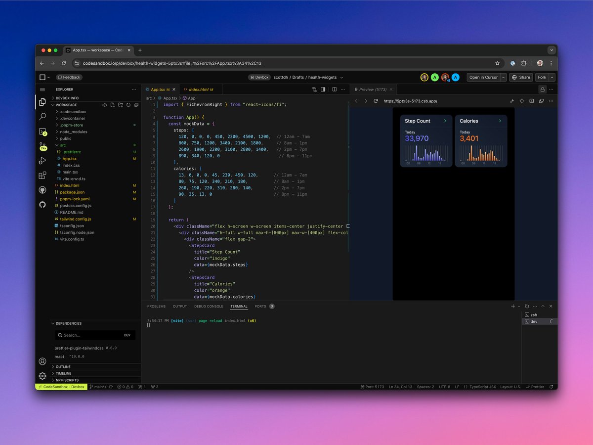
Popped my @cursor_ai cherry today!
A few weeks back, I made a "Step Count" widget in React. Today with Cursor, I generated better mock data n added props for different data arrays, titles n colors. Now I've both a Steps and Calories widget 😍
Take a 👀: https://t.co/UYiHOewdw3
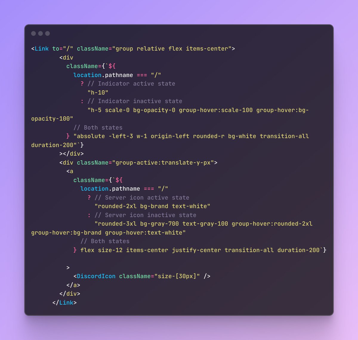
The code for getting that cool inactive/active state on the server icons, complete with animated indicator bar.
Getting the hang of tailwind now and impressed how easy this was to achieve using just out-the-box values.
Discord Clone Update:
Yay! I've built my first multi-page SPA using React-Router. While setting up routes wasn't exactly a breeze, it clicked once I got the mental model of route nesting and layouts.
It never occurred to me the body has a recycling function, that modern, round the clock food access/diets inhibit.
Before I honestly couldn’t have told you the last time I went 12 hrs without calories, outside of illness.
📖 Outlive, by @PeterAttiaMD
💡Rapamycin, the Easter Island wonder molecule. The processes our cells undergo, when they’re told nutrients are scarce (e.g via mTOR suppression with Rapamycin or fasting) is crazy interesting.
As a result I’m trying out intermittent fasting (16:8 5 days a week) and enjoying the feeling. Tracked with a couple apps @fastic and @zerolongevity for a design critique later.
Context is everything. Particularly with health data.
Making it this easy to see not only what’s going on right now, but how that fits with your own personal trend over time is design n engineering time very well spent.
Love the thoughtful design in @Gentler_App!
1. Horizontal view of condensed widgets for today's vitals at a glance.
2. Beautifully transitions into vertically aligned full-width widgets, providing context for today’s metrics over a longer period with spark-lines. 😍
@disco_lu 😂 Fiiiine. The contrast is pretty shocking. In my defence the labels alone provide all info needed. Complete task support isn’t reliant on the bar graphic at all, which I did make sure of.
But yeah, if it’s there - make it accessible 👍
Almost half way through my GOWOD 10hrs in 30 days mobility challenge. I know I'm behind, but have no idea by how much. The in-app challenge widget's design doesn't help me at all.
Here’s my fix: two subtle tweaks, one major boost in task support.
Niiiice feature from @ridewithgps! Drag and drop multiple routes onto the map. Can't wait to try it! Curious how it handles routes from very different geographic locations dropped in at once. Sure it’s given their designers n engineers some fun headaches.
Playing with @fastic’s app. Ignoring the scaling errors on the chart (green section appears to start after 10 days not 7) and hyperbole in the claim, is there a name for this design tactic? Pre-empting an initial poor experience with a new behaviour, but encouraging perseverance.
Learning to build UIs in React via the tried and tested "monkey-see-monkey-do" method (Sam Selikoff's Discord clone course). Using @tailwindcss feels so similar to designing in Figma. With all the advantages of code. See progress via dodgy looking link: https://t.co/i98Q6BiQz7