(1/4) The ongoing market response to last week’s US tariff announcement was both predictable and preventable. Even if you agree with the premise of these tariffs, every reasonable effort should be made to give US companies sufficient time to adapt.
Yes this is a poor redesign. Let’s talk about the typography of this horror.
1- type style: geometric sans serifs are seen as neutral but a better way to describe them is as static fonts. They are rigid and do not move. Why would you use this for a brand that has sports cars??
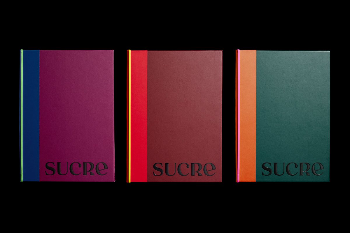
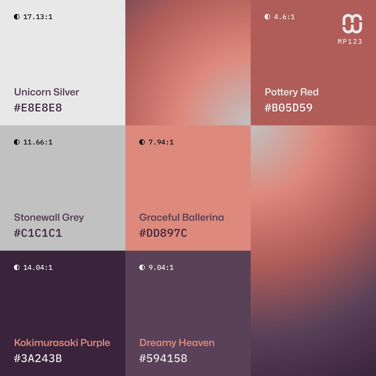
🆕 New #ColorPalette – #MindfulPalettes № 123 has a strong #Japanese influence. It offers a blend of traditional elegance and modern minimalism through the use of muted, warm and deep tones – a celebration of the Ma (negative space) principle.
❤️ Likes and Shares appreciated.
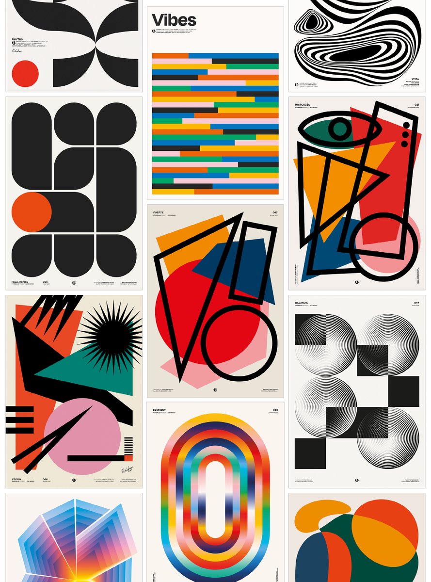
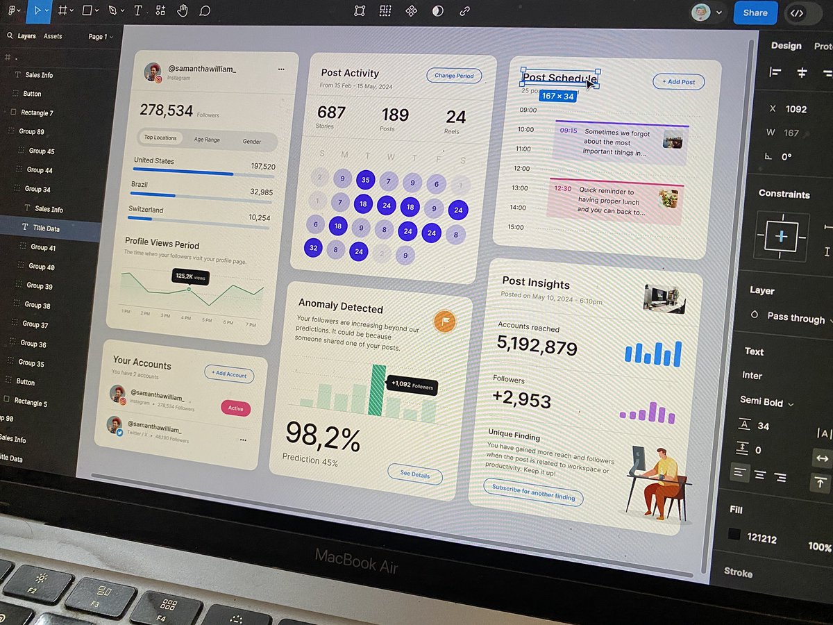
Design exploration tips 👨🏻💻:
1. Open your old files.
2. Make small tweaks.
3. Change the topic or theme.
4. And voilà, you’ve got a new design exploration!