We’re The Screenshot First Company
We just hit 10k followers 🎉
It’s the perfect time to re-introduce ourselves:
We specialize in creating captivating visuals and adding rizz that make your app shine in stores.
Clients: Promova, Gringo, Happn, Bump, Paired, Cal AI, Sleepiest, Purp, Kismia, Uxcel, Jammable, Riveo, and counting.
Huge thank you to everyone who’s been part of the journey 🚀
@SmartFoxDev fair point!
that was intentional though. the first frame shows the chaos of parenting life (you can see the latests live version highlights the chaos even more clearly)
then the rest of the set shows how the app brings order to it. contrast is the hook
Good question from @emil406p. Honest answer, the best screenshots find balance between things that pull in opposite directions.
A few we'd flag:
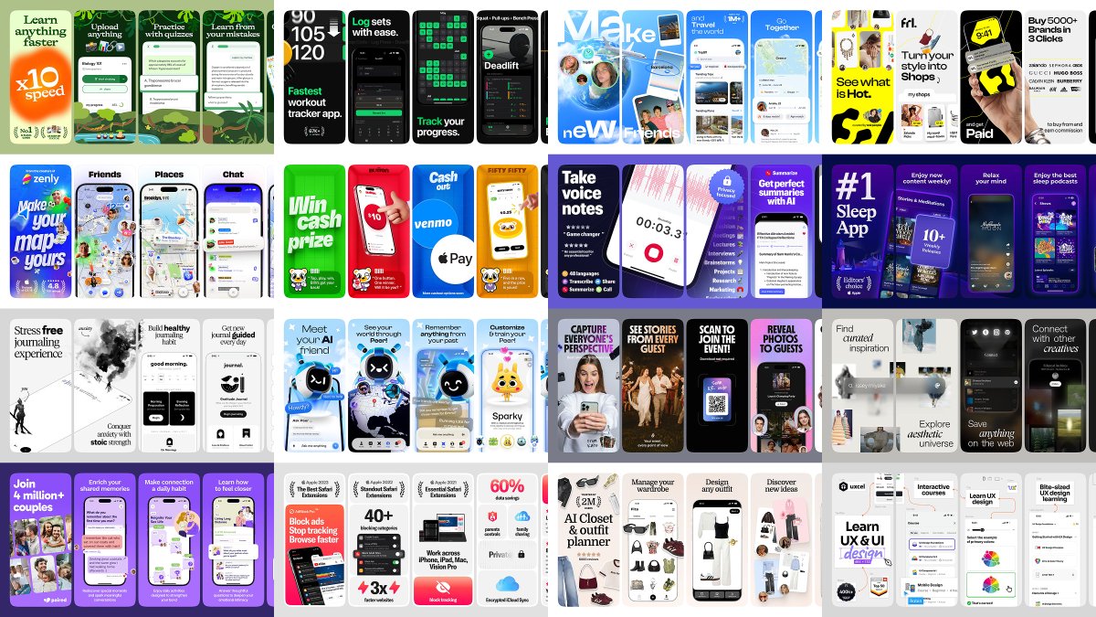
- Simple, but not boring. Strip it back without going flat. Pebble does this really well, lots of white space but the handwritten notes give it life.
- Eye catchy, but still structured. You want to stop the scroll, but the eye also needs somewhere to land. TripBff is wild and collage-y but each frame still has a clear focal point.
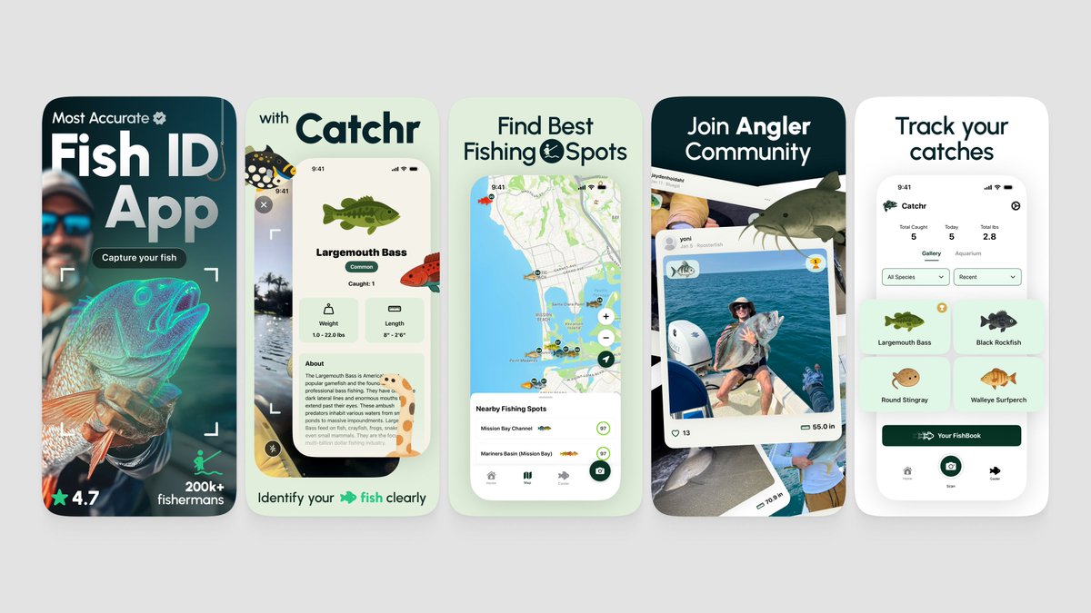
- Storytelling, not just feature listing. Every frame should pull you to the next one. Catchr opens with a hero photo, then the product, then the proof, then the community. There's an arc.
- One strong hook on frame 1. People decide in 2 seconds. unstuck nails this with a giant "x10 speed" claim that you can't miss even at thumbnail size.
The real trick isn't picking one side or finding some perfect balance once.
It's constantly testing what works with your specific audience.
Use every tool you have, custom product pages, A/B tests, different angles for different traffic sources, and adjust each part to who's actually showing up for your app.
Some examples below 🌈