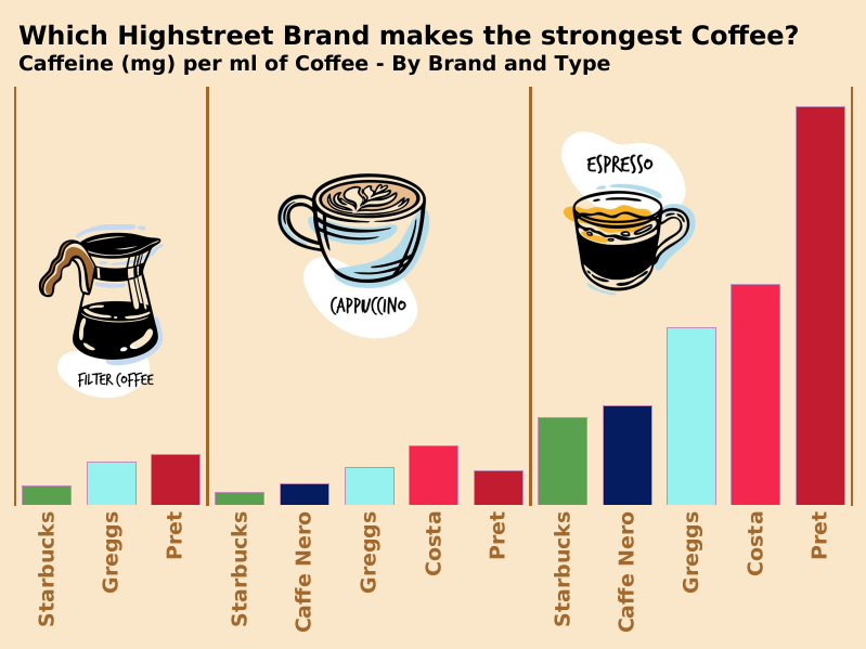
What a useful piece of info. Where can I get the strongest coffee? - No surprise to see Starbucks at the bottom, but surprised to see Greggs beat Cafe Nero! #MakeoverMonday week 9.
@priyankadobhal_@tableaupublic@tableau Ah I see - to be honest I still feel it's hard to read. i think because its hard not to see the outer and inner representing some sort of scale (rather than just am and pm)
@DataNath@cyclestreets Great viz. Really informative and mostly very clear and good looking. But I am confused by the use of the same colours for different things. Most of all why are the years on a colour scale at the top? Suggests that there were slight collisions in 2005 and fatal colisions in 2019?
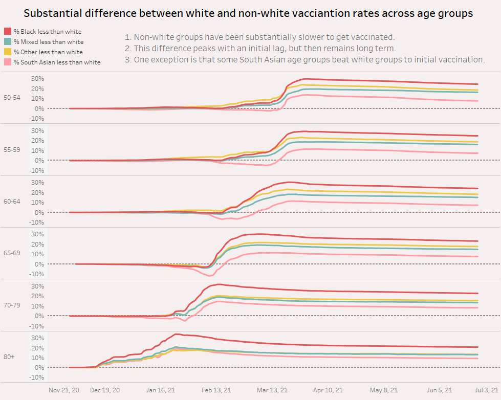
@TGIVizday@tableaupublic@VizWizBI hihi - I think choosing colours for your chart that reflect your closest approximation to the racial group being represented is a little bit dangerous ;-)
@joshpresto@VizWizBI Hi Josh. Really? - I 6.5x on what measure? - I dont see where this statement comes from (either in your chart or in the original report)
@MarianoRomrod@makeover_monday My favourite so far. Nice that you selected only some of the info and displayed it well. (better than many attempts to display all of the categories)